Life Online: Charts About the Internet, 2008–2010
The collection that dated fastest, and is therefore the most useful.
The charts in this collection were drawn by people describing a thing that had not settled down yet. In 2008 the internet was still a place you went to, on a computer, in a room, and the everyday friction of it — waiting for a download to finish, deciding whether a link was safe to click, being the fourth person to write “first” under a video — was novel enough that plotting it counted as an observation rather than a complaint.
That is why this is the collection that aged fastest and the one that turned out to be worth the most. Ninety-seven sites still link to it still point at these addresses, more than any other theme in the archive, and they come from an unusual mix: technology blogs, university IT departments, forum threads, and at least one piece of published journalism.
The browser charts
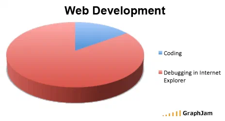
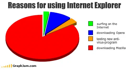
Four charts here are about which browser people used and why, and they are the closest thing in the archive to a primary source. Reasons for Using Internet Explorer from March 2009 divides its pie between reasons that are all some version of “it was already there”, and it was picked up by the Thai technology site Blognone and by Techrights, both of which were covering the European antitrust case about browser bundling at the time. Usage of Internet Explorer does the same job as a line. How To Make Google Chrome treats a browser as a recipe. Web Browser Cookies takes the one piece of browser terminology that sounds like food and refuses to let go of it.
Read together they record something the market-share graphs of the period do not: that browser choice in 2009 was mostly not a choice. The joke each chart makes depends on the reader already knowing that.
Comment sections, threads and the shape of an argument
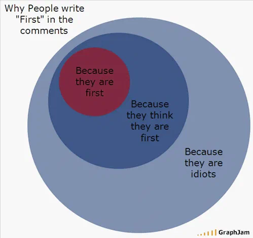
The archive’s most-cited single chart is about comment sections, and this collection holds the rest of that vein. Thread Topic Flowchart takes the observation that every long forum thread ends up in the same three places and draws it as a decision tree with no exit. Internet Communities maps them against each other. Results of Misspelling or Grammatical Erriors on the Internet commits its own error in the title, which is either the whole joke or an accident that improved the chart.
There is a specific reason this material travelled. A chart about an argument is usable inside an argument, and several of these were linked from the middle of threads as a way of ending them. That is a different kind of circulation from a humour round-up, and it is why the sites linking here are so varied.
Spam, pop-ups and the friction that disappeared
Some of this is now archaeology. Time Spent When A Pop-Up Ad Comes Up assumes a browser that lets pop-ups through. What People Download From Limewire assumes Limewire. People who check the “I have read the Terms of Services” box assumes, correctly and permanently, that nobody does. Since I Began Responding To All Spam is a chart about a deliberate experiment in wasting your own time, and Intended Use of Spam when Purchased is a pun that only works because both meanings of the word were current at once.
Download speed vs. % done is the one everybody recognises: the bar that races to ninety percent and then stops. It plots an experience of network buffering that the technology has since hidden rather than fixed.
Facebook, before it was infrastructure
Three charts here treat Facebook as a curiosity: facebook wall activity, People who find you on Facebook, and Facebook Users with >500 “Friends”. None of them is critical in the way a 2016 chart about Facebook would be. They are charts about a social novelty, drawn by people who found the mechanics funny, and the absence of any suspicion in them is the most dated thing in the collection.
- Charts here
- 41
- Images recovered
- 26
- Published as plates
- 9
- Referring domains
- 97
- First posted
- Apr 2008
- Last posted
- Aug 2010
The charts
In publication order. Sides run in tens, the way a record does. A chart marked as a plate has its own page and its own retrospective; the rest are published here, at the addresses they held when they were posted.
- A1
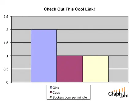
Check Out This Cool Link!
- A2
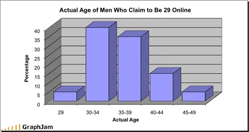
Actual Age of Men Who Claim to Be 29 Online
- A3
A Practical look at the information age
- A4
- A5
Since I Began Responding To All Spam
- A6
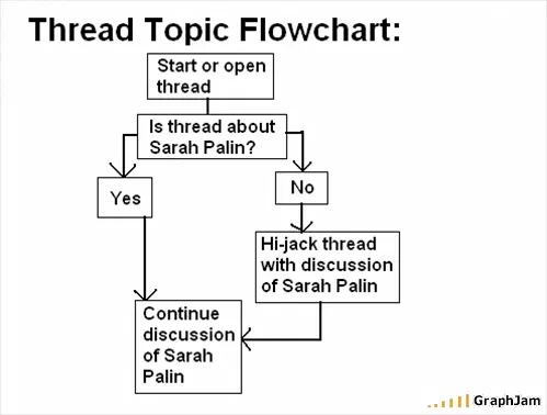
Thread Topic Flowchart
- A7
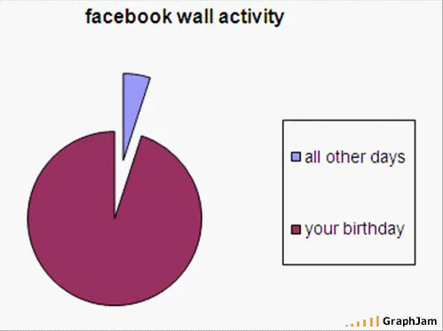
facebook wall activity
- A8
Why People Write “First” in the Comments
- A9
Web Browser Cookies
- A10
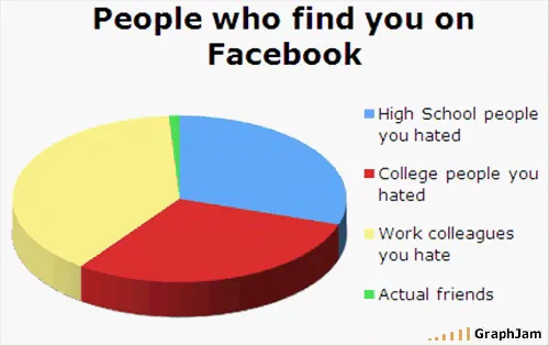
People who find you on Facebook
- Side B
- B1
- B2
Online Gaming Players
- B3
- B4
- B5
Things I do when my internet connection is being slow
- B6
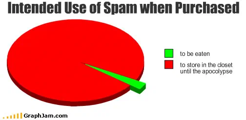
Intended Use of Spam when Purchased
- B7
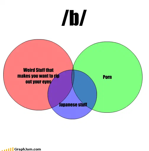
/b/
- B8
- B9
Uses of Their/There/They’re By People 12-20 online
- B10
- Side C
- C1
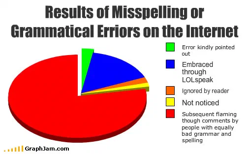
Results of Misspelling or Grammatical Erriors on the Internet
- C2
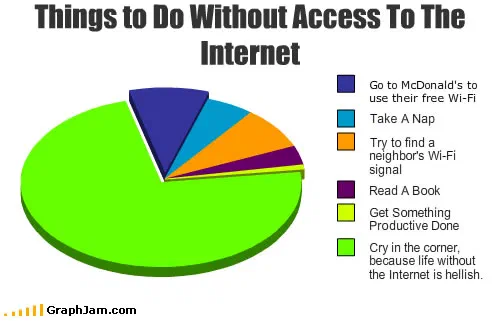
Things to Do Without Access To The Internet
- C3
How people research things
- C4

People Who Email Me
- C5
Download speed vs. % done
- C6
- C7
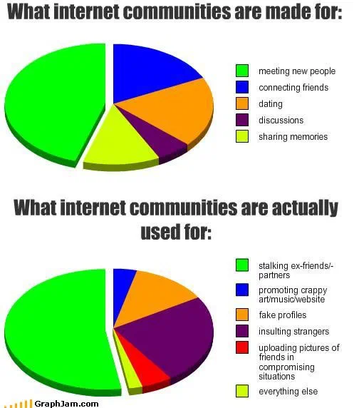
Internet communities
- C8
Usage of Internet Explorer
- C9
Time Spent When A Pop-Up Ad Comes Up
- C10
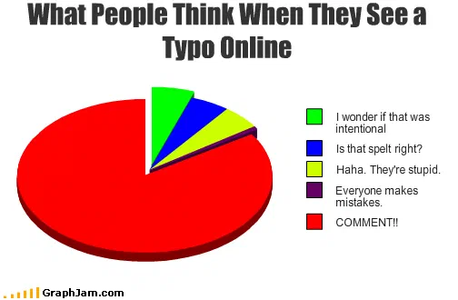
What People Think When They See a Typo Online
- Side D
- D1
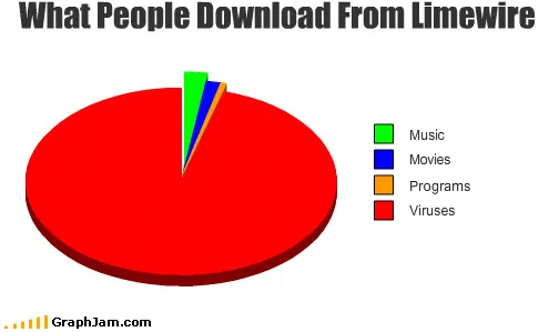
What People Download From Limewire
- D2
Lol texting
- D3
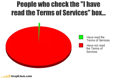
People who check the “I have read the Terms of Services” box…
- D4
- D5
Facebook Users with >500 “Friends”
- D6
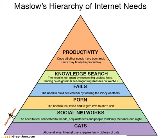
Internet Needs
- D7
Typical website evolution
- D8
- D9
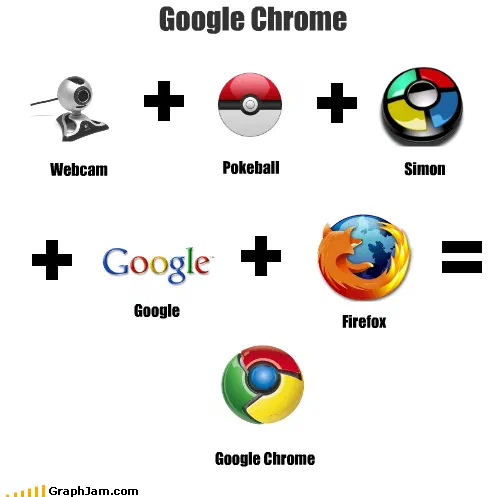
How To Make Google Chrome
- D10

Our Secrets Revealed
- Side E
- E1
Is It NSFW Or Really NSFW?