Charts About the News, 2008–2010
The only collection here with a timestamp you can check against a front page.
Eighteen charts, and this is the only collection in the archive with a verifiable external clock. Every entry responds to something that was on a front page in a particular week, which means the dates are not incidental — they are the content.
The coverage charts
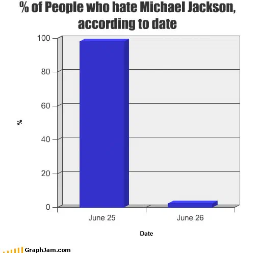
The most interesting group here does not plot the event. It plots the reporting of the event, which is a harder and more useful thing to draw. % of People who hate Michael Jackson, according to date is the archive’s best example: a step change at a single date, plotting public sentiment as a function of one piece of news. Seven domains still link to it. One of them is a Wikipedia talk-page archive, where a single editor posted it as a summary of their own feelings about the coverage, a joke chart surfacing, briefly, inside somebody else’s argument rather than making one.
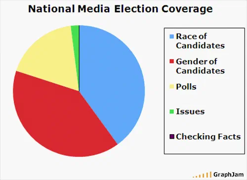
Press Coverage of Obama, CNN News Coverage July 2009, National Media Election Coverage and You Know the Media is Blowing Something Out of Proportion When…. all work the same seam. Four charts, four readers, one shared observation about proportion, drawn independently across ten months.
The panic curve
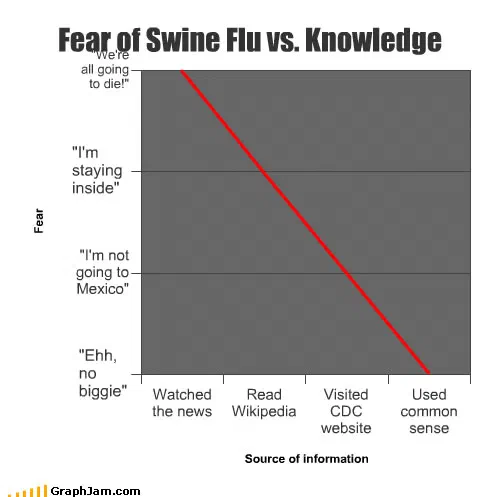
Fear of Swine Flu vs. Knowledge is a two-axis chart with an inverse relationship and it is, as far as this archive gets, a real epidemiological communication point: concern peaks where information is thinnest. Published as its own plate, three links from other sites.
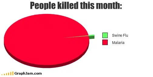
SWINE FLU (H1N1) arrives six months later, when the story had turned into a seasonal footnote, and plots the deflation. Read as a pair they are a better record of that news cycle than either alone.
Will the LHC create a black hole? from September 2008 is the same shape of joke about a different scare, and Popular Thoughts About Global Climate Change holds two sites still link to it, the one subject here that never resolved into a footnote.
Single stories, dated precisely
Toyota sudden acceleration incidents is from March 2010, in the middle of the recall. NASA in the News is linked from two sites, and plots an agency’s visibility rather than its work. Respect For Pluto Over Time and Poor Pluto… are two charts, fourteen months apart, about a reclassification that a surprising number of people took personally, the second is linked from two sites.
Winners of Miss Universe, World cup mistakes 2 and The vuvuzela explained are the 2010 tail: three charts about three summer stories, all with the image lost, all still holding the address somebody linked.
What the collection is for
A joke about the news has the shortest shelf life of anything in this archive. Almost none of these is funny now. What they are instead is a sample of what a large online audience considered over-covered, at eighteen specific moments between September 2008 and July 2010, drawn by people with no stake in the coverage.
That is not a dataset anyone set out to produce, and it is the reason this collection is worth keeping at its original addresses rather than summarised.
- Charts here
- 18
- Images recovered
- 13
- Published as plates
- 3
- Referring domains
- 33
- First posted
- Sep 2008
- Last posted
- Jul 2010
The charts
In publication order. Sides run in tens, the way a record does. A chart marked as a plate has its own page and its own retrospective; the rest are published here, at the addresses they held when they were posted.
- A1
National Media Election Coverage
- A2
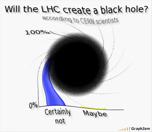
Will the LHC create a black hole?
- A3
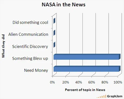
NASA in the News
- A4
- A5
- A6
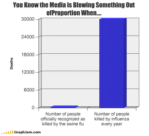
You Know the Media is Blowing Something Out of Proportion When….
- A7
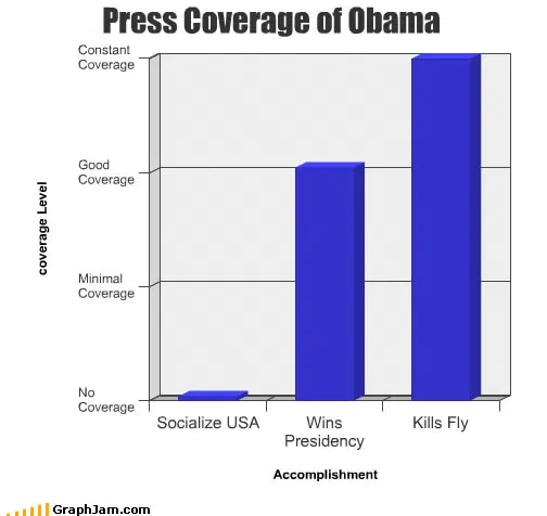
Press Coverage of Obama
- A8
- A9
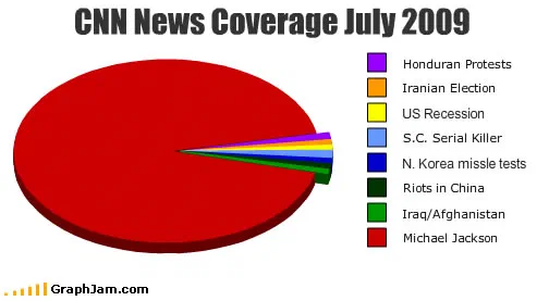
CNN News Coverage July 2009
- A10
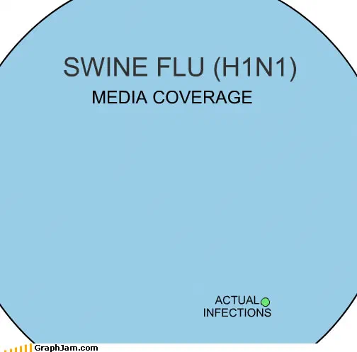
SWINE FLU (H1N1)
- Side B
- B1
Respect For Pluto Over Time
- B2
Popular Thoughts About Global Climate Change
- B3
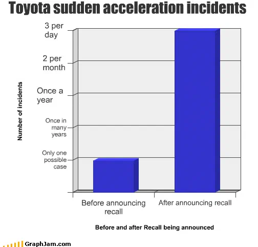
Toyota sudden acceleration incidents
- B4
Winners of Miss Universe
- B5
The vuvuzela explained
- B6
World cup mistakes 2
- B7
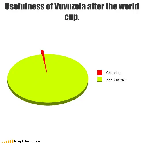
Usefulness of Vuvuzela after the world cup.
- B8
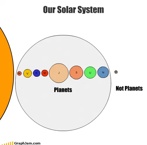
Poor Pluto…