Most charts get made to settle something. Somebody has a hunch about how a thing works, draws it on two axes, and the shape of it either supports the hunch or quietly demolishes it. That is the whole editorial premise here.
It started with the song chart meme. Between 2008 and 2010 GraphJam published several thousand reader-submitted charts on exactly that principle, and the largest group by a wide margin plotted music: a monthly calendar filled in with the days named in a Cure chorus, a pie chart of what a Morrissey lyric is made of, a bar chart of a band’s decline. That phrase, song chart meme, is still in the address of four hundred and fifty of these pages. The rest, filed as funny graphs, widened out to browsers, work, food and probability. They were jokes, but they were jokes with axes, and several ended up cited by CNN, Wired and The New Yorker. That archive is being put back, plate by plate, at the addresses it originally lived at.
Alongside it sits newer work on a subject that turns out to suit the same treatment: the arithmetic of casino games.
What the charts and graphs here actually measure
Two things, kept deliberately apart.
The archive is cultural. It plots opinions, irritations and observations, and its accuracy was never the point. A graph of reasons to open Internet Explorer is funny precisely because the y-axis is unmeasurable.
The new material is the opposite. Roulette, blackjack and slot machines have payout structures that are published, fixed and checkable. Charts and graphs built on those numbers are either right or wrong, and the sourcing is stated on the page. Both halves belong in the same annual, but a reader should never have to guess which one they are looking at.
Pop culture, plotted
The recovered plates are indexed by theme rather than by date, because nobody looks for a 2009 chart by remembering the week it ran. Music, the internet, work, food and probability each get their own section of the archive, and the scatter plot on the archive index shows the whole run at once: every plate positioned by the date it was published and the number of sites that ended up linking to it.
That second axis is the interesting one. Pop culture charts spread unevenly, and the shape of that unevenness is itself a chart worth looking at.
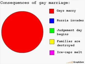 Consequences of gay marriage
2008 · 25 sites link here
Consequences of gay marriage
2008 · 25 sites link here
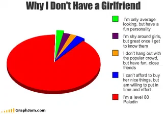 Why I Don’t Have a Girlfriend
2009 · 13 sites link here
Why I Don’t Have a Girlfriend
2009 · 13 sites link here
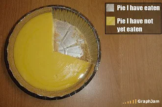 Pie I have eaten
2008 · 11 sites link here
Pie I have eaten
2008 · 11 sites link hereThe three most-cited charts in the archive, at the addresses they have held since 2008. Every one was drawn by a reader in a browser, and every one was picked up by sites that are still linking to it.
The odds behind the games
The odds section covers the games whose mathematics is settled. European roulette pays 35 to 1 on a number that comes up once in 37 spins, and everything else about the game follows from that single gap. Blackjack odds move with the rules of the specific table. Slot machines are governed by a figure the manufacturer sets and the regulator checks.
None of this is secret and none of it is complicated, but it is almost always explained in prose when it should be drawn. A house-edge comparison is a bar chart. Basic strategy is a matrix. Roulette odds are a table with one column that does all the work.
Payouts, return and what the published figures mean
The RTP section deals with the other half: what happens to money over time rather than on a single bet. Return to player is a long-run percentage, not a promise about an evening, and the difference between those two readings is where most of the confusion about payouts lives.
Published payouts are also the one number in this industry that is externally audited, which makes them unusually good material for charts and graphs. Where a figure comes from a testing house or a regulator, the page says so, and what a regulator actually certifies when it licences an operator is a narrower thing than the badge suggests, which is why the Malta licence has a page of its own. Two further pages take the published numbers apart: house payout rates, which are a weighted average of what customers happened to play, and the highest RTP slots, where the headline figure usually carries a condition.
Music in charts: the song chart meme archive, 2008 to 2010
The plates are being restored from the original captures rather than reconstructed. Titles are the ones that ran, down to the song chart meme prefix the site used for years, and the funny graphs prefix that replaced it. Contributor credits are printed where the original page recorded them. The charts that drew the most attention get their own page at their original address; the rest are gathered into themed collections, each plate reachable by its own anchor.
It is an odd thing to treat a decade-old song chart meme as an archival object. Doing it anyway is the joke, and the joke only works if the archiving is done properly.