Probability and Paradox, in Charts
The collection where the joke is carried by an actual calculation.
Seventeen charts, thirty links from other sites, and a distinctly higher hit rate than the archive average. The reason is simple and it is the most useful thing this archive demonstrates: a joke with a real calculation inside it gets forwarded, because the calculation can be disputed.
The paradox pair
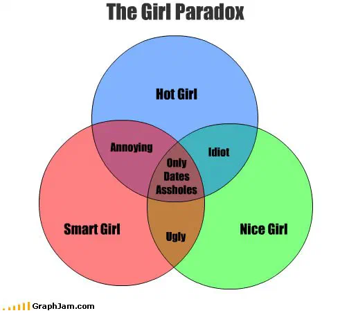
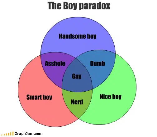
Two plates here, published six days apart in September 2009, are linked from five sites each, the highest count in this collection, though several charts elsewhere in the archive hold more. They are a complementary pair of Venn diagrams about the dating pool, and Discover Magazine covered both, taking the later one first, which is why several accounts reverse the order.
What they share with the rest of this collection is the mechanism rather than the subject. A three-set Venn diagram sends the reader looking for the region where every condition holds at once, and in both of these plates the whole argument is what is waiting in that region. Each is published individually as a plate rather than as an entry here.
Volume paradox and Monty Python Paradox, the latter filed under films, are the looser members of the same family, and Headphone Paradox, filed under the machines, is the one that names a real physical annoyance rather than a logical one.
Conditionals, drawn properly
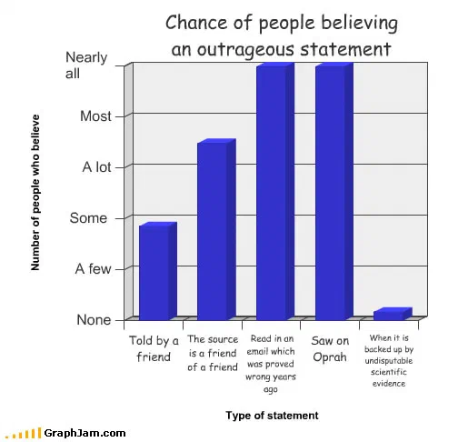
Chance of people believing an outrageous statement, published as its own plate, plots credence against the confidence of delivery. Chances The Stranger You Just Spoke to is Jewish is a base-rate chart, and it is drawn as one. Probability Of Girls Crying and Probability of Getting Things both plot conditional likelihood against a stated circumstance.
Chances that the bad guy you just shot a bunch of times is really dead. is the best-constructed of them: a decaying probability against number of shots, applied to a genre convention that ignores probability entirely.
Assertions dressed as findings
The other half of the collection asserts what it cannot know, and does so in statistical costume. Average Accuracy of Adult Male announces a population and a measurement and supplies neither. Difficulty of Task as Perceived by the Average Person invokes an average person, which is the standard move for making an opinion sound sampled. Polydactylism vs Being Killed is linked from three sites, a correlation with no plausible mechanism, which may be the point.
Outcome Analysis for Alternative Options is the most bureaucratically titled chart in the archive and is linked from two sites. Desirability of Splits in selected situations uses “selected situations” the way real papers use it, to mean the ones that worked.
The methodological jokes
The Kniviness of a Small Sampling of Knives is the collection’s quiet masterpiece. Every word in the title is a methodological hedge, a small sampling, of an invented quantity, reported as a finding, and the chart delivers exactly what the title promises. It is a parody of a paper abstract that predates most of the criticism of paper abstracts.
Percentage of this chart that looks like the blue man group is the same joke turned inward: a chart whose only variable is its own appearance. Likelihood of Abduction of Royal Family is the earliest entry, from March 2008, and states a risk assessment for an event with no historical base rate at all, which is what most published risk assessments of rare events actually do.
The distinction the collection keeps returning to, a calculation you can check against one you cannot, is the same line the annual draws between its two halves. Where the outcomes really are countable, the odds of the common games do the arithmetic in full.
- Charts here
- 17
- Images recovered
- 9
- Published as plates
- 3
- Referring domains
- 30
- First posted
- Mar 2008
- Last posted
- Mar 2010
The charts
In publication order. Sides run in tens, the way a record does. A chart marked as a plate has its own page and its own retrospective; the rest are published here, at the addresses they held when they were posted.
- A1
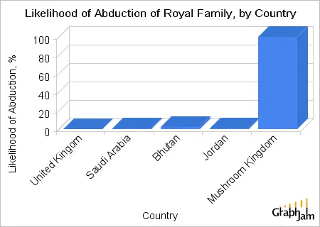
Likelihood of Abduction of Royal Family
- A2
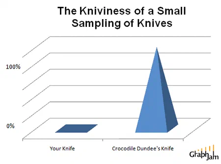
The Kniviness of a Small Sampling of Knives
- A3
Percentage of this chart that looks like the blue man group
- A4
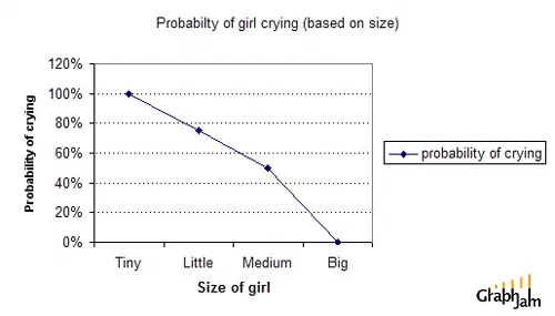
Probability Of Girls Crying
- A5
Polydactylism vs Being Killed
- A6
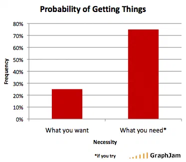
Probability of Getting Things
- A7
Outcome Analysis for Alternative Options
- A8
Desirability of Splits in selected situations
- A9
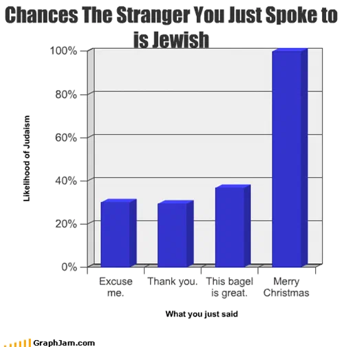
Chances The Stranger You Just Spoke to is Jewish
- A10
- Side B
- B1
Average Accuracy of Adult Male
- B2
Difficulty of Task as Perceived by the Average Person
- B3
- B4
- B5
Volume paradox
- B6
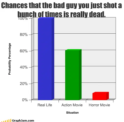
Chances that the bad guy you just shot a bunch of times is really dead.
- B7
Chance of Ideas vs. Where They Happen