Chance of People Believing an Outrageous Statement
A bar chart of credence by provenance, in which the best evidence performs worst.
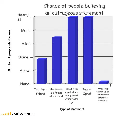
Five categories along the bottom, ordered by the route a claim took to reach the listener, against a vertical scale with no numbers on it at all.
Five categories along the bottom, ordered by how a claim reached the listener. Told by a friend. The source is a friend of a friend. Read in an email that was disproved years ago. Saw it on daytime television. Backed by undisputable scientific evidence.
The y-axis runs from none to nearly all. The last bar is the shortest on the chart.
The ordering is the argument
Everything here depends on the sequence of the x-axis, and the sequence is not accidental.
Read left to right, the categories are arranged as an ascending scale of epistemic quality, or rather, they would be if the bars cooperated. Personal testimony, then testimony at one remove, then a written source, then a broadcast source, then peer-reviewed evidence. That is roughly the order in which a person is supposed to increase their confidence.
The bars go the other way. They rise as the sources get worse, peak on the two categories with no evidential standing whatsoever, and collapse at the only one that has any.
A chart whose category order sets up an expectation and whose bars violate it is doing something a list of the same five items cannot do. The reader’s eye follows the axis, builds the expected staircase, and hits the last bar.
The verbal y-axis
The vertical scale is labelled none, a few, some, a lot, most, nearly all. No numbers.
This archive uses that device three times, and both times on a quantity nobody has measured — here for credence, and on the swine flu plate for fear. Both times it is the right call. An invented percentage would be a false precision that invites a fact-check the chart cannot survive; a verbal scale states an ordering, which is all the chart actually claims.
It also makes the last bar readable. A bar at “a few” against a scale of words is a specific and dismissive statement. A bar at 4% against a scale of numbers would just look small.
The two categories that peak
The forwarded email and the daytime television appearance are the two tallest bars, and they were both current complaints in March 2009 rather than timeless ones.
The email category carries an extra clause, disproved years ago, which is what makes it sharper than a general complaint about chain mail. It is not saying that people believe unverified claims; it is saying that refutation does not reduce circulation, which is a stronger and better-evidenced position.
The television category names a specific host. That was pointed at the time: the programme’s platforming of unevidenced health claims was an active argument among exactly the science writers who went on to cite this chart, which is presumably why they cited it.
Where it travelled
Three sites still link to it, and two of them are people who write about medical misinformation professionally.
A ScienceBlogs post about a thirty-million-dollar fine levied over a health scam linked it with the comment: “Amazing. There are still people who believe this garbage? This chart explains it all.” Respectful Insolence, a long-running blog on medical pseudoscience, whose whole subject is the mechanism this chart describes, linked the address directly. A personal blog added “That’s about the size of it.”
That is a browser-drawn bar chart being used as shorthand by writers whose day job is documenting the exact phenomenon, twice.
What the plate is worth now
Three sites still link to it, for a chart with about forty words on it.
The two peak categories have been replaced by faster ones since 2009, and the mechanism has been studied a great deal more thoroughly than it had been then. What has not changed is the shape: credence is not a function of evidence, and the bar for the best evidence is still the shortest one on the chart.