How Often 'Eh' Is Said
A chart about a stereotype in which the stereotype's holders are the measured population.
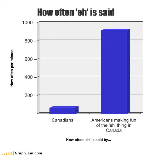
Two bars against a numbered axis running to a thousand per minute. Canadians sit just above the baseline. Americans making fun of the Canadian habit reach over nine hundred. The axis is quantified, which is what makes the comparison land.
Two bars. The y-axis is labelled how often per minute and it is numbered, from zero to a thousand.
Canadians sit just above the baseline. Americans making fun of the ’eh’ thing in Canada reach over nine hundred.
The instrument turned round
The chart’s whole method is a substitution. A conventional version of this joke would plot how often Canadians say the word, and the joke would be at their expense. This one plots the same word across two populations and finds it concentrated in the wrong one.
That converts a chart about a national stereotype into a chart about the people who hold it, which is the same move the mental-map charts in this archive make. The subject of How Californians See America is Californians; the subject of this chart is Americans doing an impression.
Once the axis is set up that way, the measurement does the arguing. Nobody has to be told that the stereotype is overstated, the two bars state it.
Why the numbers are on the axis
Most charts in this archive avoid numbering their vertical scale, and usually that is the right call. Here it is essential.
Nine hundred utterances per minute is fifteen per second, which is not physically producible by a human speaker. Putting that figure on a numbered axis makes the impossibility explicit and turns the exaggeration into part of the content: the imitation is not merely more frequent than the real thing, it is happening at a rate that could not occur.
A verbal scale — a lot, constantly — would have said the same thing more weakly. The number is the joke’s second stage.
What the real linguistics says
The tag is genuine. It functions in Canadian English as a discourse marker, roughly, an invitation to the listener to confirm or agree, and it is used in a specific and fairly narrow set of grammatical positions rather than appended to everything.
That is the gap the chart is pointing at. The stereotype treats a real feature as a verbal tic of unlimited frequency, and imitation always exaggerates the feature it has noticed. The chart does not defend Canadian English; it measures the imitation.
Where it travelled
Three sites still link to it, and two of them are the best kind of citation this archive gets.
A Canadian discussion forum linked it inside a thread whose title asks, in earnest, whether Canadians really do end all their sentences that way. That is a chart about a stereotype being introduced into a genuine argument about whether the stereotype is accurate, by the people it is about.
The second is more interesting still. A Brazilian blog took the construction and rebuilt it with a different tag word, the one associated with one Brazilian state, noting that it was adapted from this chart. That is not a repost. It is somebody recognising that the structure was the reusable part and applying it to their own regional stereotype, which is the highest compliment a joke chart can receive and the only clear instance of it in this archive.
The third is a forum thread on an English-teaching site.
What the plate is worth now
Three sites still link to it, a chart with two bars and about twenty words.
Its subject is one of the most worn national stereotypes in existence, and the reason it is worth an individual page is that it declines to make the obvious version of the joke. Any stereotype can be charted this way, plot the trait across both the stereotyped population and the imitators, and let the second bar be the finding, and a Brazilian blogger worked that out within weeks.