Usage of my Cell Phone
Drawn as a complaint about one person's habits, and now the closest thing this archive has to a measurement.
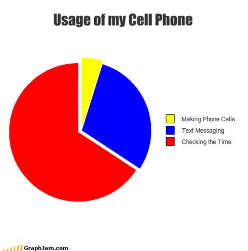
Three slices, in the site builder’s default red, blue and yellow. Checking the time takes roughly three fifths of the pie. Text messaging takes most of the rest. Making phone calls is the sliver.
Three slices. Checking the time takes about three fifths of the pie. Text messaging takes most of what is left. Making phone calls is the yellow sliver at the top, narrow enough that it needs the legend to be readable at all.
It was drawn in January 2009 by a reader using the builder the original site gave its readers, which is why it has the builder’s default palette, the flat red, blue and yellow that runs through a large part of this archive and is the fastest way to identify a chart made in the browser rather than in a spreadsheet.
What it was, and what it became
As a joke it is modest: a person noticing that they use an expensive communications device mainly as a watch. As a document it is better than that, because of what it puts last.
In January 2009 the claim that a mobile phone was principally not a telephone was still slightly novel. The chart does not argue for it. It simply orders the categories, puts calling third, and moves on, and the absence of any defensiveness is the interesting part. Whoever drew this did not think they were making a point about the industry. They thought they were describing their own week.
Two years later the same observation would be the premise of a thousand trend pieces. Here it arrives as a shrug.
The time-checking slice
The dominant category is the one nobody predicted. A phone displaced the wristwatch before it displaced the camera, the calendar, the map or the newspaper, and it did so without anybody marketing it that way. There was no campaign for the phone as a timepiece; it happened because the screen was already in your hand.
That is the sort of substitution that leaves no trace in sales figures for either product, and it is exactly what an amateur self-report catches and a market survey does not. The chart is not evidence, one reader, no data, a browser tool, but it is a record of what the substitution felt like from inside, at a specific month.
Why it translated
Six sites still link to it, and four of them are not in English.
Dario Salvelli, writing in Italian, embedded it as “un interessante grafico sull’uso del cellulare” and used it to ask his readers how many of them had abandoned the wristwatch. David GP ran it in Spanish under Para que usamos el teléfono móvil. Matillas.org, also Spanish, built a whole series out of it — Estadísticas Obvias Ep.1: Usos del Móvil, obvious statistics, episode one — crediting this site as the inspiration. Radiocool.lt included it in a Lithuanian StumbleUpon round-up.
The reason is structural. This chart contains eleven words. None of them is a pun, an idiom or a cultural reference. A joke that depends on wordplay dies at the language border; a joke that depends on the ordering of three universal activities does not.
The two English-language links say the same thing in different registers: “Yeah… this looks about right”, and “This is how everybody uses a cell phone, including me.” Both are recognition rather than analysis, which is the response the chart was built for.
Why the format is defensible here
Most pie charts in this archive should have been bar charts. This one should not.
The three categories exhaust a single quantity, the time this person spends holding their phone, and they do not overlap. Three slices is few enough to read at a glance, and the comparison the reader needs to make is share-of-whole rather than magnitude. Those are precisely the conditions under which a pie is the correct choice, and they are rarely all met.
The one weakness is the sliver. A slice that thin is hard to compare against anything, which is a real limitation of the format and, here, an accidental reinforcement of the argument: the calling slice is difficult to see, which is approximately the finding.
What the plate is worth now
Six sites still link to it across four languages, for a chart with almost no text in it, about a device that has since changed beyond recognition.
The phone in this chart is gone. The ordering it asserted is now so obvious that stating it sounds like a truism, which is the fate of every accurate early observation. The chart’s value is the date on it.