Uses of Google
Four uses for a search engine, and the official one is a sliver.
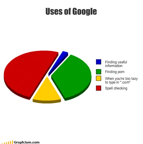
Four uses of a search engine, ranked by area. Spell checking takes the largest share; finding useful information is the blue sliver at the top.
An exploded three-dimensional pie, in the primary colours of a spreadsheet default. Spell checking takes the largest wedge. Finding porn takes the second. Typing a site’s name into the search box because you are too lazy to type “.com” takes the third. Finding useful information is the blue sliver at the top, cut so thin it needs its own leader line.
The one true observation
Three of the four categories are jokes. The third one is a finding.
Navigational search, the habit of typing “facebook” into a search engine to reach a site you could have addressed directly, was a real and well documented share of query volume long before this chart existed, and it was one of the odd facts about the web that everybody had noticed and nobody had drawn. Putting it between spell checking and pornography is what makes it land: it arrives disguised as a fourth joke and it is the only line on the chart that would survive contact with data.
It also aged in an interesting direction. Browsers spent the following years resolving the joke by merging the address bar and the search box into a single field, which retired the distinction the chart depends on. A reader under twenty-five now has to have the premise explained: there used to be two boxes, and using the wrong one felt like a small confession.
Spell checking has aged the same way and survived better. It is still, for a large number of people, the fastest spell checker available, and the chart’s decision to make it the largest slice rather than a punchline reads as affectionate rather than sharp.
The blue sliver at the top does the structural work that the archive’s better pie charts all do: it puts the officially sanctioned answer on the chart, at an honest size, and lets the geometry deliver the verdict.
Where it travelled
It went abroad almost immediately, and it went with the labels translated rather than the image redrawn.
The Italian blog of Dario Salvelli ran it under “Uses of Google: come e perchè usi Google”, walking through the four categories in order. The Spanish site VitaminaWeb published it as “Usos de Google”, crediting GraphJam plainly. Radiocool in Lithuania filed it under humour. A Polish links round-up carried it with the caption “do czego służy nam Google”, what Google is for. Another Spanish blog used it as a teaching example, telling readers to look at what people actually do with the thing.
One repost is worth flagging for the record: an English site presented the chart as “the poll made to measure what are the proportions of Google usage”. It was not a poll and it measured nothing. That is the standard failure mode for charts of this kind, and it is the reason this archive states the point plainly on every plate.
The academic-looking site Indo-European.eu used it in passing, in a way that suggests the observation had already become common property: “it is well known that Google is used by many when they are too lazy to type in .com”. At some point after the chart the joke was being cited as a known fact, without attribution, in a sentence about something else entirely; that page carries no date. That is usually the last stage in the life of an internet joke, and the only stage that leaves no links behind.
What the plate is worth now
The three-dimensional perspective is a real fault. Tilting a pie makes the front slices look larger than the back ones and destroys the one thing a pie chart is supposed to deliver, which is a comparison of areas. In an annual report it would be an error. Here it is a fingerprint: it dates the image, it identifies the tool, and it tells you the chart was made by a reader in a browser rather than by a designer.
Ten domains in five languages still point at this address.