Computers, Phones and Tech Support, in Charts
Charts drawn by the people who get called when it stops working.
Forty-six charts here, and a striking number of them were drawn by people at work. The formats give it away: summary tables, resolution rates, time-spent breakdowns. This is the collection where the archive’s borrowed business idiom stops being a joke about business, because the people drawing these charts actually had to file reports that looked like this.
The helpdesk charts
IT Helpdesk Summary and Tech Desk Call Resolution are the two clearest examples, and their titles are almost indistinguishable from real internal reporting. Neither image is among those recovered, so what each one actually showed is not on the record. Likelihood of a computer issue being solved by… names the dominant slice out loud. People who bring their computer into a repair shop profiles the caller rather than the fault.
Computer skills I have vs what friends and family think about is linked from two sites and plots the gap that creates unpaid support work. She found the power button herself, the last entry in the collection, is the same joke told once more in October 2010 with the chart already lost.
Printers, and the one true chart
Chance that the Printer is Working is the collection’s most reliable joke, because it needs no setup in any decade. Likelihood of ever getting more ink for my printer extends it into procurement. Between them they cover the whole relationship.
Microsoft Office Autoformat and Time Spent with Adobe belong to the same family: software that does something you did not ask for, plotted as if the software had intentions. What people do when the WinRAR trial expiration message comes up documents a piece of software behaviour that outlived nearly everything else in this collection.
Phones, in the year the answer changed
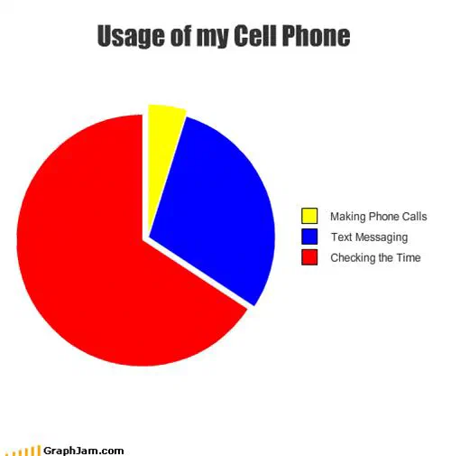
Nine entries here are about mobile phones, and they cluster tightly in 2008 and 2009 because that is when the object changed. iPhone Use by Application, from October 2008, is a genuine snapshot: the categories are what a smartphone was for in its first year of mass use. Cell Phone Features plots the features against the ones anybody used. Most Common Cell Phone Uses puts telephony low on the list, which was still a surprising claim at the time.
Cell Phone’s Ringer Status when You Lose It and Chance the phone will stop ringing relative to your distance from it both plot the same physical injustice. Probability of Remembering a Phone Number records a skill in the process of being outsourced.
The platform argument
Usability by Operating System, Apple Computer compatibility, Anything’s Possible with Windows, Why People Hate Windows and Mac vs. PC are five positions in an argument that ran through the whole period. Anything’s Possible with Windows is linked from four sites, the most of the five, which tells you which side of that argument was reading.
None of them settles anything, and read together they are more interesting than any single one: five charts, drawn by different readers over two years, plotting the same dispute with the same borrowed authority and reaching no agreement whatsoever. That is a fair record of what platform arguments were, and are.
- Charts here
- 46
- Images recovered
- 24
- Published as plates
- 2
- Referring domains
- 61
- First posted
- Apr 2008
- Last posted
- Oct 2010
The charts
In publication order. Sides run in tens, the way a record does. A chart marked as a plate has its own page and its own retrospective; the rest are published here, at the addresses they held when they were posted.
- A1
Anything’s Possible with Windows
- A2
Drunk in MS Paint
- A3
Intentions of the Women on My Mind
- A4
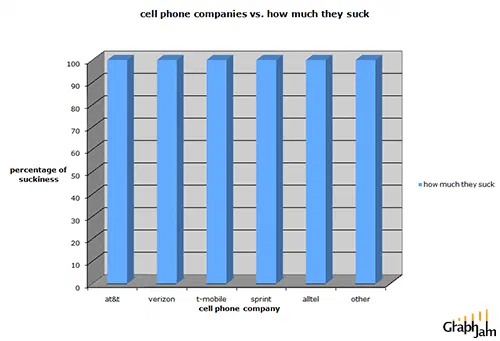
cell phone companies vs. how much they suck
- A5
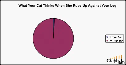
What Your Cat Thinks
- A6
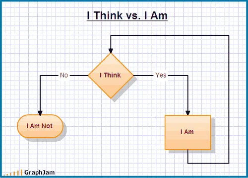
I Think vs I Am
- A7
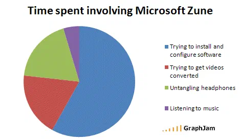
Time spent involving Microsoft Zune
- A8
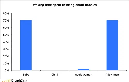
Waking time spent thinking about boobies
- A9
Alternate Uses for a Phone Booth
- A10
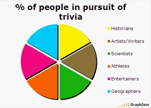
% of people in pursuit of trivia
- Side B
- B1
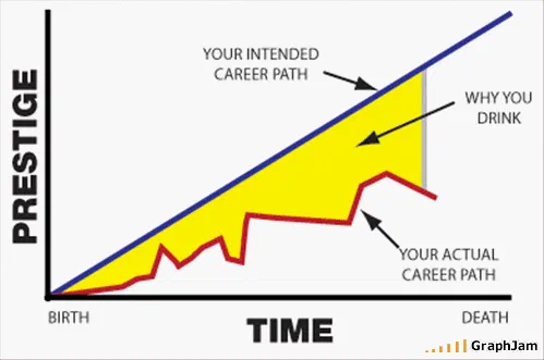
Why you drink
- B2
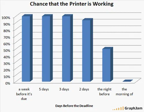
Chance that the Printer is Working
- B3
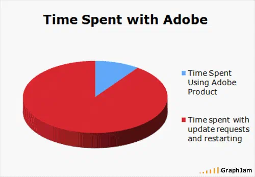
Time Spent with Adobe
- B4
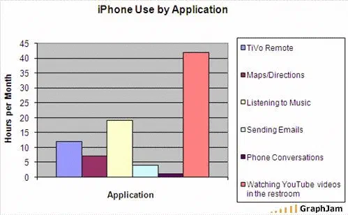
iPhone Use by Application
- B5
Why People Hate Windows
- B6
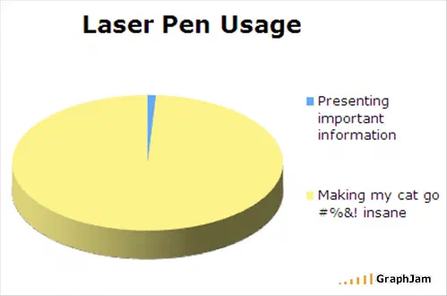
Laser Pen Usage
- B7
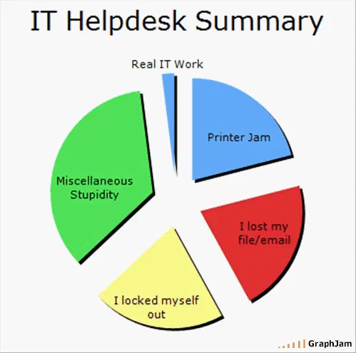
IT Helpdesk Summary
- B8
Chance the phone will stop ringing relative to your distance from it
- B9
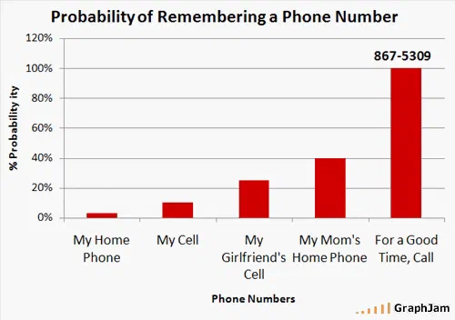
Probability of Remembering a Phone Number
- B10
Tech Desk Call Resolution
- Side C
- C1
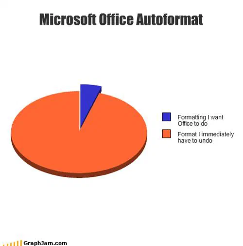
Microsoft Office Autoformat
- C2
Percentage of five year olds who think crayons are
- C3
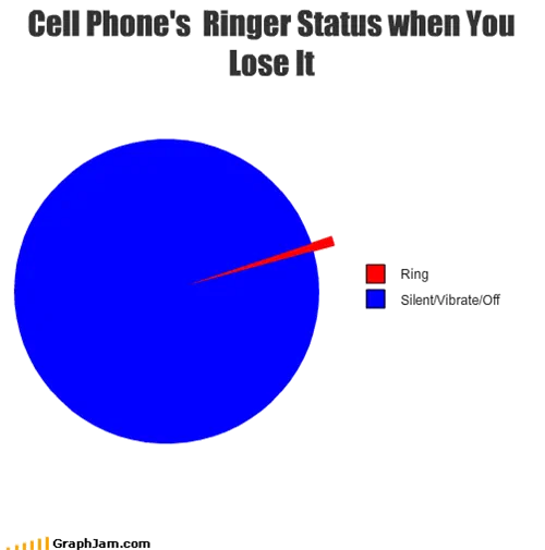
Cell Phone’s Ringer Status when You Lose It
- C4
- C5
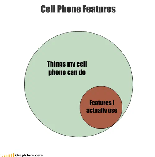
Cell Phone Features
- C6
Most Common Cell Phone Uses
- C7
Likelihood of ever getting more ink for my printer
- C8
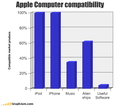
Apple Computer compatibility
- C9
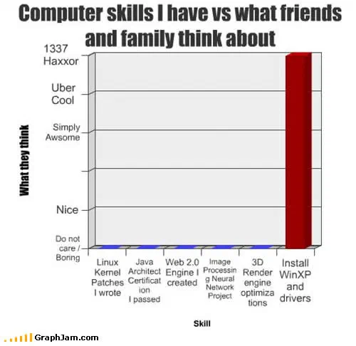
Computer skills I have vs what friends and family think about
- C10
Time Spent on the Computer
- Side D
- D1
Shit I’ll Get Fired For
- D2
People who bring their computer into a repair shop
- D3
Why people think I’m a lesbian.
- D4
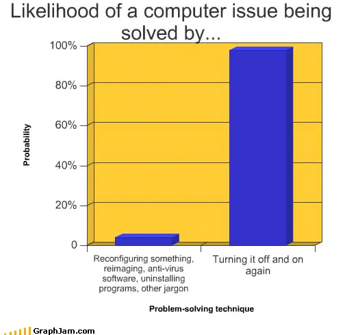
Likelihood of a computer issue being solved by…
- D5
Headphone Paradox
- D6
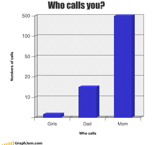
Who calls you?
- D7
- D8
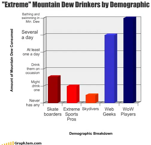
“Extreme” Mountain Dew Drinkers by Demographic
- D9
Snapple Ingredients
- D10
Time it takes to run a DNA analysis
- Side E
- E1
What people do when the WinRAR trial expiration message comes up
- E2
Repair wireless
- E3
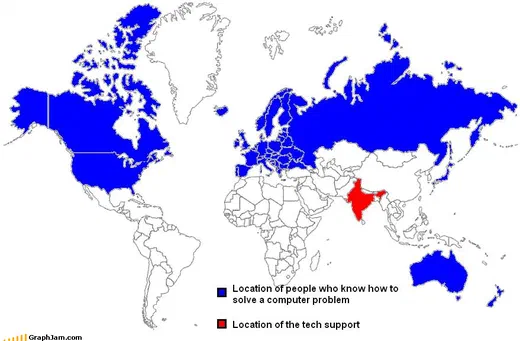
Tech Support
- E4
Mac vs. PC
- E5
Do you have what it takes
- E6
She found the power button herself