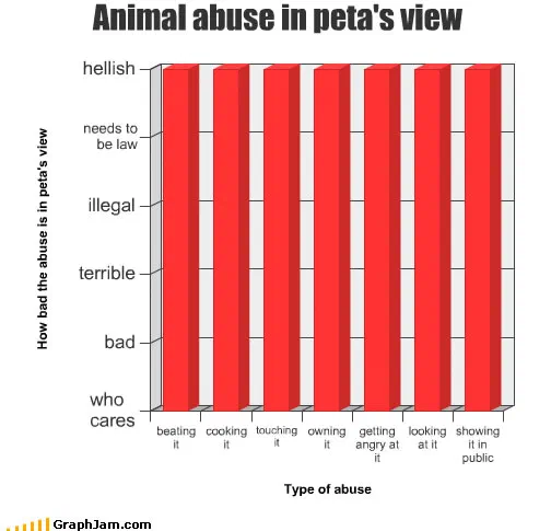
Cats and Other Animals, in Charts
The house pet as a measurable system, drawn by people who lived with one.
Twenty-one charts, and the collection has a clear centre of gravity: the domestic animal treated as a system with inputs and outputs. That framing is why the good entries here are better than the subject suggests. A chart about a pet is a chart about a creature whose behaviour you have observed daily for years without ever writing any of it down.
The cat charts
Things That Attract My Cat’s Attention is the model: a ranked list with the categories in the wrong order, which is the finding. Awesomeness of Cats is a single value asserted without evidence. Cat Biting Preferences is a distribution. When my cat sleeps on me and Where my cat sits expecting pet are both about position over time. How My Cat Reacts to… is a response table. Feline Dietary Preferences is the one that any owner would dispute in detail while agreeing with in substance.
Seven charts, all drawn independently, all reaching the same conclusion by different routes. That consistency is more interesting than any one of them: it is a crowd-sourced description of an animal, produced by people who did not know they were collaborating.
Dogs, and the rising line
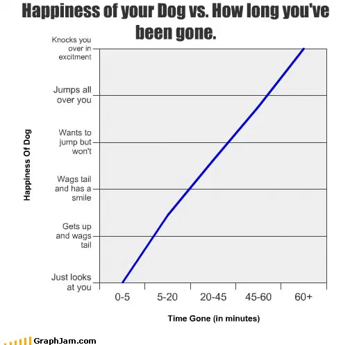
Happiness of your Dog vs. How long you’ve been gone. is the best chart in the collection and possibly the most efficient in the archive. Two axes, one line, and a steady climb from just looks at you at five minutes to knocks you over in excitement at an hour. Every dog owner reads it instantly, and the joke is entirely carried by the geometry, which is the argument this whole site was accidentally making.
The world as my dachshund sees it is linked from two sites, and does the opposite: it takes the animal’s point of view rather than measuring it from outside.
The research-question charts
Three entries here are funny because they are phrased like papers. Probability of waterfowl running around in circles by species names a population, a behaviour and a comparison across species. Comparison of Headwear Worn by Gnomes by % uses the notation of a real survey on a population that does not exist. Cuteness vs. Number of Legs proposes a single explanatory variable for an aesthetic judgement, which is exactly what a bad paper does.
People Who Hate Snakes And The Intesity of the Hate belongs with them, two dimensions, a spelling error in the title, and a finding nobody would challenge.
The strays
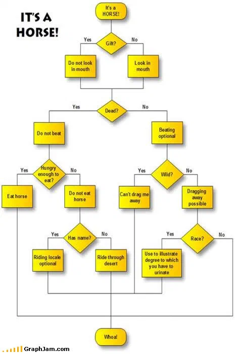
Not everything here is a pet or a survey. It’s A Horse! is a chart about recognition. Bird name mentioned vs smuttiness of ensuing banter is linked from two sites and is really about conversation rather than birds. Pig Distribution is a distribution of pigs. Beware of Ninjas, from September 2010, is filed here because of what it is guarding against rather than what it is, and Lonely black sheep of the, the last entry, with the image lost and the title truncated by whatever linked to it, is the archive’s own final animal chart, left mid-sentence.
- Charts here
- 21
- Images recovered
- 11
- Published as plates
- 1
- Referring domains
- 25
- First posted
- Apr 2008
- Last posted
- Oct 2010
The charts
In publication order. Sides run in tens, the way a record does. A chart marked as a plate has its own page and its own retrospective; the rest are published here, at the addresses they held when they were posted.
- A1
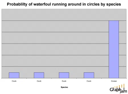
Probability of waterfowl running around in circles by species
- A2
Cat Biting Preferences
- A3
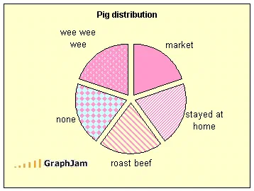
Pig Distribution
- A4
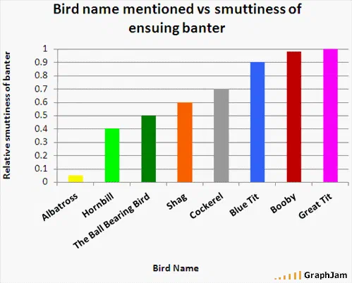
Bird name mentioned vs smuttiness of ensuing banter
- A5
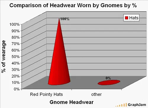
Comparison of Headwear Worn by Gnomes by %
- A6
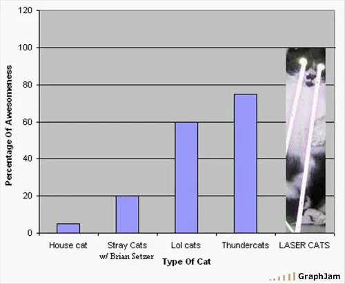
Awesomeness of Cats
- A7
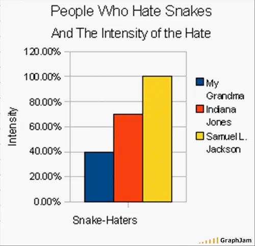
People Who Hate Snakes And The Intesity of the Hate
- A8
When my cat sleeps on me
- A9
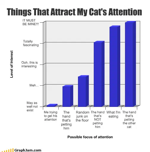
Things That Attract My Cat’s Attention
- A10
It’s A Horse!
- Side B
- B1
Happiness of your Dog vs. How long you’ve been gone.
- B2
The world as my dachshund sees it
- B3
- B4
Feline Dietary Preferences
- B5
How My Cat Reacts to…
- B6
Cuteness vs. Number of Legs
- B7
Usefulness of Patio Umbrella
- B8
Where my cat sits expecting pet
- B9
Pet Peeves List: Congratulations, You’re On It!
- B10
Beware of Ninjas
- Side C
- C1
Lonely black sheep of the