Food and Drink, in Charts
The one subject where a pie chart has a defensible claim to be the right diagram.
Twenty-five charts about eating, and the collection has an advantage no other one here does: its subject is genuinely divisible. A meal, a packet, a plate and a dinner are all whole things made of parts, which means that for once the pie chart is not a borrowed authority. It is the right diagram.
The archive knows this. Its single most-cited chart of all is a photograph of a lemon pie with one slice removed, filed under Charts About Charts because what it is really about is the format.
The one real dataset
M&M Color Distribution is the collection’s outlier: an actual count of an actual population, performed by a reader with a packet. It is linked from two sites, and at least one of them arrived from somebody comparing the drawn ratios to the manufacturer’s published ones. That is a chart being used as evidence, which almost nothing else in this archive can claim.
Meals at Our House and My Cooking are the domestic equivalents — self-reported counts over a real period, with the categories chosen by the person doing the cooking.
Single-variable models of taste
tastiness vs area of sandwich is the clearest example of the collection’s other mode: propose one explanatory variable for a judgement that has many, plot it confidently, and let the reader supply the objection. Burgers by Location does it with geography. How Food Looks does it with presentation. Snack Food and Things that Reportedly Taste Like Chicken are both taxonomies rather than models, and the chicken one is the funniest, because the category is defined entirely by comparison to a thing outside it.
Why people buy foods with “50% Less Fat” is the sharpest chart here. It plots motivation rather than nutrition, and the dominant slice is not health. It is a chart about marketing that happens to be filed under food.
Drink, coffee and the working day
Make More Coffee is a decision procedure. Coffee Venndor holds two referring domains for a pun that required drawing overlapping sets to work at all. Why you drink, filed under the machines, because of what it blames, belongs with them in spirit. “Extreme” Mountain Dew Drinkers by Demographic and Snapple Ingredients both plot a product’s marketing against its contents, and the Snapple one holds three sites still link to it, the highest count in this collection’s neighbourhood.
But It’s the Only One with Tea Time from October 2010 is the last recovered chart here, and one of the last in the archive at all.
Meals as arithmetic
The remaining group treats food logistics as a scheduling problem. Will my kids eat this? is a probability. Thanksgiving Dinner sizes is a growth curve. Silverware in Conjunction is a combinatorial chart about cutlery. Reasons to Do the Dishes and What people do immediately after driving away from the Drive-Thru plot the moments either side of the meal rather than the meal, which, on the evidence of this collection, is where most of the actual comedy of eating lives.
- Charts here
- 25
- Images recovered
- 14
- Published as plates
- 0
- Referring domains
- 28
- First posted
- Apr 2008
- Last posted
- Oct 2010
The charts
In publication order. Sides run in tens, the way a record does. A chart marked as a plate has its own page and its own retrospective; the rest are published here, at the addresses they held when they were posted.
- A1
Relative amount I am tempted by various fruits
- A2
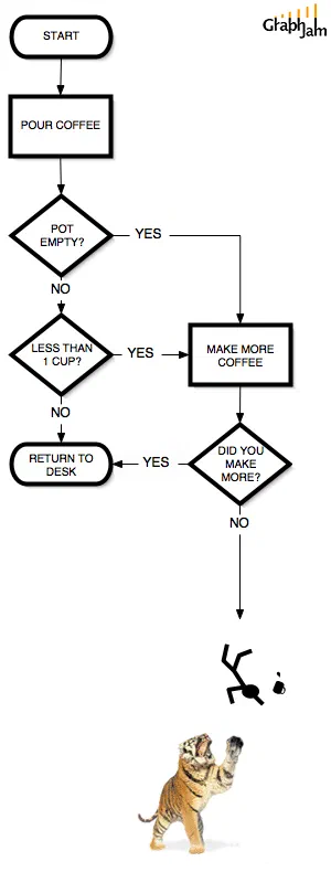
Make More Coffee
- A3
Number Of Tourists Eaten By Attraction
- A4
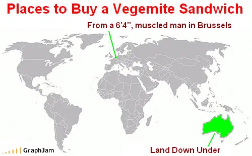
Places to Buy a Vegemite Sandwich
- A5
Things that Reportedly Taste Like Chicken
- A6
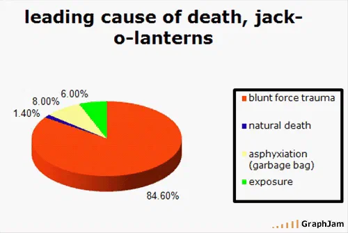
leading cause of death, jack-o-lanterns
- A7
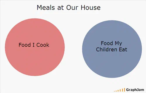
Meals at Our House
- A8
Will my kids eat this?
- A9
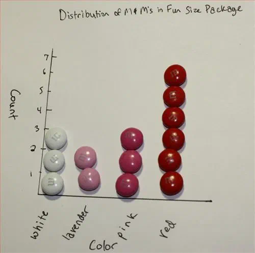
M&M Color Distribution
- A10
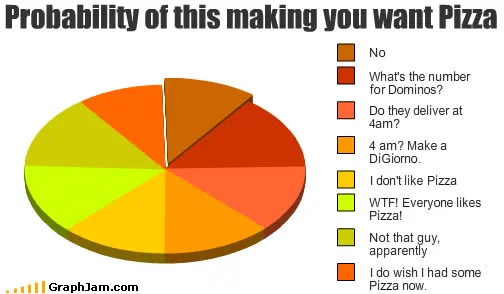
Probability of this making you want Pizza
- Side B
- B1
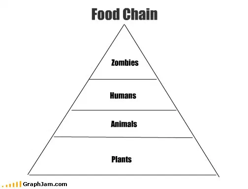
Food Chain
- B2
Reasons to Do the Dishes
- B3
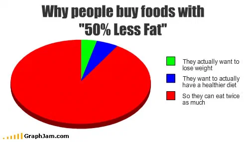
Why people buy foods with “50% Less Fat”
- B4
Snack Food
- B5
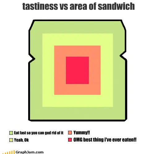
tastiness vs area of sandwich
- B6
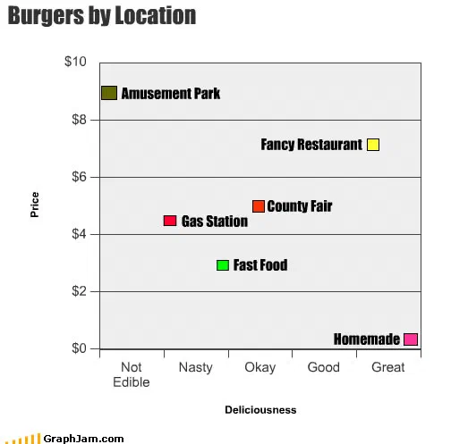
Burgers by Location
- B7
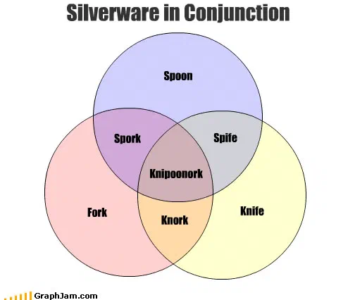
Silverware in Conjunction
- B8
How Food Looks
- B9
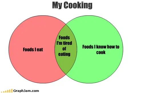
My Cooking
- B10
Thanksgiving Dinner sizes
- Side C
- C1
Airplane seating
- C2
What people do immediately after driving away from the Drive-Thru
- C3
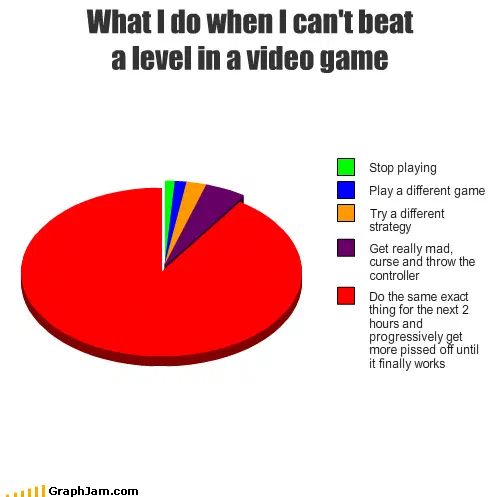
What I Do When I Can’t Beat A Level In A Video Game
- C4
Coffee Venndor
- C5
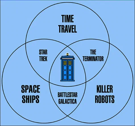
But It’s the Only One with Tea Time