Charts About Charts: The Self-Referential Collection
The collection that reviews the format it is drawn in, and the one data-visualisation researchers actually cite.
Eighteen charts about charts. It is a small collection that matters more than its size, because it is the one that crossed out of humour and into the literature: two of its entries are cited in writing about data visualisation, by people who were not looking for jokes.
The chart that is its own subject
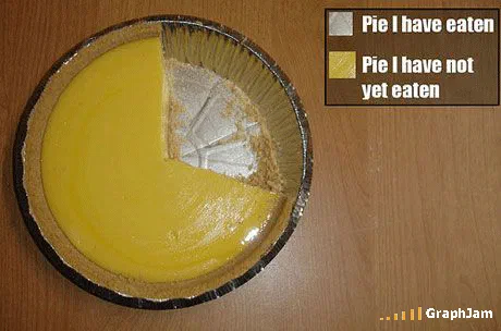
Pie I have eaten is linked from eleven sites, and is published as its own plate. A photograph of a lemon pie in a foil tin, one slice gone, with a two-item legend attached. It is the only pie chart in the archive that satisfies every condition a textbook sets for using one: two mutually exclusive categories that exhaust a single whole, with areas that are true because the missing wedge is the pie that was eaten.
It was filed at eagereyes in a piece on charts and metaphors, posted to MetaFilter, picked up by a public-sector data discussion, and translated approvingly in Spanish and German. Charts that depend on wordplay die at the language border; this one has four words in it and an object that means the same thing everywhere.
The format, criticised in its own language
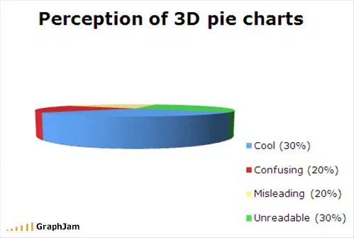
Perception of 3D pie charts is the collection’s other real argument. A tilted pie distorts area systematically, the near slices read larger, and that is the standard objection to the most common decorative choice in business graphics. Drawing the objection as a chart is more persuasive than stating it.
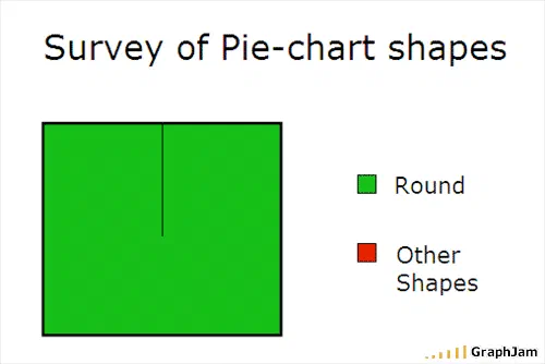
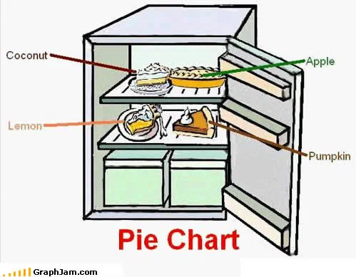
Survey of Pie-chart shapes is a taxonomy of a single format. Distribution Of Bar Chart Column Heights asks what a bar chart looks like when the bars are the data. Practical Use of the Colon is linked from two sites, and is about punctuation rather than charts, but belongs here by temperament. Pi chart holds three, for a homophone.
Charts about GraphJam itself
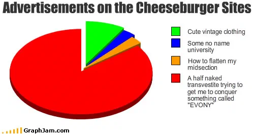
Four entries turn the instrument on the platform. Color Blind Friendliness of Graphs made on GraphJams is a genuine accessibility complaint about the site’s own chart builder, published by the site. Number of readers plots its own audience. Advertisements on the Cheeseburger Sites charts the network the site belonged to. Graphjam ladies plots its own demographics.
That the submission queue accepted all four says something about how the place was run. Been There, Done That, Made A Graph About It, the last entry in the collection from October 2010, is the same reflex applied to the whole enterprise three weeks before it stopped.
The honest ones
Why I made this Graph is the most self-aware title in the archive: the reasons for drawing a chart, charted. Its image is not among those recovered, so what the categories were is not recorded here. Lies damn lies invokes the statistical proverb without completing it. Numbers that grab your attention is about the presentation of figures rather than the figures. Percentage of graph ownership when submitted through Google Chrome is a joke about the site’s own submission form.
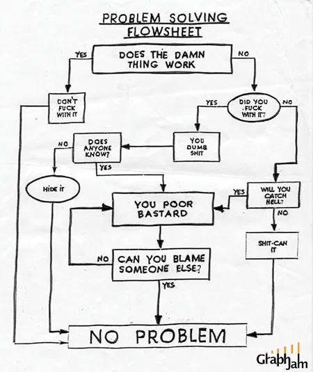
A Brief Lesson in Flow Charts and Problem Solving Flowchart, the latter published as a plate linked from three sites, close the loop: instructional diagrams about instructional diagrams, which is where a self-referential collection was always going to end up.
Every complaint in this collection is a complaint about a chart that flatters its author. The test is whether the drawing survives being checked against the number it claims, which is exactly what a published payout rate has to survive: one percentage standing in for a whole year of mixed behaviour.
- Charts here
- 18
- Images recovered
- 6
- Published as plates
- 3
- Referring domains
- 37
- First posted
- Apr 2008
- Last posted
- Oct 2010
The charts
In publication order. Sides run in tens, the way a record does. A chart marked as a plate has its own page and its own retrospective; the rest are published here, at the addresses they held when they were posted.
- A1
- A2
Distribution Of Bar Chart Column Heights
- A3
Survey of Pie-chart shapes
- A4
Percentage of graph ownership when submitted through Google Chrome
- A5
- A6
- A7
Color Blind Friendliness of Graphs made on GraphJams
- A8
Pie Chart
- A9
Number of readers
- A10
Advertisements on the Cheeseburger Sites
- Side B
- B1
A Brief Lesson in Flow Charts
- B2
Numbers that grab your attention
- B3
Why I made this Graph
- B4
Graphjam ladies
- B5
Practical Use of the Colon
- B6
Lies damn lies
- B7
Pi chart
- B8
Been There, Done That, Made A Graph About It