Perception of 3D Pie Charts
The only chart in this archive that demonstrates its own thesis by existing.
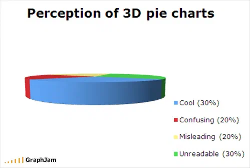
Tilted almost to the horizontal, so the pie reads as a disc with a side wall and the slices compress to slivers. The legend supplies the figures the drawing cannot: cool 30%, confusing 20%, misleading 20%, unreadable 30%. Two categories share the same value and look nothing alike.
A pie chart, tilted so far towards the viewer that it has stopped looking like a circle and become a shallow disc with a thick side wall. The legend gives four categories with their percentages: cool 30%, confusing 20%, misleading 20%, unreadable 30%.
Not one of those four values can be checked against the drawing.
The thing it proves by existing
Almost every chart in this archive makes an argument. This is the only one that is the argument, and it is worth being precise about the mechanism.
A pie chart encodes quantity in exactly one channel: the angle each slice subtends at the centre. That is the whole information content of the format — everything else, the colour, the labels, the ordering, is annotation.
Tilting the disc towards the viewer applies a perspective projection to that single channel. Angles at the front of the ellipse are stretched; angles at the back are compressed. The distortion is not uniform, it is not correctable by eye, and it depends on how far the disc has been tipped, which nothing on the chart tells you.
So the two categories sitting at 20% each end up looking nothing like each other, and the 30% slice at the back is smaller on the page than the 20% slice at the front. The chart is wrong in the only way a pie chart can be wrong.
Why the legend is the confession
Notice where the numbers are: in the legend, in brackets, after each label.
A chart that could be read would not need them. Printing the figures beside the categories is an admission that the drawing has failed at its one job, and it is a habit visible in a very large proportion of real business graphics, the tilt goes on for decoration, the numbers go in the legend to compensate, and what is left is a table with an illustration attached.
This plate makes that trade explicit in a single image. The reader who checks whether the picture matches the legend discovers that the question cannot be answered, and that discovery is the content.
The two 30% slices
There is a detail that rewards a second look. Cool and unreadable are both at 30%. They are the largest categories, they are exactly equal, and they are the two that a reader is most likely to try to compare, because the chart’s implied question is whether the format’s appeal outweighs its failure.
Being unable to compare them is the answer.
The lesson has a direct application in this annual: the charts on the highest RTP slots are drawn flat and labelled with their values, for exactly the reason this one demonstrates.
Where it travelled
Four sites still link to it, and the strongest is the one that matters most.
SAS, the analytics software company, whose entire business is the correct presentation of data, ran it on its own blog under the headline You can use it for evil, too, introducing it as “this excellent example of What Not To Do”. A vendor blog using an amateur joke chart as a teaching example for its own customers is about as good a placement as this archive contains.
Curt Monash’s DBMS 2, a long-running analyst blog on database and analytic technology, filed it under Stupid Excel tricks. Stefan Niggemeier, one of Germany’s better-known media critics, linked it. And sebsauvage.net archived the whole page, title and tagline included, which is why the export records the site’s own strapline as the link anchor.
Not one of those four is a humour site. All four are people who think about presentation for a living.
What the plate is worth now
Four sites still link to it, the strongest, for an image with about a dozen words in it, drawn in a browser tool in November 2008.
The criticism it makes has been made thousands of times in prose, in style guides, in every introductory course on the subject. It is still being made, because the tilt is still a default in commonly used software. This chart makes it once, without a sentence of argument, in a form nobody can dispute, because disputing it would require reading the chart.