US Political Belief vs Media Attention Given
Two charts, one axis, opposite shapes. The most analytically serious thing in this archive.
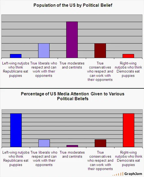
Two panels sharing one category axis. Upper: population by political belief, peaking hard on moderates and centrists, with the two caricatured extremes as the smallest bars. Lower: share of media attention, with those same two extremes as the tallest bars and the centre reduced to almost nothing. The two distributions are inversions of each other.
Two bar charts, one above the other, sharing the same five categories on the x-axis. The categories run from a caricatured left-wing position, through liberals who can work with their opponents, to moderates and centrists, to conservatives who can work with their opponents, to a caricatured right-wing position.
The upper panel is the population. It peaks hard in the middle.
The lower panel is media attention. It peaks at both ends and the middle is almost empty.
Why this is the most serious chart in the archive
Nothing else in this collection attempts what this does, and the technique has a name: small multiples. Two charts, identical axes, identical scales, stacked so that the reader compares shapes rather than reading numbers.
That is the correct design for this argument and it is not the obvious one. The instinct would be a single chart with two series overlaid, which would have produced ten bars in five clusters and a legend, and the shape of neither distribution would have survived. The instinct after that would be a single chart of the difference between the two, which would have shown the gap and hidden what the gap is made of.
Stacking them keeps both distributions intact and makes the comparison a matter of looking at two silhouettes. Population is a hill. Attention is a valley. The reader does the subtraction without being asked to.
It was posted on 12 November 2008, eight days after a presidential election.
The wording of the categories
The five labels are doing something careful.
The two extremes are described in the language their opponents would use, and each is defined by an absurd belief about the other side. That symmetry is the chart’s claim to even-handedness: neither extreme gets a neutral description, and both get the same treatment.
The two intermediate categories are defined not by policy but by a behaviour — willingness to work with opponents. And the middle category is simply moderates and centrists, with no qualifier at all.
The categories are ordered left to right in the conventional way, but what separates them is not policy. It is cooperativeness: the two ends are caricatures who impute cartoon beliefs to their opponents, and the three in the middle are defined by respecting them. That is a more sophisticated choice of axis than any other political chart in this archive makes.
What the finding is worth
The pattern the chart asserts is real and has been studied at length: news coverage over-represents conflict, disagreement and outlying positions, because those have the properties that make something reportable. Agreement is not an event.
The chart supplies no data, and its categories are caricatures rather than survey instruments — nobody has ever asked a representative sample whether they believe their opponents eat puppies. So it states a documented effect without measuring it, which is the standing condition of this entire archive.
Where it goes beyond the archive’s usual practice is that both panels are internally plausible. A centre-heavy population distribution and a bimodal attention distribution are each what the relevant literature would predict, which is more than can be said for most charts here that assert two variables at once.
Where it travelled
Three sites still link to it, and two of them read it as analysis rather than as a joke.
Beliefnet ran it in a post from its New Christians blog asking whether the United States is a centrist country, a chart used as evidence in a piece of religious-political commentary. DBMS 2, Curt Monash’s analyst blog, linked it under the anchor Political news coverage explained — on a page headed Fun stuff, which is where an analyst files a joke rather than an argument.
The third is a forum post. That is the whole profile, and its size is not the point: two of three citations treated this as a finding.
What the plate is worth now
Three sites still link to it, for an image containing about sixty words.
The election it was drawn after is history and the attention economy it describes has since been rebuilt twice over, on platforms that did not exist in 2008 and that select for the two tall bars far harder than television ever did.
The design is what to keep. Two panels, one axis, no legend, and a comparison the reader performs by looking.