Politics and Public Life, in Charts
The collection holding this archive's single most-linked chart, and the only one whose jokes were being argued over in public at the time.
Twenty-four charts, fifty-nine sites still link to it, and the archive’s biggest single hit. This is the collection where a joke format collided with a real argument, and the collision is the reason a chart site from 2008 still has links from publications that have never mentioned pie charts otherwise.
The chart that outlived the archive
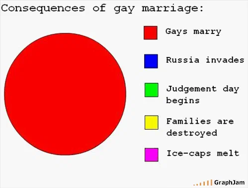
Consequences of gay marriage is linked from twenty-five sites — more than any other page here, including the homepage’s own most-linked plates. It is published separately as a plate, and the reason it travelled is structural rather than political: it takes a claim made repeatedly in campaign material, treats it as a prediction, and plots the prediction. A chart that falsifies a stated forecast is usable as evidence, and it was used that way, by Mother Jones among others.
A second chart with the same title appears in June 2010, submitted independently by a different reader. Its image was not recovered. That duplication is itself a finding about what the audience wanted to say.
The 2008 campaign, in real time
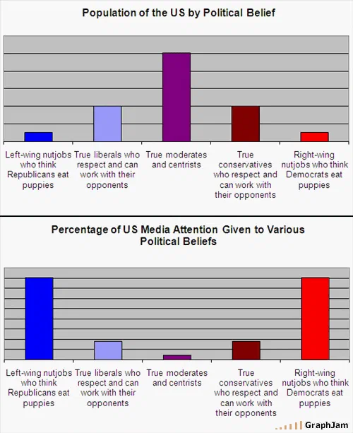
Five entries plot the election while it was running. US presidential preference is a straight preference chart. Probability of Obama Bumper Sticker versus Vehicle Type is a correlation nobody measured and everybody recognised. National Media Election Coverage, filed under the news, plots the coverage rather than the race. During Obama’s Inaugural Speech is a time-use chart of a single event, and US Political Belief vs Media Attention Given, published as its own plate, is the most analytically ambitious chart in the collection: two axes, a stated relationship, and an argument about attention that would hold up in a media studies seminar.
People Who Want Sarah Palin to Run for President in 2012 arrives in February 2009 and is linked from two sites, which is a small piece of evidence about when that conversation started.
Religion, belief and the space between
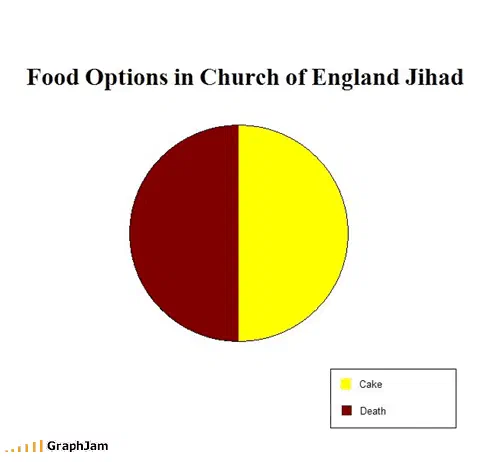
Concerns of Dyslexic Evangelicals is linked from two sites, a joke that requires reading the title twice. Probability Someone Will Insult Religion if They Are plots a conditional. Belief in Santa is a decay curve by age. Food Options in Church of England Jihad is the collection’s most improbable title and its subject is institutional mildness rather than religion.
None of these is a chart about doctrine. They are all charts about how belief gets performed in public, which is a different subject and the one this audience was actually interested in.
Government as a process
How a Government Gets a Job Done is a flow chart, and it is the correct diagram: a process with many steps and no exit. The Political Cycle plots the same thing as a loop. Bipartisan Agreement in Action! carries its joke in its title; the image itself is not among those recovered. Budget Concerns for Georgia: July is oddly specific and, for that reason, the most convincing entry here.
The collection closes in September 2010 with Nerdgasm states renamed by gdp, which is linked from three sites, and belongs half to this collection and half to the maps. It renames every American state after the country whose economy it matches, a real dataset, correctly applied, drawn as a joke, and still circulating because the underlying comparison is genuinely surprising.
- Charts here
- 24
- Images recovered
- 12
- Published as plates
- 3
- Referring domains
- 59
- First posted
- Jul 2008
- Last posted
- Sep 2010
The charts
In publication order. Sides run in tens, the way a record does. A chart marked as a plate has its own page and its own retrospective; the rest are published here, at the addresses they held when they were posted.
- A1
Food Options in Church of England Jihad
- A2
Budget Concerns for Georgia: July
- A3
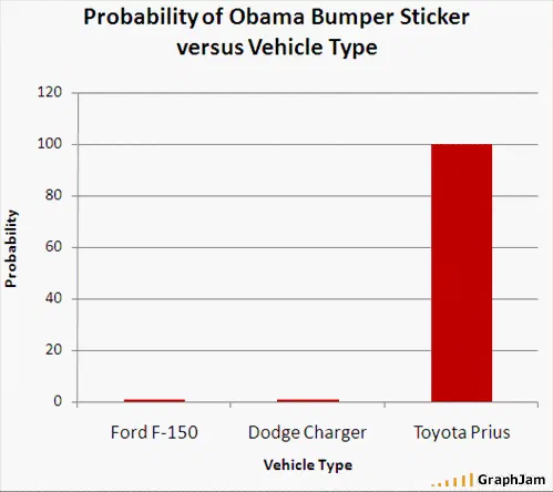
Probability of Obama Bumper Sticker versus Vehicle Type
- A4
- A5
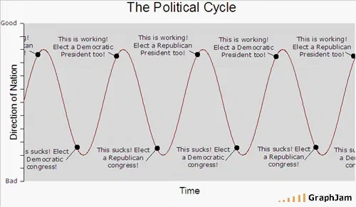
The Political Cycle
- A6
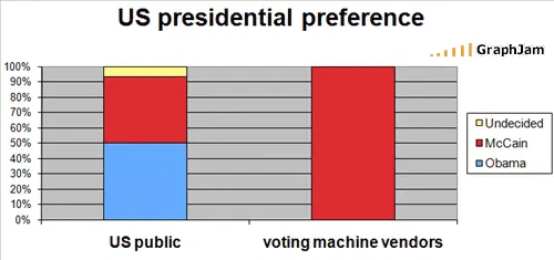
US presidential preference
- A7
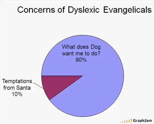
Concerns of Dyslexic Evangelicals
- A8
- A9
- A10
Belief in Santa
- Side B
- B1
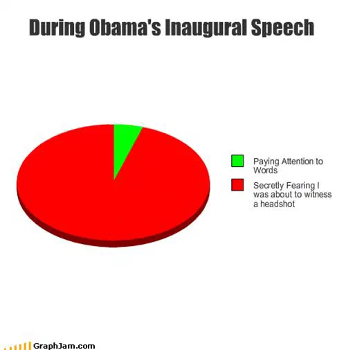
During Obama’s Inaugural Speech
- B2
People Who Want Sarah Palin to Run for President in 2012
- B3
Politicians’ answers to questions
- B4
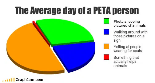
The Average day of a PETA person
- B5
The Gay Agenda
- B6
Probability Someone Will Insult Religion if They are
- B7
Biggest Threats to America’s Youth
- B8
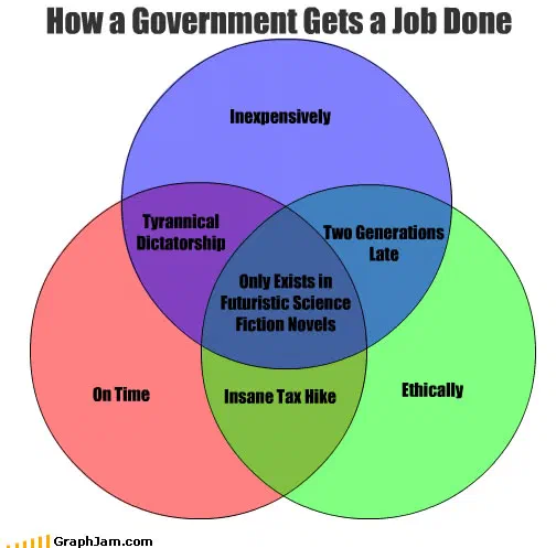
How a Government Gets a Job Done
- B9
Literacy
- B10
Why People “Go Green”
- Side C
- C1
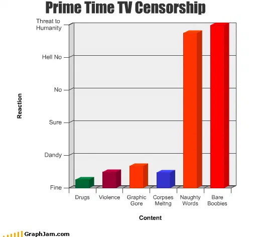
Prime Time TV Censorship
- C2
Consequences Of Gay Marriage
- C3
Bipartisan Agreement in Action!
- C4
Nerdgasm states renamed by gdp