Who Benefits Most From the $700,000,000,000.00 Bailout?
The only chart in this archive with a negative bar, and it is the one labelled You.
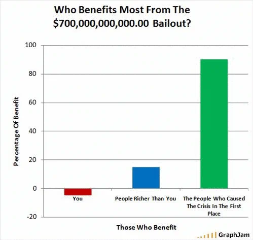
Three bars against an axis of percentage of benefit, running from −20 to 100. You is a short bar below the zero line. People richer than you reaches about fifteen. The people who caused the crisis in the first place reaches about ninety. The three do not sum to a hundred, which is the second joke.
Three bars. The axis is percentage of benefit and it runs from minus twenty to one hundred.
You is a short bar hanging below the zero line. People Richer Than You reaches about fifteen. The People Who Caused The Crisis In The First Place reaches about ninety.
The negative bar
Six hundred and fifty-two charts survive in this archive and this is the only one with a bar below zero. That is worth stating, because the choice changes what the chart is saying.
A chart in which the reader’s category is small says the distribution is unfair. A chart in which the reader’s category is negative says something categorically different: that the reader is not a small beneficiary but a net payer, and that the transfer runs in the other direction.
To draw that, the axis has to cross zero, which most chart tools will not do by default and which the drawer had to choose. Extending the axis down to minus twenty for the sake of one short bar is a deliberate act, and it is the difference between a complaint and an accusation.
The number in the title
Seven hundred billion dollars, written out as a numeral, with the decimal point and the two trailing zeros a spreadsheet would give a currency cell.
Written that way it is unreadable, you have to count the digit groups, and being unreadable is the argument. The figure had been in every headline for a fortnight as “$700 billion”, which is three syllables and a word most people cannot picture. Rendering it as a numeral with a cents column restores the thing the phrase hides: that this is a quantity of money with a specific number of zeros in it, being disbursed by an institution that writes cheques with a decimal place.
The date
30 September 2008.
The day before, the House of Representatives had rejected the first version of the rescue bill, and the Dow Jones fell by its largest single-day point total to that date. The revised Emergency Economic Stabilization Act passed on 3 October.
So this chart was drawn in the three-day window when the package had failed once, was being rewritten, and nobody knew whether it would pass at all. It is not a retrospective, it is a chart made during an argument, about an argument that was still open, which is true of very little in this archive.
The arithmetic
Roughly minus five, fifteen and ninety, which sums to exactly a hundred, so it does read as a distribution, and the negative share is taken from the other two rather than added alongside them. That is the arithmetic the joke depends on.
That is the right amount of wrong. A chart whose bars summed exactly to a hundred would be claiming to have data, and inviting the question of where the data came from. This one is visibly an assertion, and the imprecision is what keeps it honest about being one.
Where it travelled
Three sites still link to it, and the strongest is a dictionary.
Wordnik, a reference site, carried it on its page for the word bailout, in the community material attached to the definition, with the comment “I think this says it all.” A chart attached to a dictionary entry is an unusual afterlife, and it means the link is on a page that exists to explain the word rather than to argue about the policy.
Classical Values, a libertarian-leaning blog, posted it under a piece about who gets to define rights, with the note that it “sums up the bailout nicely”. A finance blog picked it up the following July, which is nine months later, a long tail for a chart about a specific week.
The three are a dictionary, a libertarian-leaning blog and a finance site, not a political cluster, which is a reminder that this particular grievance was not held on one side only in late 2008.
What the plate is worth now
Three sites still link to it, a chart with three bars and one negative value.
Whether the package worked is a question with a large literature and no consensus summary, and the chart is not evidence about it. What the chart records is the shape of the public grievance in the days before it passed, and the shape was not that the distribution was uneven. It was that the reader was paying.