Carrie, Will You Marry Me?
Every other chart here is a joke. This one was a question, and it was waiting for an answer.
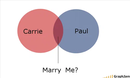
Two circles of equal size, equally overlapped, one red and one blue. A thin leader line runs down out of the lens where they meet, to a question: Marry Me? The intersection itself carries no label, the line is the label.
Two circles of equal size, overlapping by about a third each. The left one is red and says Carrie. The right one is blue and says Paul. A thin line runs down out of the lens where they meet, and at the bottom of the line: Marry Me?
It was submitted in September 2008 and signed With Love, From Paul.
The only chart here with a job to do
Six hundred and fifty-two charts survive in this archive. Every other one was made to be looked at. This one was made to be answered.
That changes how it should be read. The rest of the collection can be judged on whether the joke lands, whether the format fits, whether the proportions are defensible. This one has a recipient, and its success or failure was decided in one conversation that nobody recorded.
The archive holds the proposal, and the original post records no reply. One of the sites that linked to it does: Pingdom’s write-up, quoted below, reports that she declined. That is a third party’s account rather than the archive’s own record, which is why it is attributed rather than stated as fact.
Why the empty intersection is the whole design
The diagram is formally correct, which is rarer in this archive than it should be. Two sets, one intersection, no third circle, no nesting, no implication that either set contains the other. Most Venn diagrams here are actually Euler diagrams or simply two shapes near each other.
But the good decision is not the correctness. It is what the intersection does not say.
A weaker version of this chart writes “marriage” or “us” or “forever” inside the lens. Any of those states the conclusion, and a diagram that states its own conclusion has nothing left for the reader. Here the lens is empty and a leader line takes the eye out of it to a question mark.
The intersection is therefore the thing being asked about rather than the thing being asserted. Two circles already overlap, that part is established, it is the relationship that exists, and the question is whether the overlap gets a name. That is a genuinely elegant use of a set diagram, and it was drawn by somebody who was not trying to be elegant.
The colours
Red and blue, one each, at equal size and equal overlap. Nothing about the diagram makes either circle dominant, larger, or containing.
That sounds like a small thing and it is the reason the chart has aged well. A proposal diagram drawn in 2008 could easily have made one circle bigger, or nested one inside the other, or given the intersection to one party. This one is symmetrical in every respect a reader could check.
Where it travelled
Three sites still link to it, and all three understood what they were looking at.
Pingdom, the website-monitoring company, whose blog had a large technical readership, included it in a piece on marriage proposals in true geek style, describing it as “a proposal in graph format” and noting where it came from. Cal Henderson, a developer known for his work at Flickr, posted it with a one-line verdict: “ok, this is exactly the correct way to propose.” PriceScope, a forum for people researching engagement rings, filed it under Cute Proposal, which is the most on-topic possible venue.
Those are three different audiences, infrastructure engineers, web developers, people buying jewellery, and the diagram needed no adaptation for any of them.
What the plate is worth now
Three sites still link to it, for an image containing four words.
Its position in this archive is unique and worth stating plainly: it is the one chart that was not published to be funny. The site accepted it anyway, in among the pie charts about breakfast, and it has kept its address and its links for eighteen years.
Whatever was said that day, the diagram is still asking.