Elevator Door Close Time
The most technically correct chart in the archive, and the one that turned up in design research.
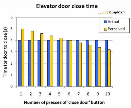
Ten groups of two bars, with a numbered axis in seconds and a legend. Actual close time is four seconds and never varies. Perceived close time starts at five, falls with every additional press, meets the actual value at six presses, and continues down to about three and a fifth by ten.
Ten groups of two bars. The x-axis is the number of presses of a close-door button, one to ten. The y-axis is time for the door to close, in seconds, running from zero to six.
The blue bars are actual, and they are four seconds in every group. The yellow bars are perceived, and they start at five, fall with each additional press, cross the blue at six, and finish at about three and a fifth.
Why this chart is different from everything else here
Six hundred and fifty-two charts survive in this archive. This is the one that would pass a design review without a single change, and it is worth listing what it has that nearly none of the others do.
A quantified y-axis, with a named unit and a sensible range. An x-axis that is a genuine ordered variable rather than a set of categories. Two series drawn on a shared scale so they can be compared directly. A legend that distinguishes them without ambiguity. Gridlines at readable intervals. No tilt.
And, most importantly, a finding that lives in the geometry: a flat series, a falling series, and a crossover. Everything the chart claims is visible in the shape, and nothing has to be read off the labels.
The crossover at six presses
That crossover is the actual content, and it is a more specific claim than the chart needed to make.
Up to five presses, the reader still perceives the door as taking longer than four seconds — impatience inflates the wait. At six, perception meets reality. Beyond that, perceived time drops below actual: the presser now believes they have made the door close faster than it does.
A chart that only showed perceived time falling would be a chart about impatience. Putting the flat actual series beside it, on the same axis, converts it into a chart about self-deception, and the crossing point is where the deception starts.
The real phenomenon
The numbers are invented. The effect is not.
Close-door buttons on a great many lifts are non-functional, either disconnected at commissioning or restricted to authorised use, for accessibility reasons that have been in building codes for decades. The button remains because removing it would be more disruptive than leaving it, and because people expect it.
That class of control is studied as the placebo button, and it is a real topic in interaction design: an interface element that provides a sense of agency without a mechanism behind it. Pedestrian crossing buttons and office thermostats are the other standard examples.
So this chart is not merely plausible. It is a diagram of a documented effect, drawn by a reader in 2008 who was making a joke about waiting for a lift.
Where it travelled
Three sites still link to it, and two of them are the same researcher.
Dan Lockton, who works on how designed objects shape behaviour, and whose Design with Intent material is widely used, posted it twice, on two of his sites. Once in a piece on feature deletion, and once in a piece titled around placebo buttons, false affordances and habit-forming design. Both times the introduction is identical: “This is a great graph from GraphJam, by ‘Bloobeard’. It raises the question, of course…”
Two things are worth noting there. He credits the reader by handle — most people who reposted charts from this site credited the site, or nothing. And he uses it as an opening exhibit for a piece of design argument, not as a punchline.
The third link is an aggregator.
What the plate is worth now
Three sites still link to it — modest numbers, and the least representative figures in this archive, because two of the three are a design researcher building an argument on it.
Every other plate here earns its page on how far it travelled or what it recorded about its moment. This one earns it on craft. A reader with a browser and a spreadsheet drew a two-series comparison with a real unit, a real crossover and no decoration, about a documented phenomenon in interaction design, and put a joke on top of it.