Countries Destroyed by the Large Hadron Collider
A choropleth whose entire argument is that one of its two categories is empty.
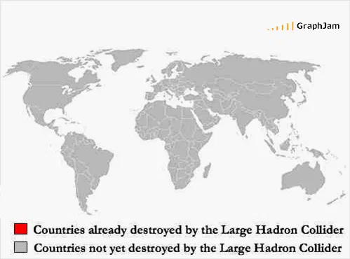
A world map with a two-entry legend, one of which has no members anywhere on the map. The empty category is the whole of the argument.
A world map. Every country is grey. Below it, a legend with two entries: countries already destroyed by the Large Hadron Collider, in red, and countries not yet destroyed by the Large Hadron Collider, in grey.
There is no red on the map.
The empty category
This archive contains several charts built on a single dominant slice, and a couple built on one slice only. This is the one built on a category with nothing in it, which is a different and rarer construction.
A choropleth map exists to shade regions by a value. Shading none of them is not a failure state, it is a legitimate result, and reporting a null result on a map that was drawn to display it is a more emphatic way of saying nothing happened than a sentence would be. The reader has to scan the whole map looking for the red before concluding there is none.
Compare it with the single-slice pie elsewhere in this archive, which says there is exactly one answer. This says there are no cases, and it makes you check.
The word doing the work
Delete yet from the second legend entry and the map becomes a dry factual statement. Keep it and the map becomes something sharper, because yet is a claim about the future dressed as a description of the present.
That is precisely the structure of the argument the chart is answering. Nobody arguing that the collider was dangerous was claiming a catastrophe had occurred; the claim was always about what might still occur, and no accumulation of uneventful running can refute it. A null result plus the word yet is unfalsifiable, and the map demonstrates that by adopting it.
Seventeen words of legend across two lines, and one of them is a small essay on how unfalsifiable risk claims work.
Not yet is unfalsifiable in the same way a gambler’s due is. Where a probability is genuinely fixed and knowable — the odds of the common games, no amount of waiting moves it.
The date
23 September 2008, and the date is not incidental.
The collider circulated its first beams on 10 September, amid a genuinely large wave of public anxiety — lawsuits had been filed, safety assessments had been published by CERN and by independent reviewers, and the phrase micro black hole had reached the front pages. On 19 September a faulty electrical connection triggered a magnet quench that vented several tonnes of helium into the tunnel and damaged dozens of magnets. The machine was shut down for more than a year.
So this chart was drawn four days after the collider broke, at the point where the honest answer to has it destroyed anything was it has destroyed itself. The chart does not make that joke, which is a restraint worth noticing. It just reports the null and leaves the yet in.
Where it travelled
Three sites still link to it, and the first is the most unusual placement in this archive.
It was mailed to funsec, a long-running security mailing list, in a PGP-signed message, under the subject line Countries Not Yet Destroyed…, with the body consisting of “Enjoy. :-)” and the URL. That is a chart being distributed by a cryptographically signed email to a professional security list, which is a delivery mechanism no other entry here can claim, and which is why the link survives in a public list archive.
The Spanish blog Enchufa2 linked it with the anchor hadron under the headline Pues va a ser que no — roughly, well, apparently not. A personal blog filed it under diversions.
What the plate is worth now
Three sites still link to it, an image with a legend of seventeen words and a map with no data on it.
The collider was repaired, restarted in November 2009, and has run for fifteen years. The first category is still empty. The word yet is still in the legend, and it is still doing exactly as much work as it was in September 2008, which is the property of an unfalsifiable claim, and the reason the chart has not needed updating.