Pie I Have Eaten
The only pie chart in this archive whose units are pie.
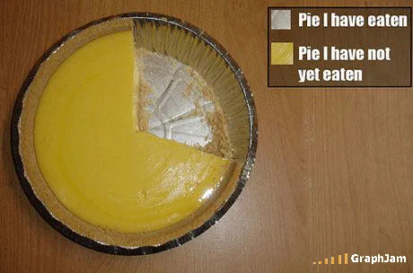
A lemon pie in its tin, one slice gone, with a two-item legend attached: pie I have eaten, pie I have not yet eaten. No drawing, no software, no abstraction step.
Somebody photographed a lemon pie in a foil tin with one slice cut out of it, attached a two-item legend, and produced a chart that needs no drawing step at all. Pie I have eaten. Pie I have not yet eaten. The categories are exhaustive, they do not overlap, and the areas are exact, because the missing wedge is literally the pie that was eaten.
Why it survives the check
Most of the charts in this archive would fail a first-year statistics review, and most of them are trying to. This one passes. A pie chart is appropriate when you have parts of a single whole, when the parts are mutually exclusive, and when there are few enough of them to read at a glance. Two categories of one pie satisfies all three conditions more cleanly than nearly any real pie chart you will see in an annual report.
The joke is not that the chart is wrong. The joke is that it is right, and that being right required removing every layer of abstraction the format normally depends on. A pie chart is a diagram that borrows the shape of a food to explain a proportion. Take away the borrowing and you are left holding the food, still explaining the proportion, perfectly well.
That is a harder thing to construct than it looks. Photograph a pizza with a slice missing and you have a joke about pizza. The legend is what does the work: two swatches, sober labels, the visual grammar of a chart applied to an object that has never needed one.
A pie survives that check when its slices are a real division of one whole. It is the same test a house payout rate has to pass and usually cannot, because a single published percentage is a weighted average of whatever customers happened to play.
Where it travelled
This plate had an unusual afterlife. Most GraphJam charts circulated through forums and link round-ups and then stopped. This one crossed into the literature about charts.
Robert Kosara filed it at eagereyes, in a piece on charts and metaphors, as an example of work “that revert the pie metaphor back to actual food”. It was posted to MetaFilter in a thread about pie chart logos, with the introduction “here’s my personal favourite pie chart”. It turned up on GovLoop, of all places, in a discussion titled “Why Isn’t Government Data Fun?”, where a public sector data practitioner used it to argue that data people should be allowed to play. Free Thought Blogs called it the best pie chart ever, in passing, on the way to something else.
It also travelled well in translation, which not every joke does. The Spanish technology site Microsiervos ran it as a “gráfico de tarta autorreferente (además de literal)”, a self-referential and additionally literal pie chart, which is a more precise description than anything written about it in English. A German blog found it via the information aesthetics blog infosthetics and praised its “vorbildlich saubere Empirie”, exemplary clean empiricism. A Catalan cookery blog picked it up because it was, after all, a pie.
Charts that depend on wordplay die at the language border. This one has no words in it beyond four in the legend, and the argument is carried by an object that means the same thing everywhere.
What the plate is worth now
There is a category of visualisation criticism that treats the pie chart as indefensible: bad at angle comparison, worse at more than three categories, usually replaceable by a bar. That criticism is mostly correct and it has been made thousands of times. This photograph makes the opposite case without arguing, by showing the one situation where a pie chart is the only honest option available, which is when the subject is a pie.
Eleven separate domains still link to this address, several of them from discussions about how charts ought to work rather than from humour round-ups. That is an unusual profile for a photograph of a dessert.