Web Development
Two categories, and writing the site is the smaller one.
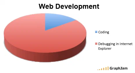
Two categories only. Coding takes roughly a fifth of the circle; debugging in Internet Explorer takes the rest.
Two slices. A small blue wedge for coding, and everything else in red for debugging in Internet Explorer. No third category, no legend beyond those two lines, no attempt at precision past the rough one-fifth the tool drew.
Two categories is the whole technique
Nearly every pie chart in this archive uses four or five slices, because a list of absurd categories is funnier than a short one. This plate goes the other way and gets more out of it. With two slices there is no ranking to work out and no labels to compare against each other. There is one ratio, and the reader has either lived it or has not.
The restraint is also what makes the claim arguable rather than silly. Nobody reading this in 2008 thought compatibility work was literally eighty per cent of a project. What they recognised was the shape: the part of the job that produces the thing, and the part that produces nothing new and cannot be skipped.
The specifics behind it were concrete. Internet Explorer 6 shipped in 2001 and was still widely deployed seven years later, particularly inside companies that had built internal tools against it. It implemented the box model differently, mishandled transparency in PNG images, and misplaced floated layouts in ways that had documented names and documented workarounds. Front-end work carried a second, invisible budget for making a finished design behave in one browser, and that budget is what the red slice is.
Where it travelled
This plate spread inside the trade rather than outside it, and it spread as agreement rather than as a joke.
The Spanish blog Enchufa2 reposted it with a four-word verdict: “la pura y triste verdad”, the pure and sad truth. Puffbox, a British developer’s blog that wrote regularly about Microsoft platforms, carried it. It was pasted into an IRC channel for World of Warcraft interface developers, where the log for 24 September 2008 preserves the bare URL, which is a fair indication of how far the annoyance reached: people writing add-on interfaces for a game had the same complaint as people building websites.
A South African web agency put it on their company blog. A handful of personal development blogs filed it in monthly round-ups. The audience for this one was specifically people who had spent an afternoon on a rendering bug.
What the plate is worth now
Internet Explorer 6 is gone, Internet Explorer itself was retired in 2022, and the specific grievance has no target left. The structure of the complaint survived the browser completely. The same two-slice chart still gets redrawn with the red category relabelled, first for older mobile browsers, later for whichever engine is currently the outlier, and it lands every time.
That is the useful thing about a chart with only two categories. There is nothing in the drawing tied to the era except the label, so the plate ages into a template rather than into a period piece.