Video Games Played in the 80's
Pull one slice out of a pie chart and you have drawn a mouth.
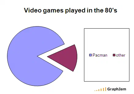
Two slices, with the smaller one exploded outward. The gap it leaves is a triangular notch on the right of the circle, and the shape that remains is the game the chart is about. The legend needs only two words.
A pie chart with two slices. The smaller one has been pulled out and set to the side, which is a standard spreadsheet flourish for drawing attention to a category.
What is left behind is a circle with a triangular notch bitten out of its right side. It is Pac-Man. The legend has two entries: the game, and other.
Why this is a better chart than it looks
Nearly every entry in this archive borrows a business format and applies it to inappropriate content, and the mismatch carries the joke. This one does something rarer: the format generates the joke, using a feature that exists for a completely different purpose.
The exploded pie slice is a real option in every charting tool ever shipped. Its stated purpose is emphasis — pull the slice you want the audience to notice away from the rest. Its actual effect is to make the proportions harder to read, which is why it is disliked by anybody who thinks about charts for a living.
Here the misfeature is the whole design. Explode one slice of a two-slice pie and you have not emphasised a category, you have drawn an open mouth. The chart is a visual pun that only a charting tool could have produced.
The proportions are not the point, and that is fine
The split is set by geometry rather than by any claim about play habits. The notch has to be roughly a quarter of the circle for the shape to register, so the small slice is roughly a quarter, and other gets whatever that leaves.
Ordinarily this archive is harder on charts that invent their proportions. The exemption here is simple: the chart is not arguing about what anybody played. It is a shape joke with a legend, and it never pretends otherwise. There is no implied dataset to be wrong about.
Where it travelled
Four sites still link to it, and two of them are libraries.
The Shifted Librarian, a long-running blog by a librarian writing about technology and information, posted it under Pac Man Fever Redux. Bibliotecários Sem Fronteiras, a Brazilian librarians’ association, ran it in Portuguese under Humor com gráficos, humour with graphs, with the link anchor simply “pacman”.
That is not a coincidence and it happens repeatedly across this archive. Librarians and information professionals were an unusually receptive audience for chart jokes, because they spend their working lives on the question of how information gets shaped for an audience. A chart that demonstrates what an exploded slice does to legibility is, to that reader, a teaching example that happens to be funny.
The other two links are a Canadian shopping forum, which hotlinked the image file directly from its original host, and a link round-up.
The hotlink, and where the file went
That forum link is worth recording for a practical reason. It points at
graphjam.files.wordpress.com/2008/08/125.png, the raw image on the original host, not
the post.
Every one of those image URLs now returns an error, which is the single fact that made recovering this archive difficult. The images had to come from surviving copies instead, and only about half survived. This chart’s did. A meaningful number of others in the same collection did not, and they are listed there as titles and dates.
What the plate is worth now
Four sites still link to it, two of them professional library blogs, for an image containing seven words.
Its interest is not nostalgia about the game. It is that a chart-drawing tool, used slightly wrong, will hand you a picture of something else entirely, and that this is the only entry in the archive where the misuse of an emphasis feature is the entire content.