Contents of Africa According to the Rest of the World
A mental map whose subject is not the continent but the person looking at it.
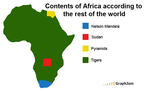
The continent as one flat green field, keyed in the legend to a single animal. Three small rectangles interrupt it: a yellow patch at the north-east corner for the pyramids, a red square in the centre for one conflict, and a blue tip at the south for one man. Four labels for fifty-four countries.
An outline of Africa, filled almost entirely with one flat colour. Three small rectangles interrupt it: a yellow patch at the north-east corner, a red square near the centre, and a blue tip at the southern end. The legend gives four labels, the pyramids, one country, one man, and, for the whole remaining continent, tigers.
Tigers are Asian. They have never lived in Africa.
What the chart is actually plotting
This is a mental map, and like every good one its subject is the viewer rather than the territory. Nothing on this image is a claim about Africa. Every label is a claim about what somebody outside it can name.
The three small rectangles are each defensible as facts and indefensible as proportions. There are pyramids in Egypt. There was, in 2008, a widely reported conflict in Sudan. Nelson Mandela was South African and, that year, the single most internationally recognised living African. Each is real, each is confined to a patch a few pixels across, and together they account for a fraction of the map.
Everything else, the great majority of the surface, fifty-odd countries, a billion people, is one undifferentiated field keyed to an animal from the wrong continent.
Why the error is the best part of it
A weaker version of this chart would have labelled the large region “jungle” or “poverty” or “safari”. Any of those would have been a caricature, and caricature is easy to dismiss.
Labelling it with an animal that is simply not there does something harder. It makes the largest region on the map wrong rather than merely reductive, and it requires the reader to supply the correction themselves. A reader who does not know that tigers are Asian reads the chart as a mild joke about safaris. A reader who does know reads it as a chart about confident ignorance, and realises, in the same moment, that the chart has just tested them.
That is a considerable amount of work for four legend entries and a browser drawing tool.
Where it travelled
Four sites still link to it, and none of them is a humour site.
Doc Searls, a writer on markets and the open web, and one of the authors of the Cluetrain Manifesto, linked to it and specifically noted that he had gone looking for its origin: “not only did I find the telling graphic above, but discovered its source, GraphJam”. The word he chose was telling.
Jillian C. York, who writes on internet freedom and on the Middle East and North Africa, posted it under her own headline: The Way the World Sees Africa…. That is somebody with professional standing in the subject using an amateur chart as a statement of a position.
The French data-journalism outfit OWNI embedded the image file itself, the link anchor is the filename, afrique_restedumonde, in a piece launching DespoticMind, a visualisation tool about which states violate human rights. A joke map about ignorance of a continent, used as an illustration by a project trying to fix ignorance of a continent.
The company it keeps
This archive holds several mental maps: how one American state sees the rest of the country, how Midwesterners see it, how Europeans see it, how the average American ranks the world by relevance. All of them work by the same mechanism and all of them are in the same collection.
This is the only one where the viewer being satirised is the whole rest of the world rather than one region, and it is the only one that has been cited by people who work on the subject professionally. That combination is why it earned its own page.
What the plate is worth now
Four sites still link to it, across English and French, for an image containing barely any text at all.
It has aged in one specific way that is worth naming: Mandela died in 2013, and the conflict marked by the red square has been succeeded by others. A reader arriving now may not recognise two of the three small labels, which means the chart’s largest region has grown. The joke is not weaker for that. It is more accurate.