Maps, States and How America Looks From Elsewhere
The collection with the highest proportion of individually published plates, and the one people still argue with.
Thirteen charts, and proportionally this is the strongest collection in the archive: five of the thirteen earned individual publication as plates, against an archive average closer to one in fourteen. Twenty-seven sites still link to it across thirteen charts is a high rate for a collection this small.
The reason is that a map makes a claim about somewhere real, and people from somewhere real answer back.
The mental-map genre
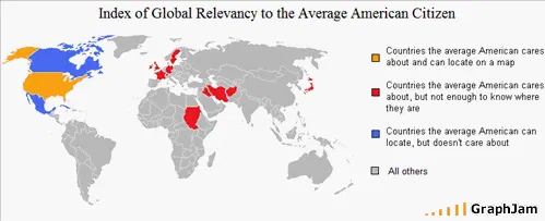
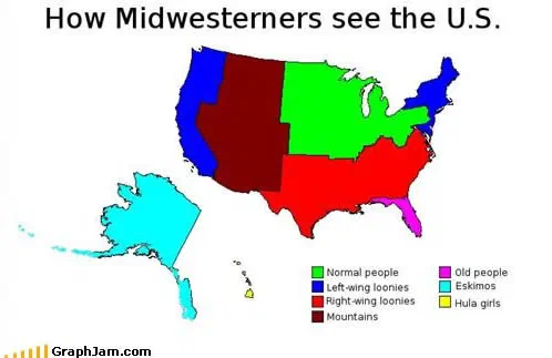
The dominant form is a map of a place as somebody wrongly imagines it. How Midwesterners see the U.S. is linked from two sites. American Map According to Europeans runs it in reverse. The Japanese population according to the average person. applies it to a country rather than a region, and Index of Global Relevancy to the Average American Citizen drops the map entirely and just ranks the world by how much attention it gets.
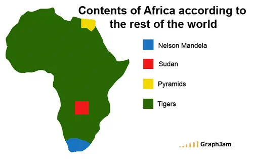
These are charts about a viewer, not about a place, and the good ones make that explicit. Contents of Africa according to the rest of the world, published as its own plate linked from four sites, is the clearest case: the subject is the ignorance, and the continent is the evidence. It is the collection’s most-linked chart and the one that most needs its own page rather than a line in a list.
Places with reputations
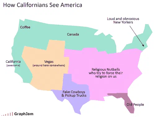
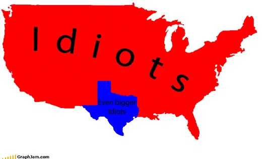
Californians is linked from four sites, a chart about a population that has a national reputation and knows it. Texas is the terser version. Probable Effects (based on elevation) as caused by y’all, from March 2008, the second-oldest entry in the entire archive, plots a dialect boundary as a topographic function, which is a genuinely inventive thing to do with a map projection.
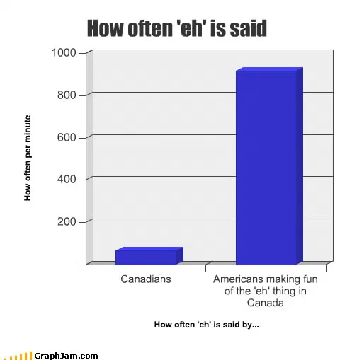
How often ’eh’ is said, published as its own plate, does the same for a different border and holds three domains. Both of these are linguistic geography drawn as a joke, and both are more precise than the joke needed them to be.
Charts where the map is the punchline
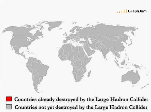
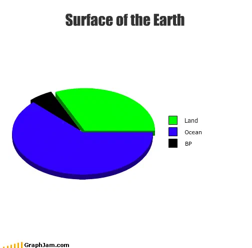
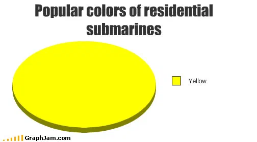
Surface of the Earth, published as a plate linked from four sites, takes a statistic everybody half-remembers about water coverage and plots it so the ratio is unavoidable. Countries Destroyed is a world map with an empty category, a two-item legend counting the nations destroyed by the Large Hadron Collider, drawn four days after the accident that shut the machine down for a year. Popular colors of residential submarines is a chart about a housing stock that does not exist, and the deadpan is carried entirely by the word “residential”.
American and European Culture is the only entry here that attempts a comparison rather than a caricature, and its image was not recovered, which means the archive’s single balanced map chart survives as a title.
Why these are worth republishing individually
A chart about a country is the kind of thing that gets linked from inside that country, in a language the original author did not write in. That is visible in the links for this collection: they are more geographically spread than anywhere else in the archive.
It is also why every one of these addresses matters. A map chart’s link profile is built over years by people who found it in their own language, and a redirect to a general index would break every one of those arrivals.
- Charts here
- 13
- Images recovered
- 9
- Published as plates
- 5
- Referring domains
- 27
- First posted
- Mar 2008
- Last posted
- Oct 2010
The charts
In publication order. Sides run in tens, the way a record does. A chart marked as a plate has its own page and its own retrospective; the rest are published here, at the addresses they held when they were posted.
- A1
Probable Effects (based on elevation) as caused by y’all
- A2
Texas
- A3
- A4
- A5
Index of Global Relevancy to the Average American Citizen
- A6
- A7
- A8
Popular colors of residential submarines
- A9
How Midwesterners see the U.S.
- A10
The Japanese population according to the average person.
- Side B
- B1
American and European Culture
- B2
- B3
American Map According to Europeans