Surface of the Earth
A pie chart of the planet with one slice too many.
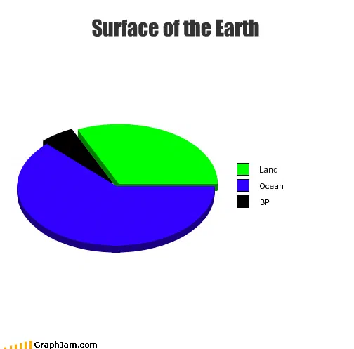
A tilted pie in the builder’s default green and blue. Ocean takes rather more than half, land takes the rest, and a narrow black wedge is labelled BP. Two of the three categories are geographic.
A pie chart of the surface of the Earth. Ocean takes rather more than half. Land takes the rest. And there is a third slice, narrow and black, labelled BP.
It was posted on 14 June 2010. The Deepwater Horizon rig had exploded on 20 April and the well was not capped until July, so this chart was drawn while the leak was still running and nobody knew how long it would run for.
What makes it work
The chart has almost no data in it, and its accuracy is beside the point. What it does is commit a category error on purpose.
Land and ocean are the two exhaustive divisions of a planetary surface. They are the same kind of thing, measured in the same units, and between them they account for all of it. Adding a company to that list is not a smaller version of the same claim, it is a different sort of claim entirely, and the reader notices the wrongness of the type before doing any arithmetic about the size.
That is why the wedge does not need to be large. A chart arguing that the spill covered a specific percentage of the ocean would invite a fact-check. This one argues that a corporation had become a feature of planetary geography, which is either obviously false or, in June 2010, uncomfortably close to how it felt.
The land and ocean split, checked
The real division is about 71 per cent water and 29 per cent land, and the chart is close enough. That matters more than it might seem: the reader has to accept the frame as a plausible chart of the planet before the third slice can land as a joke. Get the first two slices visibly wrong and the whole thing reads as sloppy rather than pointed.
The tilt is the one real flaw, and it is the flaw this archive complains about elsewhere at length. A three-dimensional pie exaggerates the slices nearest the viewer and compresses the ones at the back, so the areas stop being readable as proportions. Here it happens to shrink the black wedge, which, depending on how generous you are feeling, either undercuts the argument or makes it.
Checking a chart against the quantity it claims to plot is the whole of the method used on the published payout figures elsewhere in the annual — with the difference that those are audited, and a chart that missed by ten points there would not be close enough.
Where it travelled
Five sites still link to it, and the two strongest are Chinese.
The technology site iteye and the mobile edition of cnBeta both included it in a round-up of Gulf-spill infographics, listing it as Surface of the Earth(地球的表面) alongside the serious visualisations of flow rate and slick extent that news organisations were producing that month. That is an interesting placement: a joke chart filed in a survey of information design about the same event, in a language the chart contains none of.
It also survived a Dutch magazine blog and a German one, and, the detail worth keeping, it was pasted into the IRC channel log of a World of Warcraft interface development community on 24 June 2010, ten days after publication, by somebody who presumably just wanted to show it to whoever was in the channel.
Why the translation was free
This chart contains eight words. Three of them are a title, three are category labels, and one of those labels is a two-letter company name that was, that summer, the single most recognisable initialism in the world.
A joke that depends on a pun cannot cross a language border. A joke that depends on a category error can, because the categories translate and so does the error. That is why the Chinese round-ups needed only to gloss the title and could leave the rest of the image alone.
What the plate is worth now
Five sites still link to it, and a place in two Chinese surveys of spill infographics, for a chart made in a browser tool by a reader with no data.
Read from the 2020s, its subject has become historical: the well was capped, the settlements were paid, and the company still exists. What has not dated is the construction. A list of two mutually exclusive categories, plus one that does not belong, is a rhetorical device with no expiry date, and this is the cleanest example of it in the archive.