Things That An Average Person Would Do During A Zombie Apocalypse
Every survival chart is drawn by somebody who assumes they survive. This one is not.
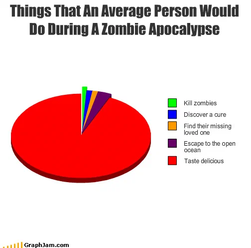
Five categories in the builder’s default palette, four of them too thin to measure against a fifth that takes almost the whole circle. The joke is in which one is the big slice.
Five categories. Four of them are slivers: kill zombies, discover a cure, find their missing loved one, escape to the open ocean. The fifth takes everything the others leave, which is almost the whole circle, and it reads taste delicious.
The one word that does the work
The title says an average person, and everything depends on it.
The zombie genre, the films, the survival guides, the kit lists, the endless online arguments about whether a machete beats a firearm, is written entirely from the perspective of somebody who makes it. That is a structural necessity of storytelling: the camera follows a survivor, because a story about the statistical majority ends in the first ten minutes.
This chart takes the genre’s own framing and applies it to the median case. The four heroic outcomes are not removed or mocked; they are included, correctly, as categories. They are simply given the share they would actually have.
The four small slices are the four standard plots
Read them again in order and notice what they are: kill zombies is the action film, discover a cure is the science thriller, find their missing loved one is the domestic drama, escape to the open ocean is the survival narrative.
That is not a random four. It is a complete taxonomy of what protagonists in this genre do, listed as if they were possible outcomes for a population rather than choices made by a screenwriter. Putting all four on one pie and shrinking them to invisibility is a piece of genre criticism executed with a browser tool.
The euphemism
Taste delicious rather than “get eaten” or “die”, and the choice is the difference between a joke and a shrug.
Stated from the human side, the largest slice would be a mortality figure and the chart would be bleak. Stated from the zombie’s side, it becomes a compliment, a product review, and the reader has to perform the switch of perspective themselves. That switch is the laugh, and it also quietly reinforces the argument: the average person is not a participant in this scenario, they are an input.
Where it travelled
Four sites still link to it, and one of them preserves the file in an unusual way.
The Travelin’ Librarian reproduced it under the chart’s full title. A discussion forum linked it mid-thread, with a smiley appended. A personal blog ran it with a bare “via”.
And it was saved to FFFFOUND, the image bookmarking service, where it appears under no
title at all — just the filename, 129205800868842105.png, and its pixel dimensions. That is what the whole archive would look like without its titles and dates: images
detached from their titles, their dates and their credits, identified by an eighteen-digit
number.
Its place in the collection
Six charts in this archive treat the zombie apocalypse as a planning exercise: a kit list ranked by usefulness, a hazard chart by location, a specification of what a zombie would do, a list of what the drawer personally would do. All of them are collected under science fiction, because a stated rule set is a stated rule set whether it is Yoda’s or a screenwriter’s.
This is the only one of the six that answers the genre rather than participating in it, and it is the only one that assumes its own author is in the large slice.
What the plate is worth now
Four sites still link to it, a chart whose entire text is its title and a five-entry legend, drawn in a browser in June 2010, at the peak of a decade-long revival of the genre it is about.
The construction is portable and has since been reapplied to prepping, to disaster planning and to space colonisation: list the heroic outcomes, give them their true share, and put the honest one in the remaining ninety-odd per cent.