Dante's Internet: Where Will You Be When You Log Off Today?
The most elaborate hand-drawn diagram in the archive, and the only one that borrows a fourteenth-century structure.
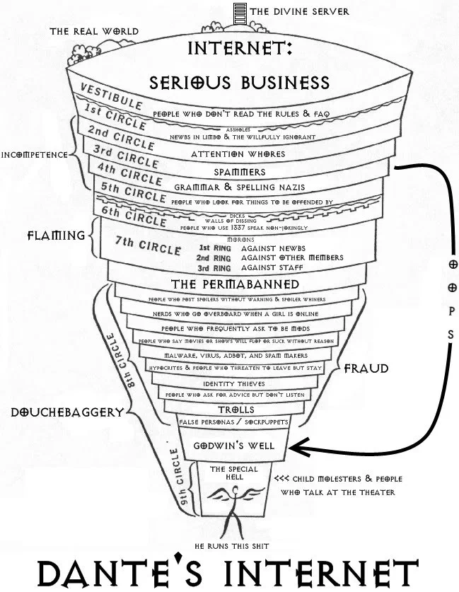
An inverted cone of nine numbered circles, hand-lettered throughout. The real world sits outside the rim; a vestibule holds those who never read the rules. The upper circles cover ignorance and attention-seeking, the middle ones argument and abuse, the eighth is subdivided into a dozen named rows, and the ninth narrows to a single reserved compartment. Brackets in the left margin group the circles into classes of offence.
An inverted cone, hand-lettered throughout, divided into nine numbered circles. The real world sits outside the rim. A vestibule beneath it holds the people who never read the rules. Each circle below that is assigned a category of online conduct, and the cone narrows to a single reserved compartment at the point.
Brackets in the left margin group the circles into broader classes of offence. The title at the bottom reads Dante’s Internet.
Why the Inferno is the right structure
The nine circles of the Inferno are not a list. They are an ordered moral taxonomy with three properties that make them unusually reusable: a fixed number of levels, a rule that lower is worse, and subdivision within levels for finer distinctions.
Any classification with those properties can be mapped onto the structure, and the mapping does work the author would otherwise have to do by argument. Placing a category in the second circle rather than the seventh is the claim about its severity, no justification required, because the frame supplies the hierarchy.
That is why this diagram is more persuasive than a ranked list of the same categories would be. It is borrowing seven hundred years of accumulated authority about the ordering of sins and spending it on comment sections.
The subdivision
The eighth circle is where the diagram does its most detailed work: a dozen narrow rows, each one a specific behaviour, stacked between the broader circles above and below.
That is faithful to the source, where the eighth circle is likewise the one subdivided into numerous separate compartments for varieties of fraud. Whoever drew this knew the structure well enough to put the fine-grained material where the original puts it, rather than distributing the detail evenly.
The seventh circle carries three rings, also matching the source. This is not a diagram that borrowed the visual and ignored the architecture.
The register, and how the archive handles it
The labels are the vernacular of a 2010 forum, and a number of them are unprintable — slurs, crude nouns, and one category at the very bottom that places a serious crime beside a minor social irritation as though they were comparable.
That last juxtaposition is the diagram’s closing joke, and it is the sort of joke that was ordinary in the venue this was drawn for and is not now.
The image is published unaltered, because it is the artefact and editing it would produce a different document. The categories are described here rather than transcribed. That is the same handling this archive applies to the workshop flowchart and to two other plates whose labels cannot be quoted.
The most elaborate hand-drawn diagram
Nearly everything in this archive came out of the site’s browser-based chart builder, five chart types, a fixed palette, a tilt setting. That tool is the reason the recovered images share a visual language.
This one did not. Every line and every letter is drawn by hand, the labels are lettered rather than typed, and the cone is constructed in perspective. It is by a considerable margin the most labour-intensive image in the archive, and it is credited to Joey Roth, a designer whose other work runs to product design and printed infographics.
Where it travelled
Three sites still link to it.
A large internet-marketing forum linked it inside a tips-and-tricks reference thread, using the site’s full page title as the anchor. Logout.hu, a Hungarian technology community, described it as Az internet poklának különböző bugyrai, the various circles of internet hell, which is a more precise translation of the concept than the English title manages. The Dink Network, a small game-modding community, linked it as “Hell, only the internet version. (Map)”.
All three are forums. That is exactly the readership the diagram is about, which means every one of those links is a community pointing at a taxonomy of its own behaviour.
What the plate is worth now
Three sites still link to it, the most detailed image in the archive.
Its categories have aged unevenly, some of the behaviours it names are period-specific, and its register belongs firmly to 2010. Its structure has not aged at all, because the structure is from 1320, and a nine-level ordered taxonomy with subdivided lower circles remains the most efficient way ever devised to argue that one kind of bad behaviour is worse than another.