Science Fiction, Monsters and the Apocalypse, in Charts
The genre most likely to be charted, because it is the genre most likely to specify things it cannot measure.
Thirty-one charts, and they are here because invented worlds do something no realist genre does: they declare their own rules out loud, and then break them wherever the plot needs it. A chart can hold a franchise to its own published specification, which is why this material produces sharper diagrams than any amount of realism.
Invented rules, taken literally
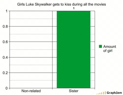
Choices According to Yoda renders the philosophy as three bars — do, do not, and a third for try that barely leaves the axis. Yoda Brainpower Allocation audits the same character as a resource budget. Girls Luke Skywalker Got To Kiss is a very short bar chart about a canonical fact the films spend three films regretting. Possible Outcomes Of Transformer Confrontations enumerates a franchise whose entire mechanic is enumeration, and Content of Transformers does the same job for the films.
The joke in each is the same and it is a good one: the fiction has told you the rule, so the chart is not inventing anything. It is reporting.
Death, counted
Star Trek Deaths is the collection’s most familiar title, because the observation behind it, that mortality on an away team tracks shirt colour, had already been made a thousand times in prose and had never once been falsified. Putting it on axes does not make it truer. It makes it look institutional, which is funnier.
Replicants alive at the end of a film runs the same audit on a different franchise and gets a shorter bar. Geographical Probability of Godzilla Attack plots a hazard map for a threat with a documented preference in landfall sites.
The zombie apocalypse as a specification
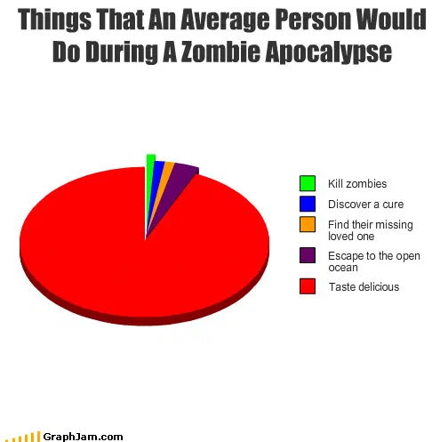
Six charts here treat the end of the world as a planning exercise, and they are the collection’s most useful material precisely because the scenario is fictional. Zombie Apocalypse Objects by Usefulness is a kit list ranked by utility. Places You’re Most Likely To See A Zombie is a hazard-by-location chart. Things a Zombie Would Do specifies the behaviour of the threat, and Things That An Average Person Would Do During A Zombie Apocalypse, published as its own plate, specifies the behaviour of everyone else, which is the funnier half.
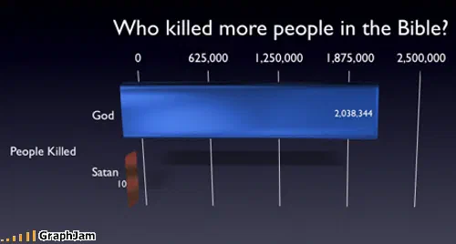
Which Lead To The Apocalypse and Far fetched apocolypse theories widen the frame from one scenario to the whole genre of endings. God vs Satan, also published as a plate, is the earliest entry in the group and the only one that plots a contest rather than a procedure.
Physics as a punchline
Four charts here borrow the apparatus of real science. SPACE/TIME CONTINUUM is a diagram of a concept the films it comes from never define. Will the LHC create a black hole?, filed under the news, since it was a news story, belongs to the same family. Schrodinger’s cat is watching takes a thought experiment about observation and points it back at the reader. Multivariate Increase of M.C.Escher’s Popularity announces a statistical method in its title and then does not use one, which is its own kind of accuracy.
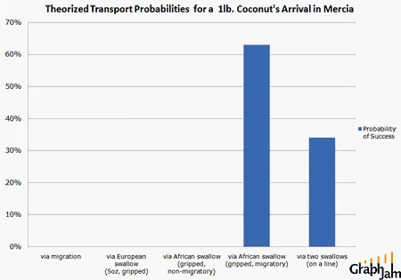
Theorized Coconut Transport Probabilities is the earliest of the group and the most rigorous: a probability distribution over an argument about load-bearing swallows, drawn in May 2008, linked from two sites.
The 2010 shift
The later entries are looser and mostly lost. Force existed, Facts are strong with this one, Jurassic youth, Caveat: She is a ROBOT, these are titles from the period when the site posted a reaction and drew a chart to carry it. Blatant Xeno-Sexism RIGHT HERE PEOPLE from September 2010 is the last recovered image in the collection and is linked from two sites, which suggests the late voice still travelled even when the discipline had gone.
What survives across the whole span is the collection’s one consistent argument: that a genre which specifies its own physics has volunteered to be measured, and that the measurement is always funnier than the specification.
- Charts here
- 31
- Images recovered
- 17
- Published as plates
- 2
- Referring domains
- 42
- First posted
- Apr 2008
- Last posted
- Sep 2010
The charts
In publication order. Sides run in tens, the way a record does. A chart marked as a plate has its own page and its own retrospective; the rest are published here, at the addresses they held when they were posted.
- A1
SPACE/TIME CONTINUUM
- A2
Geographical Probability of Godzilla Attack
- A3
Replicants alive at the end of a film
- A4
Theorized Coconut Transport Probabilities
- A5
States Satan Failed To Collect Souls
- A6
- A7
Girls Luke Skywalker Got To Kiss
- A8
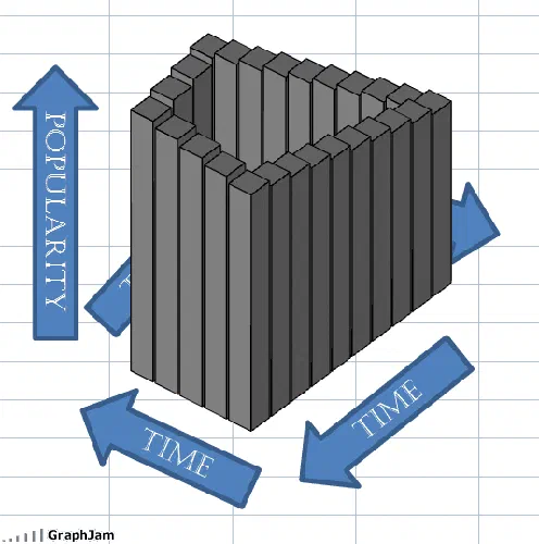
Multivariate Increase of M.C.Escher’s Popularity
- A9
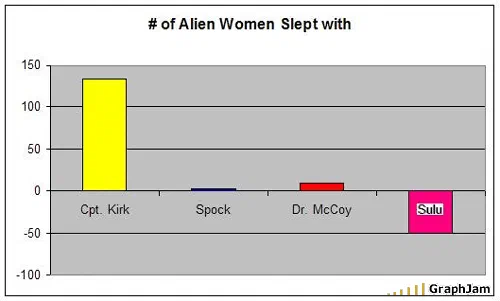
# of Alien Women Slept with
- A10
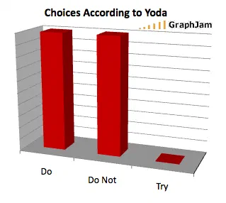
Choices According to Yoda
- Side B
- B1
Star Trek Deaths
- B2
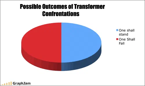
Possible Outcomes Of Transformer Confrontations
- B3
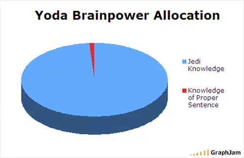
Yoda Brainpower Allocation
- B4
Animals featured on “Planet Earth” series
- B5
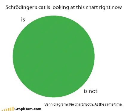
Schrodinger’s cat is watching
- B6
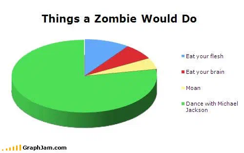
Things a Zombie Would Do
- B7
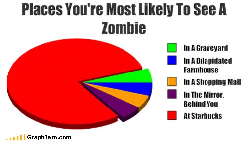
Places You’re Most Likely To See A Zombie
- B8
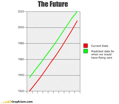
The Future
- B9
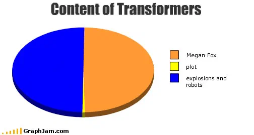
Content of Transformers
- B10
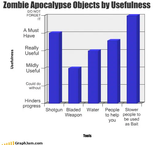
Zombie Apocalypse Objects by Usefulness
- Side C
- C1
Force existed
- C2
Things I Would Do During A Zombie Apocalypse
- C3
Volcano explode
- C4
- C5
Far fetched apocolypse theories
- C6
Facts are strong with this one
- C7
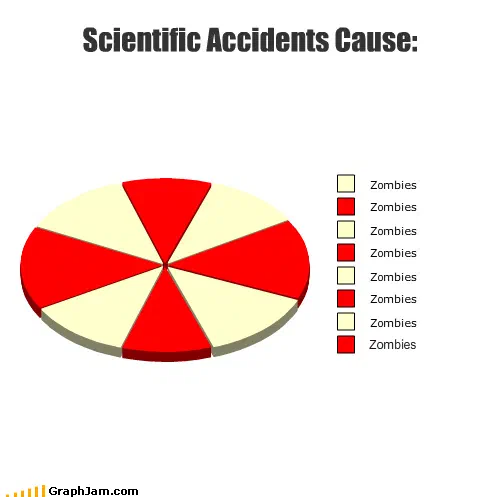
Which Lead To The Apocalypse
- C8
My superpower is extreme cleanliness
- C9
Jurassic youth
- C10
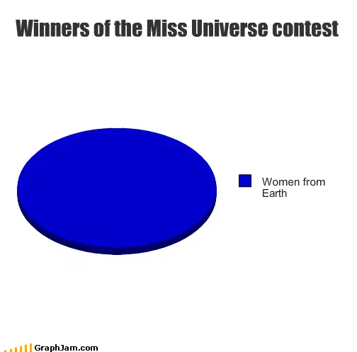
Blatant Xeno-Sexism RIGHT HERE PEOPLE
- Side D
- D1
Caveat: She is a ROBOT