Who Killed More People in the Bible?
The archive's most-argued-with chart, and the only one whose numbers come from a published count.
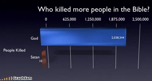
Two horizontal bars against an axis running to 2,500,000. The upper bar carries the figure 2,038,344. The lower one reaches ten, and at this scale is a sliver a couple of pixels wide. The y-axis is labelled People Killed.
Two horizontal bars on a dark blue ground. The axis runs from zero to 2,500,000. The upper bar is long and carries the figure 2,038,344. The lower bar reaches ten, and at that scale it is a sliver a few pixels wide with the number printed beside it because there is no other way to show it.
The title asks which of two figures killed more people in the Bible.
Why the scale is the whole design
This is one of very few charts in the archive that would survive a design review, and the reason is the axis.
A comparison between two million and ten cannot be drawn honestly on a linear scale, the smaller value is about five ten-thousandths of one per cent of the larger, well below the resolution of any screen. The conventional fix is a logarithmic axis, which makes both bars visible and, in doing so, destroys the thing the chart is about.
Keeping the linear scale and letting the small bar vanish is the correct choice here, because the disappearance is the finding. The reader sees a long bar, then hunts for the second one, then finds a number attached to nothing. That sequence, look, search, find the label without the bar, is the argument, and no other axis choice produces it.
Two quantities four orders of magnitude apart cannot share a linear axis. Small percentages have the same problem in reverse: a one-point difference in house edge is invisible on a single bet and decisive over an evening.
What the numbers are, and what they are not
The figures correspond to a tally that circulated widely among biblical-criticism writers: a count of killings attributed to God in scripture against those attributed to Satan, arriving at roughly two million against ten.
It needs saying plainly that this is an interpretation and not a settled count. The large figure depends on including mass events for which the text gives or implies totals, and on reading each of those as attributable in the same way. Different tallies, applying different inclusion rules and different readings, reach different results. The chart reproduces one of them and cites nothing.
That is a real weakness, and it is separable from the design. The chart’s construction is excellent; its sourcing is a number without a footnote, which is precisely the thing this archive spends most of its time parodying.
Where it travelled
Four sites still link to it, and the way it was used is more interesting than the count.
A forum thread on religion at Sonic Stadium quoted it inside a long argument, the recorded anchor text runs to a full clause about atrocities committed in the name of faith, which means somebody was building a case and reached for this image as a step in it. The Spanish blog Enchufa2 ran it under Pero, ¿el malo no era Satán?, but wasn’t Satan the bad one?, which is the chart’s own question restated. A Japanese blog cited it with a source line (出典) pointing at the address. An aggregator picked up the raw URL.
Two of those four are arguments rather than round-ups. That is the highest proportion of argumentative citation of any chart in this collection, and it is the same pattern the probability plates show: something checkable gets forwarded as a claim, not as a joke.
Why it is filed here
This collection holds the charts that take a body of stated rules and hold it to its own specification — Yoda’s philosophy audited as a resource budget, a franchise’s canonical death toll counted, a zombie apocalypse treated as a planning exercise.
This chart makes the same move on received text rather than invented text. It reads a corpus as a dataset, extracts a count, and reports it against an axis. Whether the count is right is a separate question from what the chart is doing, and what it is doing is the thing that puts it in this collection.
What the plate is worth now
Four sites still link to it across four languages, for an image with two bars and two numbers in it, published in June 2008.
Its afterlife is unusual in one respect: it is still being used. Most charts here were forwarded for a season and then stopped. This one entered a standing argument that predates it by centuries and shows no sign of concluding, and a chart that finds a permanent argument to live inside does not need to be topical to keep its links.