MTV Through the Years
A four-series line chart with a labelled projection, which is more than most charts here attempt with one series.
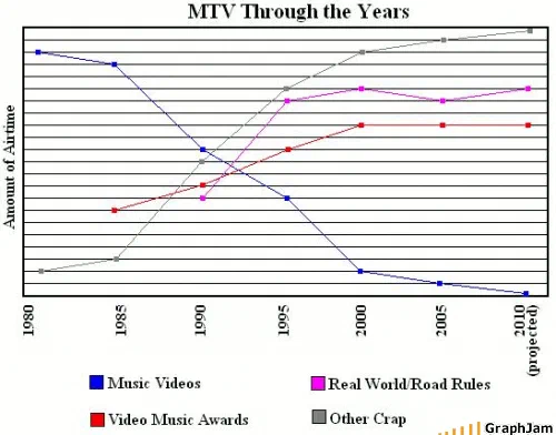
Four series over thirty years, on an unnumbered airtime axis. Music videos fall from the top of the chart to the floor. Other crap rises from the floor to the top, crossing the music line around 1992. A reality franchise and an awards show climb from nothing in the late eighties and plateau. The last point on every line is marked 2010, projected.
Four lines across thirty years. The axis is labelled Amount of Airtime and carries no numbers.
Music videos start at the top of the chart in 1980 and fall steadily to the floor. A category called other crap starts at the floor and rises to the top. They cross around 1992. Between them, a reality franchise and an awards show climb from nothing in the late eighties and plateau in the mid nineties.
The final point on every line is marked 2010, projected.
Four series, and why that is unusual here
This archive is overwhelmingly pie charts. A line chart is already rare; a line chart with four series over a thirty-year axis is nearly unique, and it is being used for the thing line charts are actually for — showing composition changing over time.
The design decisions are mostly right. Four series is at the upper limit of what a line chart can carry before it becomes a plate of spaghetti, and this one stays legible because two of the four lines are monotonic and the other two flatten out. The unnumbered y-axis is honest: there is no data, so putting figures on it would have been a lie, and proportion-of-airtime is readable from the relative heights without them.
The projection
The chart was drawn in June 2008 and its axis runs to 2010, with the last point on each line labelled as projected.
That is a real convention, extending a series beyond the data and marking the extension, and using it correctly on a chart with no data at all is either a joke about forecasting or an accident of unusual precision. Either way it is the only forecast in this archive.
It also turned out to be right. The channel removed the words Music Television from its logo in 2010, two years after this chart put music videos at the floor and marked the last point as a projection. A browser-drawn joke chart made a directional call about a media company’s programming mix and the company confirmed it by rebranding.
The crossover
The most specific claim on the chart is where the two dominant lines cross, and it lands in the early nineties rather than later.
That is a defensible reading. The channel’s move into non-music formats began well before the period most people remember it happening, the reality franchise on this chart launched in 1992, and the shift in programming mix was underway years before it became the thing audiences complained about. Putting the crossover at 1992 rather than 2000 is the chart being more accurate than the popular account.
The residual category
The fourth series is named dismissively rather than described. Its label is printed in the caption above, because it is the chart’s own wording and is rude about a genre rather than about anyone. What matters structurally is that it is a residual: everything that is not one of the three named things.
That is the same construction as the sliver labelled music on this archive’s chart of a teenager’s music library, and the same as the category labelled bacon on the chart about the site’s own submission form. A residual category is where the argument hides, and this archive reaches for it constantly.
Where it travelled
Three sites still link to it, two of them German.
A German media blog linked it with the chart’s own title as the anchor. Ask1.org linked it from a post about a new programme on the channel that the writer regarded as a further decline — “dazu MTV through the years auf graphjam.com”, pointing at this chart as corroboration. A personal blog asked what was on the channel these days and answered with the link.
The recovered post carries one other detail worth keeping: it opens by addressing Digg users directly and pointing them at two other charts. That is a record of how this site got its traffic in 2008 — front-page aggregator hits, with the editors writing landing copy for visitors who had arrived from one link and might click a second.
What the plate is worth now
Three sites still link to it, a chart with four series, no numbers, and one correct projection.
The channel it describes has since been through several further reinventions, and the argument the chart makes, that a music channel stopped showing music, is now so settled that it is a premise rather than a claim. In June 2008 it was still worth drawing.