How Californians See America
A Steinberg cartoon redrawn as a choropleth, by somebody who did not need the cartoon explained.
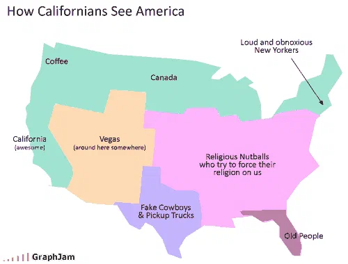
The United States in six colours. California is labelled awesome; the Pacific Northwest is Coffee; the entire northern border is Canada; the southwest is Vegas, around here somewhere; Texas and its neighbours are fake cowboys and pickup trucks; Florida is Old People; an arrow reaches the northeast corner for New Yorkers; and everything between the Rockies and the Atlantic gets one label.
A reader took a map of the United States, coloured it into six regions, and gave each region the label a Californian would supposedly reach for. That is the whole chart, and the reason it is worth a page of its own is that the format it uses is one of the oldest and most reliable pieces of information design there is.
The genre, and its canonical example
The mental map is a real category. Its defining example is Saul Steinberg’s View of the World from 9th Avenue, the 1976 New Yorker cover in which two Manhattan blocks occupy the foreground in full detail while the Hudson, the entire continent, the Pacific and Japan are compressed into the background. The original post here linked to The New Yorker, which means the reference was deliberate.
What Steinberg established is that a map does not have to be wrong about geography to be a joke. It has to be wrong about proportion of attention, and the wrongness has to be recognisable. Everything that has followed in the genre, the Midwestern version, the European version, both of which are also in this archive, works the same way.
What the labels actually do
Read the map carefully and the labels sort into two different kinds of error, which is the sign that whoever drew it understood the form.
Some are errors of resolution. The Pacific Northwest is Coffee. The southwest is Vegas (around here somewhere), with the parenthesis doing the work, the viewer knows the city exists and not where it is. Texas and its neighbours get Fake Cowboys & Pickup Trucks. These are places the viewer has heard of and reduced to one attribute each.
Others are errors of existence. The entire northern border of the country is labelled Canada, absorbing several states into the country above them. Everything between the Rockies and the Atlantic seaboard receives a single label, which is the map’s real argument: not that the middle of the country is one thing, but that from this vantage point it does not resolve into parts at all.
Florida is Old People. New York gets an arrow rather than a region, because on this map it is a point.
And California itself is labelled awesome, in braces, which is the only self-assessment on the image and the thing that makes it satire rather than mockery. The viewpoint is being reported, not endorsed.
Where it travelled
LAist ran it as Map of the Day, introducing it as “one way we see the rest of the country (& Canada…)”, the parenthesis theirs, and a sign that the Canada joke was the one that landed locally. That is a Los Angeles publication running a chart about Los Angeles myopia, which is the ideal reception for this kind of image.
The American Prospect linked to it in a post titled Harshing on GraphJam, and the detail there is worth recording because it is about this site’s mechanics rather than about the map. Their complaint was that this chart “is great, but never got voted up”, the site ran on reader voting, and the writer’s argument was that the voting was selecting for the wrong things. A political magazine using one chart as evidence in an argument about ranking systems is an unusual afterlife for a coloured map.
Two smaller blogs picked it up the same week, one of them finding it through a Google Reader shared item, which is a piece of 2008 infrastructure that no longer exists.
What the plate is worth now
Four sites still link to it, the strongest of them a city news site and a national political magazine. Neither linked because the map was funny. LAist linked because it was about them, and the Prospect linked because it was useful in a different argument.
That is the pattern across every map chart in this archive: a chart about a real place gets picked up by people from that place, in their own language, for their own reasons. It is why the map collection earns links at one of the highest rates here, and why these addresses were worth recovering individually rather than folding into a list.