Games, Players and Sport, in Charts
Charts about games, which are the one subject that arrives with its own scoring system.
Sixteen charts about playing and watching. Games are the one subject in this archive that arrive pre-quantified, a score, a level, a win rate, which ought to make them the easiest thing here to chart honestly. Mostly the collection ignores that and plots the player instead.
The unfairness charts
Probability of I-Shaped Tetris Block Appearing when I Need it is the collection’s best entry and it is wrong on purpose. The piece distribution in Tetris is uniform; the chart plots a shortage that does not exist. What it actually measures is attention, you notice the absence of the piece you need and not the presence of the others, and that is a real cognitive effect drawn as a complaint about a game.
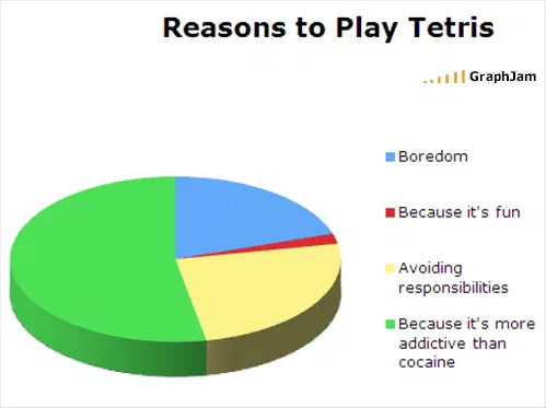
Why you always lose at video games is linked from two sites, the same argument generalised. Reasons to Play Tetris answers the question the first chart raises. What I Do When I Can’t Beat A Level In A Video Game is a response table, filed under food because of what the largest slice is.
Unfairness is easy to draw and hard to quantify, which is why these charts assert it rather than measure it. The one corner of gaming where the unfairness is published as a number is the casino floor — the house edge of each game, stated as a rate and costed per hour.
The player, profiled
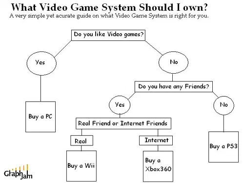
A Gamer’s Buying Guide is linked from two sites, and is a purchasing chart rather than a play chart. What World of Warcraft players desperately need is a needs assessment. Not Tonight Honey, I’m Raiding and Hes holding out for some good tank and spank are both from August 2010, both with the image lost, and both assume a reader who knows raid vocabulary, which dates them more precisely than their timestamps do.
How people use the ‘crouch’ on first person shooters is a mechanics chart, and the only entry here that plots what players actually do with an input rather than how they feel about it.
Games before the console
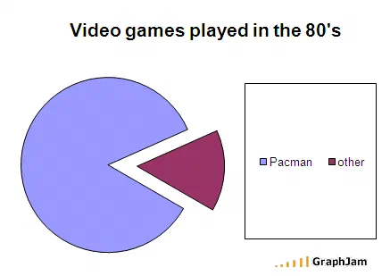
Video games played in the 80’s, published as its own plate with four referring domains, is the collection’s most-linked chart and the one furthest from its own present: a 2008 chart looking back twenty years, which is the same distance we are now looking back at it.
Distribution of Ghosts in Pac Land takes an arcade game and treats its enemy placement as a spatial dataset. Simon Says is about a toy that was itself a memory test, plotted as a memory test.
Sport, from the seats
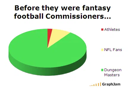
Five charts here are about sport and not one of them is about playing it. Ego of NFL players is a ranking of a quantity nobody can measure. Football According to John Madden is a chart about commentary rather than football. Before they were fantasy football Commissioners… is linked from two sites, and is about administration.
Popularity of Curling and Conclusions you come to watching Ice Dancing both arrive within four days of each other in late February 2010, during the Vancouver Winter Olympics, two readers, independently, plotting the same experience of watching a sport they had not thought about for four years and would not think about again for another four. Neither image survived, which is a shame, because as a pair they are the collection’s most precise piece of dating.
- Charts here
- 16
- Images recovered
- 6
- Published as plates
- 1
- Referring domains
- 22
- First posted
- May 2008
- Last posted
- Aug 2010
The charts
In publication order. Sides run in tens, the way a record does. A chart marked as a plate has its own page and its own retrospective; the rest are published here, at the addresses they held when they were posted.
- A1
A Gamer’s Buying Guide
- A2
Simon Says
- A3
Distribution of Ghosts in Pac Land
- A4
- A5
Before they were fantasy football Commissioners…
- A6
Reasons to Play Tetris
- A7
Football According to John Madden
- A8
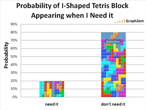
Probability of I-Shaped Tetris Block Appearing when I Need it
- A9
What World of Warcraft players desperately need
- A10
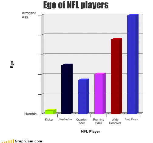
Ego of NFL players
- Side B
- B1
How people use the ‘crouch’ on first person shooters
- B2
Popularity of Curling
- B3
Conclusions you come to watching Ice Dancing
- B4
Why you always lose at video games
- B5
Not Tonight Honey, I’m Raiding
- B6
Hes holding out for some good tank and spank