Consequences of Gay Marriage
A pie chart that plots five outcomes and gives four of them nothing at all.
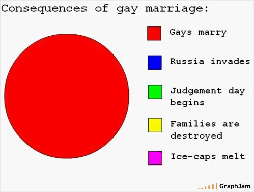
Consequences of gay marriage: one category at 100%, four categories at zero. The four zero slices appear only in the legend, because a slice of nothing cannot be drawn.
Five things were supposed to happen. Gays marry. Russia invades. Judgement day begins. Families are destroyed. Ice-caps melt. The chart grants the first one the entire circle and leaves the other four with no area whatsoever, which is why they appear only in the legend. A slice of zero cannot be drawn, and the blank space where four coloured wedges should be is the argument.
The geometry is doing the arguing
A pie chart is the most constrained format in the standard set. Every category has to fit inside one circle, the shares have to total 100%, and nothing can sit outside the total. Analysts usually treat that as the format’s weakness. Here it is the point. Put five predictions into a pie and one of them has to take space away from the others; give the first one everything and the remaining four are not contradicted, they are simply never plotted.
That is a different move from a chart that mocks its subject with a punchline label. There is no punchline in the legend. Each of the four unplotted outcomes was, in the autumn of 2008, being made in public by somebody as a serious prediction. The chart reprints them accurately and then declines to give them any area. The reader supplies the rest.
The build is also a period artefact. The red is the flat, unmodulated red of a default chart palette, the legend swatches are unstyled squares, and the type is the monospaced face GraphJam’s own chart builder produced. Nobody chose those things for effect. They are what came out of the tool, and they are exactly why the image reads as a chart rather than as a cartoon of one.
Geometry arguing in place of a number is not only a joke device. It is why the games with a settled payout structure are set out here as charts rather than paragraphs: a structure drawn to scale settles in one glance what prose spends a page hedging.
Where it travelled
The date matters. California’s Proposition 8 had passed on 4 November 2008, and the chart went up fifteen days later, into an argument that was still running at full volume. It did not stay on GraphJam.
Mother Jones ran it under the headline “Consequences of Gay Marriage, Illustrated”, crediting GraphJam directly. Smart Bitches, Trashy Books picked it up in a Friday round-up. It was pasted into a long-running election thread on the NewTek and Vizrt broadcast-industry forums, which had reached page eighty-nine by then and had nothing to do with charts, marriage or design. It turned up on personal political blogs that were otherwise posting nothing but text.
That spread pattern is the interesting part. The chart was not shared as a piece of graphic design or as a joke about pie charts. It was shared as a rebuttal, in places where people were already arguing, because it compressed a rebuttal into something that could be pasted into a forum reply without a paragraph attached. Seventeen years later it is still the most-linked single plate in this archive, and most of those links come from conversations rather than from galleries.
What the plate is worth now
Read as data visualisation it is indefensible: no source, no measurement, no scale, a pie chart with one category. Read as rhetoric it is precise, and the precision is a property of the format rather than of the drawing. The chart works because everyone knows what a pie chart is for, and knows that a category with no area means a quantity of nothing.
The archive keeps it at the address it has always had. Twenty-five separate domains still point here, most of them at conversations from a decade and a half ago, and every one of those links spent the last several years landing on an error page.