Animal Abuse in PETA's View
The flat chart: seven bars at the ceiling, and a scale nobody uses.
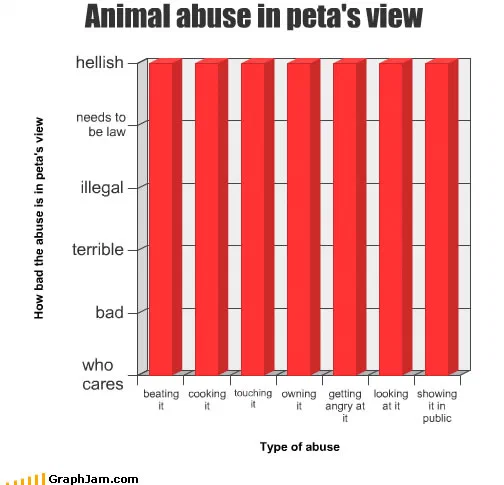
Seven categories along the bottom, running from beating an animal at one end to showing one in public at the other. The y-axis is a verbal scale: who cares, bad, terrible, illegal, needs to be law, hellish. All seven bars are exactly the same height, and the height is the top.
Seven categories along the bottom. At one end, beating an animal. At the other, looking at one. In between: cooking, touching, owning, getting angry at, showing in public.
The y-axis runs from who cares at the bottom, through bad, terrible, illegal and needs to be law, up to hellish.
All seven bars are exactly the same height, and the height is the top.
The flat chart
A bar chart has one job: show how categories differ. Every design convention it carries, the shared baseline, the common scale, the ordering of the categories, exists to make differences between bars comparable at a glance.
So a bar chart in which every bar is identical is the format reporting its own null. It says that the variable being measured does not discriminate between the categories, and it says it in the one form where the reader cannot miss it: seven bars, one height, no slope, nothing to compare.
That is a genuinely economical piece of rhetoric. Written out, the claim takes a paragraph and sounds like a straw man. Drawn, it takes seven identical rectangles.
The ordering that is not used
Notice what the chart declines to do. The categories are arranged in something close to descending order of seriousness, violence first, then use, then contact, then mere presence, which sets up the expectation of a staircase descending to the right.
The bars ignore it completely. The x-axis is ordered and the y-axis refuses to respond, which is the same device the archive’s chart of credence by source uses in reverse. In both cases the sequence of the categories does work that the bars then contradict.
The two legislative levels
The most pointed thing on the chart is buried in the y-axis: two of its six levels are not judgements at all. Illegal and needs to be law are statements about legislation, sitting on the same scale as bad and terrible.
That is a real observation about a particular register of advocacy, the slide from “this is wrong” to “this should be prohibited” treated as a single continuous dimension, with no step change where the argument crosses from ethics into law. Whether or not the target deserves it, the axis is doing more thinking than the bars are.
What it is and is not fair about
It is a caricature and the archive publishes it as one.
The organisation’s own published positions do distinguish between categories of harm; a body that campaigns on animal welfare necessarily has a hierarchy, because campaigns require priorities. What the chart is satirising is the campaigning register, the rhetorical flattening that occurs when every position has to be argued at maximum intensity to compete for attention, rather than any policy document.
That is a real phenomenon and a different target from the one the chart names. Saying so does not blunt the joke; it locates it.
Where it travelled
Three sites still link to it.
A ScienceBlogs post about a public commentator’s habitual factual errors linked it with a one-line aside — “I didn’t realise you were on GraphJam”, which is the chart being used as a punchline inside somebody else’s argument. St Eutychus, a blog about public relations and communication, used it as an illustration of message discipline going wrong: “This graph sums it up nicely.” A personal blog agreed with the graph while explicitly distancing itself from something else in the same post.
The public-relations citation is the interesting one, because it reads the chart as being about communication strategy rather than about animals, which is what the y-axis suggests it is actually about.
What the plate is worth now
Three sites still link to it, a chart containing about thirty words.
Its construction has outlasted its target. Seven identical bars over an ordered set of categories is a reusable way of saying that somebody’s severity scale has only one setting, and the argument it makes about advocacy under attention scarcity has become more true, not less, in the years since.