Just Who Is This Guy?
A three-set Venn diagram that fills in every region, which almost none of them do.
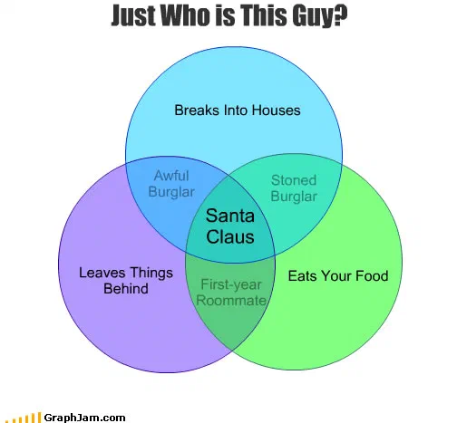
Three circles, correctly overlapped so that all seven regions exist. Breaks into houses, leaves things behind, eats your food. The pairwise overlaps are filled in, an awful burglar, a stoned burglar, a first-year roommate, and the region where all three conditions hold at once is labelled Santa Claus.
Three circles. Breaks into houses. Leaves things behind. Eats your food. The region where all three overlap is labelled Santa Claus.
Why the pairwise regions are what make it good
A three-set Venn diagram has seven distinct regions: three where one condition holds alone, three where exactly two hold, and one where all three do. Almost every joke Venn diagram ever drawn labels the centre and leaves the other six blank, which means six sevenths of the diagram is doing no work.
This one fills in the pairwise overlaps, and they are the best part of it.
Somebody who breaks in and leaves things behind, but does not eat your food, is an awful burglar. Somebody who breaks in and eats your food, but leaves nothing, is a stoned burglar. Somebody who leaves things behind and eats your food but did not break in, because they live there, is a first-year roommate.
Each of those is a genuine classification. Change one condition and you get a different person, which is exactly what a Venn diagram is supposed to demonstrate and almost never does. The centre is the punchline; the three overlaps are the proof that the diagram was thought about.
The construction, backwards
Like the best charts in this archive, this one was clearly built from the answer.
Start with the target in the centre and ask what three properties, held simultaneously, identify it. Then check that each pair of those properties, held without the third, identifies something else, because if a pair identifies nobody, the region is empty and the diagram is decorative.
All three pairs land on a recognisable type here. That is a constraint satisfied, not a coincidence, and it is why this diagram survives a second reading.
The credit line
The original post recorded the author as an unknown source, which is unusual: about two thirds of the charts in this archive carry a first name or a handle. What the site published was an attribution to nobody.
That is kept as it was found. The archive’s rule throughout is that a credit line says what the original post said, and where the original said it did not know, the plate says the same.
Where it travelled
Three sites still link to it, and the most interesting one documents the chart’s own disappearance.
The SAS blog, writing about holiday charts, described what it was doing as an imitation of “a graphjam chart that is no longer there”. By the time that post was written the address had gone dead, the images had been moved off their host, the site had been retired, and a professional analytics blog wanting to point at this diagram could only describe it from memory.
That is the outage stated in somebody else’s words: a chart good enough to be rebuilt from memory by a software vendor, with the original unreachable. It sits at the address it held in November 2009.
A German blog linked it under Das Leben ist eine Grafik — life is a graph. A personal blog added the note that it “makes an uncomfortable amount of sense”, which is the correct reaction to a diagram that classifies a children’s story figure alongside two categories of burglar.
What the plate is worth now
Three sites still link to it, an image containing about twenty words.
Its argument is not really about Santa. It is that a set diagram becomes an instrument of classification the moment you agree to label every region, and stays a joke with a circle round it if you do not. This is the archive’s cleanest example, and the SAS blog’s account of trying to link to it is the archive’s clearest statement of why any of this needed recovering.