What I Think of When Graph Jam Says "Pick a Flavor"
A chart about the interface used to draw it, answering a menu prompt the way a hungry person would.
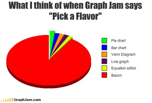
Six categories. Five slivers name the options the era’s browser-based chart builder offered, pie chart, bar chart, Venn diagram, line graph, equation editor, and the remaining ninety-odd per cent of the circle is labelled bacon.
Six categories. Five of them are slivers naming chart types: pie chart, bar chart, Venn diagram, line graph, equation editor. The sixth takes everything else, which is almost the whole circle, and it reads bacon.
The form field
The original site ran a browser-based chart builder. A reader who wanted to submit something did not draw it in a spreadsheet and upload an image; they filled in a form, and one of the fields asked them to pick a flavour.
That was the site’s own house word for chart type. This chart answers it in the sense the word actually carries everywhere else in English.
The joke is small and the artefact is not. Because those five slivers are the real contents of the dropdown, this is the best surviving documentation of what the tool could produce, and it explains something visible across the entire archive. Three quarters of the charts here are pie charts, bar charts or Venn diagrams, in the same flat red, blue, green and yellow, because those were the options and that was the palette. The uniformity of this collection is not a house style. It is a form field.
Why the equation editor matters
Four of the five are ordinary. The fifth is not: an equation editor is not a chart type at all.
Its presence explains a small group of entries in this archive that are otherwise hard to account for, the worked algebra, the inequalities, the plates that consist of a mathematical derivation rather than a diagram. Those were not drawn in some other tool and imported. They were made here, in a facility the site provided on purpose, which means somebody who built this thing decided that a chart site should be able to publish a calculation.
That is a more interesting editorial decision than anything in the chart itself.
The dominant slice
A pie chart with one overwhelming category and a fringe of slivers is this archive’s standard construction, and it appears often enough to be a house grammar: five reasonable answers, given their honest share of the drawer’s attention, plus the real one.
What makes this instance work is that the five slivers are not straw men. They are the literal available options, listed accurately and completely. The chart is not exaggerating the alternatives to make its answer look better, it is reporting them, at scale.
Where it travelled
Three sites still link to it, and the strongest is unexpected.
The Huffington Post used this image as the source in a piece about a writer who was known online for a sustained public enthusiasm for the food in the large slice, the anchor recorded in the export is simply “Source”. A second blog covering the same person used it identically. So the chart’s afterlife is not as a joke about a form field at all: it became a stock illustration for a specific person’s internet reputation, which the chart’s author could not have anticipated in December 2009.
The third link is an IRC channel log for a game-development community, dated the same day the chart was published, where somebody dropped the address in with a comment about a channel regular. Same-day circulation into a chat room and eventual absorption into a national news site’s blog network, for one image.
What the plate is worth now
Three sites still link to it, for a chart whose entire text is its title and six one- or two-word legend entries.
Its value to this archive is documentary rather than comic. Every other chart here is evidence about its subject; this one is evidence about the machine that made all of them, and it is the only entry that records what that machine offered.