Reasons for Using Internet Explorer
One browser, four uses, and the largest is installing a rival.
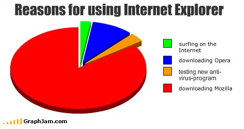
Downloading Mozilla takes most of the circle. Downloading Opera and testing anti-virus software take the rest. Surfing on the internet is the green sliver.
Four reasons to open Internet Explorer, plotted as areas. Downloading Mozilla takes most of the circle. Downloading Opera takes a wedge. Testing a new anti-virus program takes another. Surfing on the internet is the green sliver at the top, and it is the smallest category on the chart — about three per cent of the circle against the orange wedge’s four. Worth stating how that was checked, because the pie is drawn at a tilt and a tilted pie is the format this archive complains about elsewhere: the shares were read as wedge angles rather than as apparent area, which is the only way to compare a far-side sliver with a near-side one.
A chart about a default
The premise only works because of how the browser arrived. Internet Explorer was not chosen. It was present, on almost every computer sold with Windows, and for a large share of users the first deliberate browsing decision they ever made was to use it to obtain something else. The chart takes that sequence and prices it: the software’s real function is as an installer for its competitors.
The anti-virus slice is the sharper of the two small categories. It does not say the browser is insecure, which would be an assertion. It says the browser is what you open when you want to see whether your anti-virus software works, which is the same claim delivered as a use case. Structurally that is the most efficient line on the plate.
The green sliver carries the rest. Labelling it “surfing on the Internet”, with the period’s capitalisation, gives the officially intended purpose its own category and then draws it at a size that settles the argument. This is the same move as the blue sliver in the archive’s Google chart, published eight weeks earlier, and it was the house style of the site’s better pie charts: put the correct answer on the chart, at an honest size, and let the geometry deliver the verdict.
Where it travelled
The timing was fortunate. The European Commission’s antitrust case against Microsoft over bundling the browser with Windows was live in the first months of 2009, and it would eventually produce the browser choice screen that shipped across Europe. The chart went up on 9 March 2009, into the middle of that.
The Thai technology site Blognone linked it from a news report on the proceedings, under the anchor “Top Reasons for using IE”, which put a joke pie chart into the coverage of a regulatory case. Techrights preserved it in an IRC log for 11 March 2009, two days after publication. The Italian Mozilla community forum posted the bare URL in a thread of Mozilla news. BSDForen, the German BSD community, reposted it with a careful source line: “das Original stammt von”, followed by the address. The Spanish blog Enchufa2 published it as “razones para usar Internet Explorer” and was itself credited onward by another Spanish site, which is a small chain of attribution that survived intact for seventeen years.
Nearly every one of those links is from a technical community rather than a humour site. This plate was passed between people who worked with browsers, during a period when which browser you used was a position rather than a setting.
What the plate is worth now
Internet Explorer was retired in June 2022, and the specific target is gone. The chart outlasted it because the structure it describes did not go anywhere: a default browser that arrives with the machine, and a user whose first act is to fetch a different one. Move the labels to a phone shipped with a manufacturer’s own browser and the plate reads as current.
Eight domains still point at this address, in five languages, most of them from technical forums and news coverage rather than from galleries of jokes.