Fear of Swine Flu vs. Knowledge
The only chart in this archive whose y-axis is calibrated in things people said.
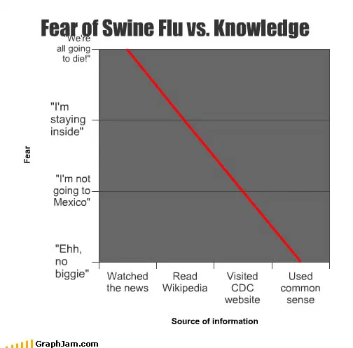
One red line, falling steadily left to right. The x-axis is four sources of information, ordered from broadcast news to common sense. The y-axis is labelled Fear, and instead of numbers its gridlines are quotations — from we’re all going to die at the top, through I’m staying inside and I’m not going to Mexico, down to ehh, no biggie.
One red line, falling steadily from top left to bottom right. Along the bottom, four sources of information in order: watched the news, read Wikipedia, visited the CDC website, used common sense.
Up the side, the axis is labelled Fear, and its gridlines are not numbers. They are quotations — from “we’re all going to die” at the top, down through “I’m staying inside” and “I’m not going to Mexico”, to “ehh, no biggie” at the bottom.
The axis calibrated in speech
That is the decision that makes this chart worth a page, and it is one almost no professional chart would risk.
Fear has no units. Every real attempt to plot it has to invent a scale, a seven-point Likert item, a normalised index, a percentage of respondents expressing concern, and every one of those requires the reader to trust an instrument they cannot see.
Labelling the gridlines with sentences does something different. It gives the axis a reference the reader can locate themselves against directly: you know which of those four things you said in April 2009. The scale is unquantified and, for this subject, more legible than a quantified one would have been.
It also fixes the chart in time in a way nothing else on it does. “I’m not going to Mexico” is a specific sentence from a specific fortnight, and it is doing the work of a date stamp.
Where the construction is weak
The x-axis does not survive the same scrutiny, and it should be said.
Four sources of information are a set, not a quantity. There is no continuous variable running from broadcast news to common sense, so drawing a line through them implies a progression the categories cannot support, the reader is invited to read the space between Wikipedia and the CDC website as an interval, and it is not one.
A bar chart would have been correct here. The line is doing something charts of ordinal categories are not supposed to do, and it gets away with it because the ordering is obviously deliberate and the reader accepts the intent.
This is a plate that would fail a design review on its x-axis and win one on its y-axis, which is an unusual combination.
The claim it makes
The argument is that fear about the 2009 outbreak was inversely related to how well informed the person was, and that broadcast coverage sat at the top of that relationship.
In outline the effect is real and well studied: coverage of a novel infectious threat over-represents worst-case framing, because the worst case is the reportable one, and concern tends to fall as people encounter primary sources. Putting the CDC’s own site third along the axis is the chart’s most pointed move, the official source is presented as de-escalating, which is the opposite of the usual reflex about government health communication.
The qualification the archive owes it: in early May 2009 a novel influenza reassortment with sustained human transmission was a legitimate thing for authorities to escalate on, and the outbreak turning out mild was a property of the virus rather than proof that everybody worried was wrong. The chart is arguing about the calibration of public feeling, and about that it holds up.
Where it travelled
Four sites still link to it, in three languages.
Les Inrocks, the French cultural magazine, included it in Revue du web #34 with the note that it summarised the previous two weeks well, the anchor recorded is a half-translated “Grippe des cochons vs knowledge”. A forum thread titled around whether the outbreak was as critical as everyone assumed linked it with the sentence “This explains everything.” A Swedish blog archived the page with the site’s full title and tagline as the anchor, which is what a bookmarking script does.
That forum is the same thread that linked this archive’s other swine flu chart four days later. One argument, two charts from the same site, used as two separate exhibits.
What the plate is worth now
Three sites still link to it, an image containing about thirty words, drawn in a browser eight days into a news cycle.
Its companion in this archive plots the month’s deaths from the outbreak against deaths from malaria, and between them they bracket the whole shape of that story: one chart about proportion, one about calibration, both drawn while nobody knew how it would end.