People Killed This Month: Swine Flu vs Malaria
The chart that was used as evidence rather than as a joke, within a week of being drawn.
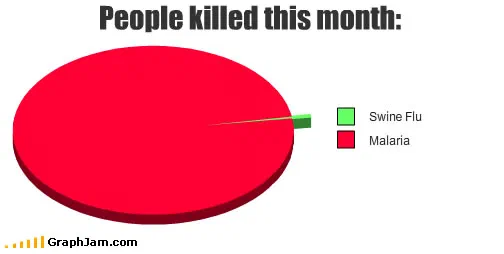
Two slices. Malaria takes effectively the whole circle in red; the green wedge for swine flu is a thin line, wide enough to be visible only because the chart drew a leader out to the legend.
Two slices. One is red and takes effectively the entire circle. The other is a green line thin enough that the chart has to run a leader out to the legend to identify it. The red is malaria. The green is swine flu.
It was posted on 6 May 2009, about a week after the World Health Organization raised its pandemic alert level, and it is the fastest useful chart in this archive.
What the chart is actually doing
There are no numbers on the image. That is a deliberate and defensible choice, because the argument is about ratio rather than magnitude, and a ratio this extreme is better communicated by an unreadable sliver than by two figures a reader has to compare.
The comparison held up. In 2009 malaria was killing on the order of tens of thousands of people a month, overwhelmingly children, overwhelmingly in sub-Saharan Africa. Confirmed H1N1 deaths in the outbreak’s first weeks were in the dozens. Whatever the eventual toll would be, and nobody knew, which matters, the ratio at the moment of drawing was approximately the ratio drawn.
What the chart is arguing is not that swine flu did not matter. It is that attention had detached from mortality, and that a disease which kills continuously attracts none of the coverage of one that is new.
The category that is not on the chart
Read the image again and notice what it leaves out: the third slice for everything else. A chart of people killed this month with only two categories is not a chart of mortality. It is a chart of two specific diseases, chosen because one was on every front page and one was not.
That omission is what makes it rhetoric rather than data, and it is also what makes it effective. A complete mortality chart would have had cardiovascular disease dominating everything and the point would have been lost in it.
Where it travelled, and how fast
Four sites still link to it, and three of them used it as an argument rather than as a joke.
A forum thread titled around the question of whether swine flu was as critical as everyone assumed linked to it with the anchor text LOOK HERE! — capital letters, exclamation mark. That is a chart being deployed mid-argument as a closer.
Empire Remixed, a theology and culture site, ran it under the headline Swine Flu in Perspective and credited the reader who drew it by name. The Spanish blog Enchufa2 filed it under Desmedida alarma social, disproportionate social alarm, which is a précis of the chart in three words.
This is the pattern that runs through the whole archive: the charts that escaped are the ones usable inside a disagreement. A chart about a lyric gets enjoyed. A chart about proportion gets used.
Why the timing is the interesting part
Almost every news chart in this archive is a joke about over-coverage made after the coverage peaked. This one was made during it, before the outcome was known, and the outcome went the way the chart implied.
That deserves an honest qualification rather than a claim of prescience. In May 2009 a novel influenza reassortment with sustained human transmission was a legitimate thing for public health authorities to escalate on, and the reason the 2009 pandemic was mild was a property of the virus, not a failure of the response. The chart was arguing about attention, and about attention it was right.
What the plate is worth now
Four sites still link to it, spread across a forum, a theology blog, a Spanish culture site and a personal blog. It is one of two swine flu charts in this archive, the other, from the same month, plots fear against knowledge and is also published as a plate, and together they are a better record of that news cycle than either alone.
The construction is reusable and has been reused a great many times since, usually without a chart: name the thing everyone is looking at, name the thing that kills more people, and put them on the same axis.