Blogs
An area comparison rather than a Venn diagram, and the difference is the whole point.
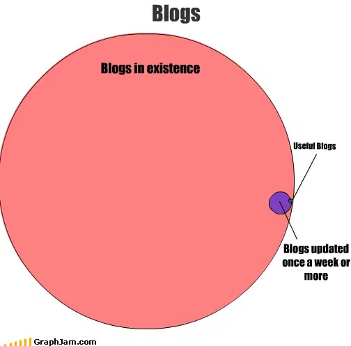
One large pink circle labelled blogs in existence. A small purple circle sits on its edge, straddling the boundary, labelled blogs updated once a week or more, and on the edge of that one sits a third circle, smaller again, which is where the useful blogs leader line lands. The comparison is of areas, not of overlaps.
One very large pink circle, labelled blogs in existence. On its edge, a small purple circle, with two leader lines running out to two labels: useful blogs, and blogs updated once a week or more.
The ratio of the areas is the entire content.
Not a Venn diagram
This gets called a Venn diagram and it is not one, and the distinction matters because the two formats answer different questions.
A Venn diagram is about which combinations exist. Its circles are conventionally the same size regardless of how many members each set has, because the information is carried by which regions of overlap are present. The three-circle diagrams elsewhere in this archive work that way.
This is an area comparison, an Euler-style diagram where the size of each shape encodes the size of the set. It makes no claim about combinations; it makes a claim about proportion, and it makes it by being drawn at a scale where the small circle is barely visible.
That is why it needs no legend, no axis and no numbers. The ratio is the statement.
The flaw
The small circle sits on the boundary of the large one rather than inside it.
Logically that is wrong. Blogs that are useful and updated weekly are a subset of blogs that exist, so the small circle should be entirely enclosed. Placing it on the edge implies that some useful, frequently updated blogs are not blogs, which is not a claim anybody was making.
It is a drawing decision rather than an argument, a circle placed fully inside a large area is harder to notice than one breaking the outline, and it is the sort of small incorrectness this archive is full of. Worth naming rather than glossing over, since the diagram is otherwise careful.
Two conditions, two circles
The small circle carries two labels via two separate leader lines: useful, and updated at least weekly.
Strictly those are two different sets, and the chart does distinguish them: a third, much smaller circle sits on the edge of the purple one, and it is that circle the useful-blogs leader line terminates on. What the drawing does not give them is an intersection, and treating the two conditions as near-coextensive is a claim in itself, that in practice the two conditions select almost exactly the same tiny population, so distinguishing them would add a region with nothing in it.
Given what the diagram is arguing, that is defensible. It is also the same simplification the archive’s chart of revolutionary T-shirts makes when it packs three conditions into one legend entry.
Whether it was right
It matched the evidence of its moment. Surveys of blog platforms in the late 2000s consistently found that the great majority of accounts had been abandoned, most of them within a few months of being created, and that active blogs updating at least weekly were a small fraction of registered ones.
So an order-of-magnitude ratio of a dot to a large circle was not an exaggeration for effect. It was approximately the real shape of the population, drawn by somebody who had presumably been looking for something to read.
Where it travelled
Three sites still link to it, the smallest profile of any plate in this archive.
A Brazilian accountancy blog reposted it alongside another chart from this site, the same blog that reposted five other entries here, which makes it one of this archive’s most persistent individual readers. A British links round-up linked it with a comment about what it reflected. A personal blog linked it with the site’s own tag as the anchor.
Charts linked from three or more sites are published individually rather than as a collection entry, and this plate sits exactly on it.
What the plate is worth now
Three sites still link to it, an image whose entire text is a title and three labels.
The irony is unavoidable and worth stating: this is a chart about how few blogs are worth reading, which survived because three blogs linked to it, and which is republished here at the address it held. The format it describes has largely gone, and the ratio it draws has simply moved to the platforms that replaced it.