Monthly Calendar for Robert Smith
Seven days, one lyric, and the only office document in this archive that a person could actually work from.
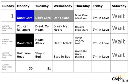
A standard month-view calendar, seven columns wide, with every cell filled from one chorus. Monday is Don’t Care three weeks out of four. Friday is I’m in Love four times. Every Sunday cell reads Always Comes Too Late, and the Saturdays just say Wait.
Somebody took a pop song that names all seven days of the week, opened a calendar, and filled in the cells. That is the entire construction, and it is the most efficient thing in this archive.
The song is Friday I’m in Love, and its structure is unusual: it is a list. It runs the days in order and assigns each one a verdict. Monday is dismissed. Tuesday and Wednesday break the singer’s heart. Thursday does not even start. Friday is the exception the title promises. Saturday waits, and Sunday always comes too late.
A lyric that enumerates a fixed set in a fixed order is not really a poem. It is a table with the columns already named.
Why the calendar beats every other format
Almost every chart in this archive borrows a business format and applies it to something the format was not built for. That mismatch is usually the joke. This plate does the opposite: it finds the one case where the borrowed format is the correct one.
A calendar is a grid of seven columns and four or five rows in which each cell holds a state for one day. The lyric supplies exactly seven states, keyed to exactly seven days. Putting them in a calendar is not a comic distortion of the song, it is the song’s own data structure, made visible.
The proof is that the result is legible without the song. Read the image cold and you can still see the shape of the week: three days written off, one good day, one spent waiting, and a Sunday that is late every single time. That is a real finding about how the working week feels, and the chart got there by copying a chorus into a form.
What the repeated rows do
The calendar does not simply repeat one week four times, which is what a lazier version would have done. Each row varies, because the song varies. The second week’s Monday reads You can fall apart rather than Don’t Care. The third week’s Tuesday and Wednesday become Heart Attack. The fourth week offers Hold Your Head and Stay in Bed, and its Thursday says Watch the Walls Instead.
Those are all lines from the same song, drawn from its later verses, where the days get revisited with different treatments. Laying them out as consecutive weeks turns a lyric that circles back on itself into a month that gets progressively worse before every Friday rescues it.
The Sunday column barely changes. Always Comes Too Late fills four of its five cells; the first holds the month’s opening date instead. Friday and Saturday repeat just as uniformly, and putting Sunday first — Sunday is the leftmost column in an American calendar — means the month opens on the same verdict every week.
Where it travelled
This plate has an unusually respectable link profile for a chart about a pop song.
Wired cited it in a piece titled Pop Culture for People in Cubicles, which is a fair description of both the chart and the site, a calendar filled in with a Cure lyric is exactly the artefact a magazine would reach for to explain a workplace humour genre to people who had not seen it yet. The link anchor was simply “song chart memes”, the phrase this site’s addresses were built out of.
MetaFilter posted it in a thread whose title was itself a lyric transcription. Glide Magazine ran it under Fun With Graphs: Inspiration!. The science-fiction critic Cheryl Morgan picked it out by name while introducing the site to her readers — “I especially like the monthly calendar for Robert Smith”, which is a useful data point, because she was choosing one chart from hundreds and chose this one.
It also turned up on FFFFOUND, the image bookmarking service, where it was filed with no title at all beyond a hash. Six separate domains, spread across a music magazine, a technology magazine, a link aggregator and an image board: this chart was legible to four different audiences without any of them needing the others.
What the plate is worth now
The song is more than thirty years old and the calendar is nearly twenty. Neither has changed, which is the advantage of building a chart on a fixed source: there is nothing in this image that can go out of date, because both of its inputs, a week and a chorus, were finished before it was drawn.
Six sites still link to it still point at this address. What they were pointing at was never really a joke about The Cure. It was a demonstration that a chart can be made purely by choosing the right container, and that if the container is right enough, no other work is required.