Percentage of People Who Hate Michael Jackson, According to Date
Two bars, two days, and the second one is almost empty.
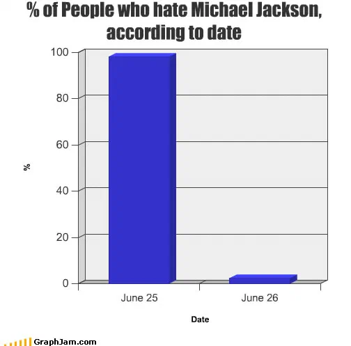
Two consecutive days on the x-axis. The column for 25 June reaches almost 100%; the column for 26 June barely leaves the baseline.
The x-axis holds two values, 25 June and 26 June. The y-axis is a percentage, scaled to one hundred. The first column runs almost the full height of the plot. The second barely clears the baseline.
Why a bar chart and not a line
The choice of format is the argument, and it is a deliberate choice rather than a default. A line chart drawn between the same two points would slope from one value to the other, and a slope implies passage: something moved, over some interval, by degrees. That is exactly the reading this plate refuses.
Two separate columns leave no space between the states. On one date the sentiment is at one extreme, and on the following date it is at the other, with no intermediate value and no mechanism shown. The reversal is presented as total and instantaneous, which is a claim about the audience rather than about the subject.
It is also worth stating what the chart does not contain. Jackson’s music is not on it. Neither is anything he was accused of, or cleared of, or asked about. The y-axis measures the people doing the hating, and the plate is indifferent to whether either position was defensible. Its only assertion is about the speed of the change, and the format delivers that assertion without a sentence of commentary.
The design is otherwise entirely default: the flat blue of the chart builder, a light grey plot area, gridlines at twenty-point intervals, an axis label reading simply “Date”. Nothing has been styled. A plate this plain, on a subject this loud, reads as deadpan rather than as unfinished.
Where it travelled
It was published on 30 June 2009, five days after the death and in the middle of continuous coverage, and it circulated where people were arguing about that coverage rather than about the man.
It was posted to Wikipedia’s Talk:Main Page, in the archived discussion of how the encyclopaedia should handle the death on its front page, with the comment that it “just about sums up my feelings on this subject”. That is an unusual destination for a joke chart: an editorial argument among volunteer encyclopaedists about tone and proportion, where somebody reached for this plate as shorthand for a position.
Elsewhere it went to forums that had reason to talk about him. A thread on Drummerworld under the heading “MJ’s music lives on”. A retirement forum’s “goodbye Michael Jackson” discussion, by then on its fifth page. A German message board thread on the death itself. A Brazilian blog. A weekend round-up on a fitness blog, which is where most GraphJam plates ended up and where this one looks strangest in hindsight.
What the plate is worth now
The reversal it describes has since become a familiar and named phenomenon, and the pattern repeats after every high-profile death: mockery, then eulogy, with no transitional period and no acknowledgement of the switch. In June 2009 that observation had not yet hardened into a cliché, and a two-column bar chart was a sharp way to make it.
Seven domains still point at this address, one of them an archived argument among Wikipedia editors about how to be proportionate, which is a more serious afterlife than the chart was drawn for.