School and Study: Charts About Exams, Degrees and Homework
Charts drawn by people who were being examined at the time.
Twenty-one charts, and almost all of them were drawn by somebody who was supposed to be doing something else. That is the collection’s defining quality and it shows in the subject matter: essays in progress, exam weeks, degree choices being second guessed, and the recurring suspicion that the syllabus and the world have very little to do with each other.
The syllabus versus the world
Math topics I will actually NEED to use is the loudest version of the argument and the one that circulated most. Uses of geometry to a middle school student makes the same case earlier in the curriculum. What I learned in Accounting Class vs Level of Importance, filed under Office Life, is the vocational version.
What is interesting is how consistently the argument is made in the visual language of the thing being dismissed. A chart complaining that mathematics is useless is a mathematical object, drawn on axes, with proportions that have to add up. Nobody in the collection seems to have noticed, and that unselfconscious irony is more durable than any of the jokes.
Exams and the shape of a term
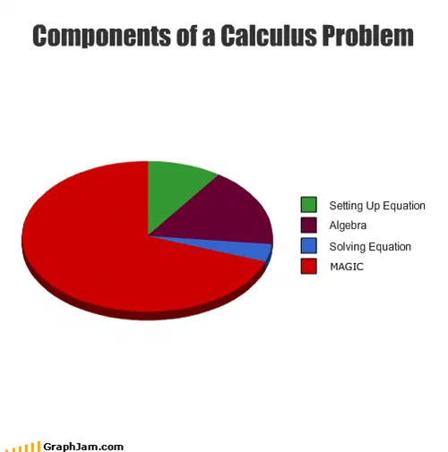
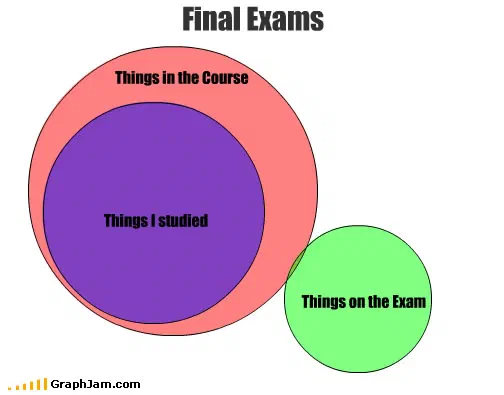
Final Exams is linked from two sites, and plots what a term does to a week. Components of a Calculus Problem is the best-constructed chart here: it divides one problem into setting up the equation, algebra, solving it, and a fourth slice, labelled MAGIC, which takes most of the circle. That is the joke, and it is also the honest answer no syllabus admits.
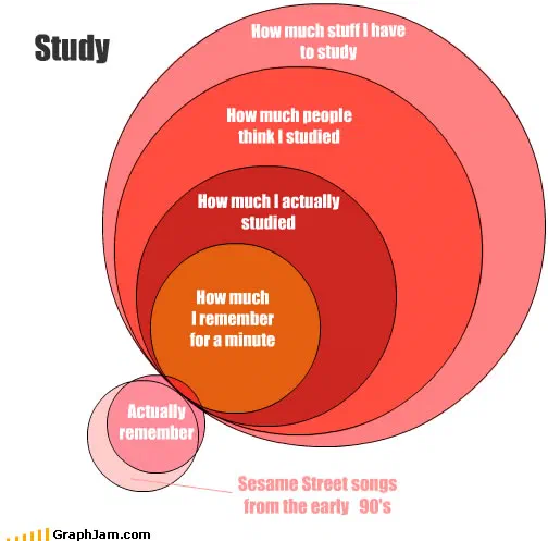
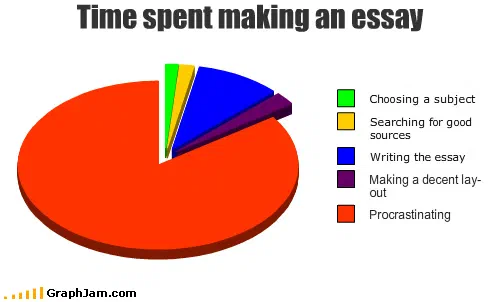
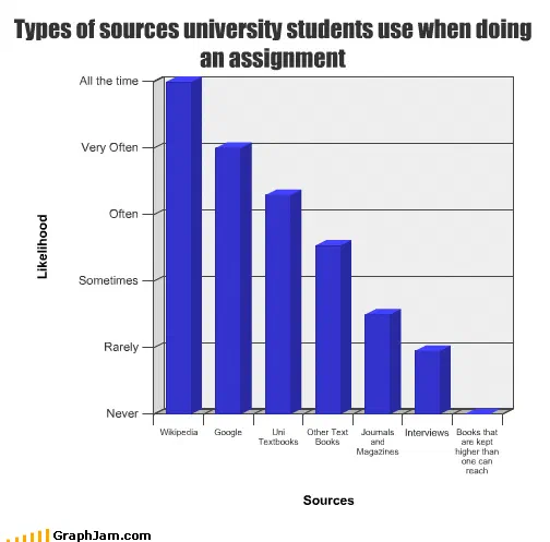
Study and Time spent making an essay both plot procrastination as a distribution rather than a moral failing. Types of sources university students use when doing an assignment is the collection’s most quietly damning entry, a ranking of source types, drawn in 2010, that a librarian could have used in a seminar without changing a thing.
Degrees, chosen and regretted
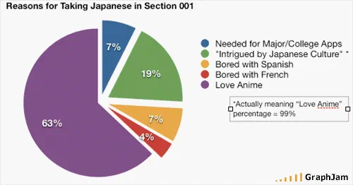
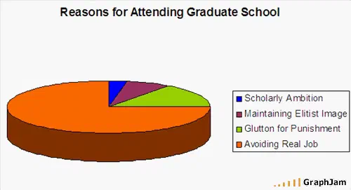
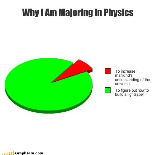
Reasons for Attending Graduate School is a decision audit. You’re getting a PhD in Math? plots a conversation rather than a decision, and holds two referring domains for it. Why I Am Majoring in Physics answers the same question positively, also with two. Reasons for Taking Japanese in Section 001 narrows it to one class of one course, which is the most specific chart in the archive and, oddly, one of the more legible.
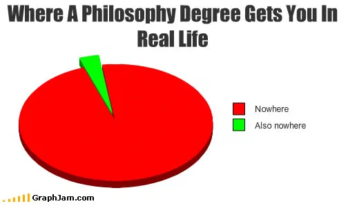
Where A Philosophy Degree Gets You In Real Life, published separately as a plate, is the genre’s canonical entry.
Knowledge, plotted as a quantity
Four charts here treat understanding as a measurable volume: All Knowledge In The Universe, How I Obtain Knowledge, What I Know About Science and What I know about Buddhism. Each divides the reader’s own ignorance into slices, which is a harder joke to make about yourself than about a syllabus, and only one of the four — All Knowledge In The Universe — holds more than a single linking site.
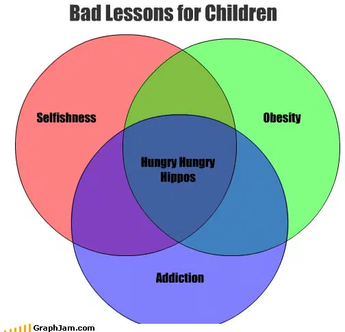
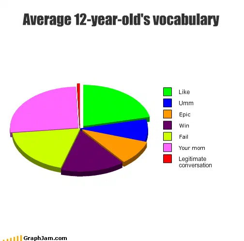
Average 12-Year-Old’s Vocabulary and Bad Lessons for Children look at the other end of education, and What I Remember From My Childhood closes the collection in August 2010 with the image already lost, a chart about memory whose own record is now a title and a date.
Plotting knowledge as a quantity is a joke because the y-axis cannot be measured. It is worth noting where that stops being true: return to player is a percentage that genuinely is measured, audited and filed, which is why it can carry a chart at all.
- Charts here
- 21
- Images recovered
- 11
- Published as plates
- 1
- Referring domains
- 28
- First posted
- Mar 2008
- Last posted
- Aug 2010
The charts
In publication order. Sides run in tens, the way a record does. A chart marked as a plate has its own page and its own retrospective; the rest are published here, at the addresses they held when they were posted.
- A1
You’re getting a PhD in Math?
- A2
Reasons for Taking Japanese in Section 001
- A3
Uses of geometry to a middle school student
- A4
Reasons for Attending Graduate School
- A5
Things One Can Have While in College
- A6
Components of a Calculus Problem
- A7
What I Know About Science
- A8
How I Obtain Knowledge
- A9
What I know about Buddhism
- A10
Final Exams
- Side B
- B1
Math topics I will actually NEED to use
- B2
- B3
Bad Lessons for Children
- B4
Study
- B5
All Knowledge In The Universe
- B6
Things my school spends money on
- B7
Time spent making an essay
- B8
Average 12-Year-Old’s Vocabulary
- B9
Why I Am Majoring in Physics
- B10
Types of sources university students use when doing an assignment
- Side C
- C1
What I Remember From My Childhood