Television, in Charts and Flow Diagrams
A format that repeats every week is the easiest thing in the world to chart, and the hardest to defend.
A weekly programme is a repeated procedure, and a repeated procedure can be diagrammed. That is why so many entries here are procedures rather than opinions, and why the best of them are structural rather than critical: they do not argue that television is bad, they show that it is predictable.
The procedural, anatomised
Typical Episode of House, M.D. is the model case. A medical procedural runs the same five beats in the same order every week, so a stacked chart of one episode is a chart of every episode. Things I Learned From Watching CSI does the same job by listing what the format teaches that is not true, and PERCENT OF CRIMES SOLVED plots the single number that separates the genre from the profession it depicts.
Things That Happen on LOST takes a show built on withheld information and counts the withholding. I Think We’re LOST, from May 2010, holds five referring domains, the most in this collection, and arrived in the month the series ended, when a very large number of people wanted a diagram that explained it.
Talent shows as decision procedures
American Idol Flow Chart is the one entry here that is arguably a better description of its subject than any prose review. A competition with a fixed elimination rule is a flow chart; drawing it as one is not satire, it is transcription.
An Hour Of American Idol takes the same programme and accounts for its hour, which is where the criticism actually lands. Its image is not among those recovered. Interest in American Idol names the trend in its title; its image is not among those recovered. Breakdown of the Price is Right Audience and Celebrity Jeopardy! apply the method to older formats.
Channels that drifted
Three charts document something that was happening in cable at exactly this moment and would be hard to evidence otherwise. Travel Channel Programming, History channel guide and The Unified Theory Of Primetime TV In 2010 all plot the gap between a channel’s name and its schedule. They are jokes about brand drift, drawn while the drift was in progress, by viewers who had noticed before the trade press did.
Mythbusters: Blowin’ Stuff Up And Callin’ It Science! from September 2010 is the last entry in the collection and belongs to the same family, a chart about the proportion of a science programme that is science.
Advertising, and the Snuggie
Snuggie, it’s the Blanket with Sleeves! and Snuggies are both from 2009, both hold their links, and both plot a product with one feature that was advertised as though it had several. Overtly Ridiculous Melodramatic Actors in US Television History is a ranking with no methodology, and Likelihood of You Knowing the Answer to the $1,000,000 Question is a chart about the format of a quiz rather than its content.
Ten of the twenty-seven entries here still have their image; the rest are titles and dates. The recovery rate is low because most of this ran in 2009 and 2010, on the hosting arrangement whose files survived least well, which is an ordinary archival accident, not a judgement on the charts.
- Charts here
- 27
- Images recovered
- 10
- Published as plates
- 0
- Referring domains
- 37
- First posted
- Apr 2008
- Last posted
- Sep 2010
The charts
In publication order. Sides run in tens, the way a record does. A chart marked as a plate has its own page and its own retrospective; the rest are published here, at the addresses they held when they were posted.
- A1
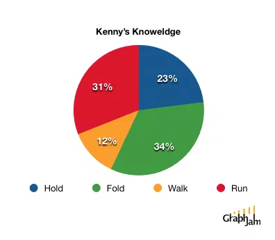
Kenny’s Knowledge
- A2
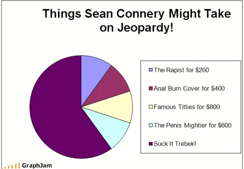
Celebrity Jeopardy!
- A3

The United States According To Network Executives
- A4
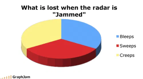
What is lost when the radar is “Jammed”
- A5
Bizarro Jerry
- A6
Age Demographic of Mutant Ninja Turtles
- A7
Kermit the Frog’s Abilities
- A8
Overtly Ridiculous Melodramatic Actors in US Television History
- A9
Quagmire’s Vocabulary
- A10
Breakdown of the Price is Right Audience
- Side B
- B1
An Hour Of American Idol
- B2
Travel Channel Programming
- B3
Interest in American Idol
- B4
Snuggie, it’s the Blanket with Sleeves!
- B5
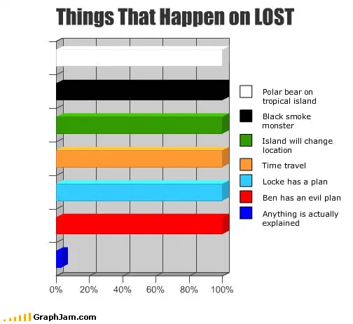
Things That Happen on LOST
- B6
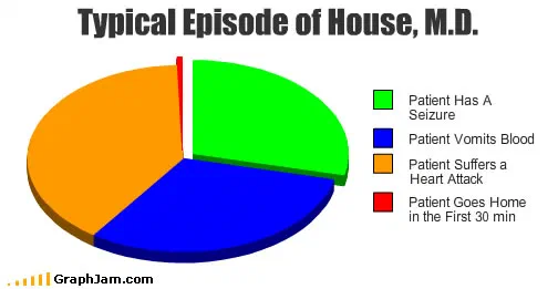
Typical Episode of House, M.D.
- B7
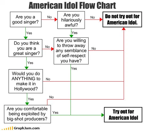
American Idol Flow Chart
- B8
Snuggies
- B9
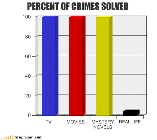
PERCENT OF CRIMES SOLVED
- B10
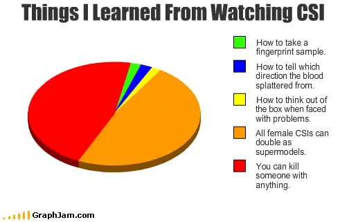
Things I Learned From Watching CSI
- Side C
- C1
Likelihood of You Knowing the Answer to the $1,000,000 Question
- C2
History channel guide
- C3
The Unified Theory Of Primetime TV In 2010
- C4
I Think We’re LOST
- C5
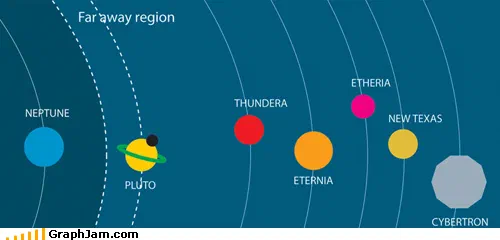
Space: The Final Frontier
- C6
What are we doing tonight brain
- C7
Mythbusters: Blowin’ Stuff Up And Callin’ It Science!