Contents of a Teenage Girl's iPod
Three brands, one sliver, and a residual category that tells you what the other three are not.
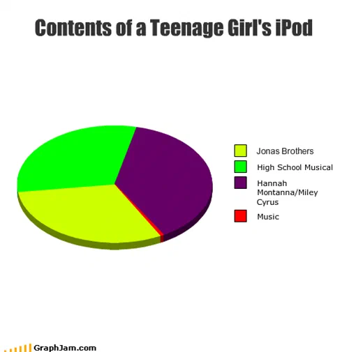
Three near-equal slices in the builder’s default palette, plus a fourth drawn as a red line a pixel or two wide. The thin one is the category the chart’s title implies should dominate.
Three slices of roughly a third each, in the chart builder’s yellow-green, green and purple. Two Disney franchises and a musical film series. And a fourth category, a red line barely wide enough to see, labelled music.
The residual category is the argument
Take the sliver away and this chart is a list of three brands. Nobody would have forwarded it.
The sliver does something a list cannot: it defines the other three by exclusion. By putting a category called music on the same axis as three named franchises, and giving it effectively nothing, the chart asserts that the three large slices are not music but something else — merchandising, or programming, or product.
That is a real rhetorical move and it appears repeatedly in this archive. A residual category is where the actual claim hides. The same construction turns up in the chart of what a government does, in the chart of a philosophy degree, and in the chart of what an average person does during a zombie apocalypse: name the expected answers, then add one more that makes them all look ridiculous.
The double label
One slice carries two names, a character and the performer who played her, because in 2008 those were not separable products. A television character, an in-character recording career, an out-of-character recording career and a concert tour were sold as one continuous thing, and a chart that split them into two slices would have been describing a distinction the market did not make.
Leaving them fused is the more accurate choice, and it is the sort of small decision that separates a chart somebody thought about from a chart somebody typed.
What it is actually attacking
It should be said plainly: the target here is an audience, not the performers.
All three of the named acts sold in extraordinary quantity to exactly the demographic in the title, and the mechanism that produced them, a television channel with an in-house record label and a touring operation, was one of the most effective pieces of entertainment engineering of the decade. Dismissing the output as not-music is a judgement about teenage girls, which is what a great deal of 2008 internet humour was about.
The archive publishes the chart as the record of a widely held attitude of its moment rather than as a verdict. That distinction matters more here than on most plates, because this is one of the entries whose politics have aged worse than its joke.
Where it travelled
Four sites still link to it, and three of them are not in English.
Microsiervos, one of the largest Spanish-language technology blogs, with a long history of covering exactly this sort of thing, ran it as El contenido del iPod de una quinceañera, which localises the subject to a fifteen-year-old and does the joke no damage. A Brazilian accountancy blog, of all places, ran it in Portuguese with a source link. A Czech quote site posted the bare address.
The fourth is a drum corps discussion forum, where somebody dropped it into a thread about the Grammy Awards. That is a chart being used as an argument about award-show taste by an audience of marching-band musicians, which is a more specific readership than anything else in this collection reached.
What the plate is worth now
Four sites still link to it, an image containing eleven words, three of which are brand names.
Two of those three franchises have ended, and the third became something the chart could not have predicted. What survives is the structure: three named things, one residual category, and the residual category doing all the work.