Piechart of Procrastination
The one chart in this archive whose accuracy depends on it never having been drawn.
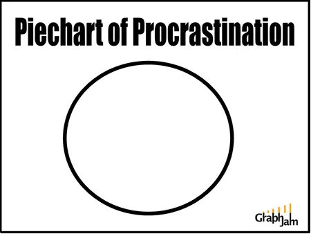
The title in heavy condensed black, and beneath it a single circle outline. No slices, no legend, no labels, no data. Nothing was ever divided up.
A title in heavy black condensed type reading Piechart of Procrastination, and below it a circle. The circle has no slices in it.
That is the entire image, and it has been forwarded for eighteen years.
Why it works, mechanically
Most jokes in this archive are carried by a mismatch between a format and its content: a business chart applied to a lyric, a probability distribution applied to a film. This one has no content to mismatch. The joke is carried entirely by the gap between what the title promises and what the image delivers.
That is a harder trick than it looks, and it depends on two things. First, the title must be doing real work, a pie chart of something implies a division, and the word procrastination sets up an expectation of categories: the time spent on this, the time spent avoiding that. Second, the circle must be drawn confidently. It is a clean, thick, deliberate outline. Nothing about the image suggests a file that failed to render.
The reader supplies the missing step. The chart was not drawn because the person drawing it was procrastinating, which makes the empty circle not a failure of the chart but its only honest possible state.
The one reading that makes it correct
There is a version of this image that is genuinely valid rather than merely funny.
A pie chart is appropriate when you have parts of a single whole, the parts are mutually exclusive, and there are few enough to read at a glance. A pie chart of work completed while procrastinating satisfies all three conditions, because the set of parts is empty and an empty set is trivially exhaustive, non-overlapping and readable.
Very few charts in this archive would survive a first-year statistics review. This one does, on a technicality, and the technicality is the joke.
Where it came from
The original post credited two people: Lindsay G., who submitted it, and Demetri Martin, thanked specially. Martin’s stand-up has always used drawings and charts as delivery devices, and the credit line makes the lineage explicit rather than leaving it to be discovered, which is worth noting, because a great deal of material in this archive arrived with no acknowledgement of where the idea came from.
Where it travelled
Five sites still link to it, and their subjects are more interesting than their count.
Podnosh, a British digital-engagement consultancy, used it in a post called Getting things done…, a productivity write-up reaching for a joke that undercuts productivity. DenkfabrikBlog, writing in German under the title Morgen. Ganz bestimmt…, tomorrow, definitely, linked straight to the image with the note “Hier gibt’s das Ding im Original”, here is the thing in the original. A German blog about putting things off, pointing at an American empty circle, and needing no translation to do it.
Duncan Rawlinson filed it under a headline claiming that graphs and charts were the new lolcats, which in March 2008 was a prediction rather than an observation, and was correct. Two more link round-ups followed.
The pattern is consistent: every one of these is a post about the subject, using the chart as a punchline. That is the most durable kind of link a joke can earn, because it does not depend on the reader having heard of the source.
What the plate is worth now
This is one of the earliest charts the site ever published, from within its first month, and it is the highest-scoring entry in the self-portrait collection, the group of charts whose subject is the person holding the pen.
It is also the archive’s cleanest demonstration of something the rest of the collection keeps proving the long way round: that a chart’s argument lives in its geometry, not its data. This image has no data at all. It still makes its point faster than a sentence would.